In this blog post, I will go over a very helpful hydrologic package in R that can make your hydro-life much easier. The package is called HydroGOF, and it can be used to make different types of plots, including mean monthly, annual, and seasonal plots for streamflow, rainfall, temperature, and other environmental variables. You can also use HydroGOF to compare your simulated flow to observed flow and calculate various performance metrics such as Nash-Sutcliffe efficiency. Indeed, the GOF part of HydroGOF stands for “goodness of fit.” More information about HydroGOF and its applications for hydrologists can be found here. Also, you can find a more comprehensive list of hydrologic R packages from this water programming blog post.
1- Library and Data Preparation
HydroGOF accepts R data frames and R zoo objects. If you are not familiar with R’s zoo objects, you can find more information at here. In this tutorial, I use HydroGOF’s test case streamflow data, which are in zoo format. Here is how you can install and load zoo and HydroGOF.
After you load the package, you need to activate your streamflow data. This is how you do so.
# Activate HydroGOF's streamflow data
data(EgaEnEstellaQts)
Now, let’s take a look at the first few lines of our streamflow data.
head(EgaEnEstellaQts)
Note that the first column is date and that the second column is streamflow data; the unit is m3/sec. Also, keep in mind that you can use zoo to manipulate the temporal regime of your data. For example, you can convert your daily data to monthly or annual.
2- Streamflow Plots
Now, let’s use HydroGOF to visualize our observed streamflow data. You can use the following commands to generate some nice figures that will help you explore the overall regime of the streamflow data.
obs<-EgaEnEstellaQts

hydroplot(x = obs,var.type = "FLOW", var.unit = "m3/s", ptype = "ts+boxplot", FUN=mean)
# Note that "hydroplot" command is very flexible and there are many
# options that users can add or remove
3- Generate Simulated Dataset
For this tutorial, I have written the following function, which uses observed streamflow to generate a very simple estimation of daily streamflow. Basically, the function takes the observed data and calculates daily average flow for each day of the year. Then, the function repeats the one-year data as many times as you need, which for our case, is ten times to match the observed flow.
simple_predictor<-function(obs){
  # This function generates a very simple prediction of streamflow
  # based on observed streamflow inputs

  DOY<-data.frame(matrix(ncol =1, nrow = length(EgaEnEstellaQts)))

  for (i_day in 1:length(EgaEnEstellaQts)){
    DOY[i_day,]=as.numeric(strftime(index(EgaEnEstellaQts[i_day]), format = "%j"))
  }

# Create a 365 day timeseries of average daily streamflow.
  m_inflow_obs<-as.numeric(aggregate(obs[,1], by=list(DOY[,1]), mean))

  simplest_predictor<-data.frame(matrix(ncol=3, nrow =length(obs )))
  names(simplest_predictor)<-c("Date", "Observed", "Predicted")
  simplest_predictor[,1]=index(obs)

  simplest_predictor[,2]=coredata(obs)

  for (i_d in 1:length(obs)){
   # Iterates average daily flow for entire simulation period
    simplest_predictor[i_d,3]=m_inflow_obs[DOY[i_d,1]]
  }
  # Convert to zoo format
  dt_z<-read.zoo(simplest_predictor, format="%Y-%m-%d")

  return(dt_z)
}
After loading the function, you can use the following to create your combined observed and simulated data frame.
# Here we just call the function
obs_sim<-simple_predictor(obs)
4- Hydrologic Error Metrics Using HydroGOF
There are twenty error metrics in HydroGOF—for example, mean error (ME), mean absolute error (MAE), root mean square error (RMSE), normalized root mean square error (NRMSE), percent bias (PBIAS), ratio of standard deviations (Rsd), and Nash-Sutcliffe efficiency (NSE). You can find more information about them here. You can use the following commands to calculate specific error metrics.
# Nash-Sutcliffe Efficiency
NSE(sim=obs_sim$Predicted, obs=obs_sim$Observed)
# Root Mean Squared Error
rmse(sim=obs_sim$Predicted, obs=obs_sim$Observed)
# Mean Error
me(sim=obs_sim$Predicted, obs=obs_sim$Observed)
You can also use this cool command to see all of the available error metrics in HydroGOF.
gof(sim=obs_sim$Predicted, obs=obs_sim$Observed)
5- Visualizing Observed and Simulated Streamflow
Here is the most interesting part: you can plot observed and simulated on the same graph and add all error metrics to the plot.
ggof(sim=obs_sim$Predicted, obs=obs_sim$Observed, ftype="dm", gofs = c("NSE", "rNSE", "ME", "MSE",  "d", "RMSE", "PBIAS"), FUN=mean)
# You should explore different options that you can add to this figure.
# For example you can choose which error metrics you want to display, etc
This post is meant to provide a very introductory overview of TensorFlow and Keras and concludes with example of a how to use these libraries to implement a very basic neural network.
TensorFlow
At core, TensorFlow is a free, open-source symbolic math library that expresses calculations in terms of dataflow graphs that are composed of nodes and tensors. TensorFlow is particularly adept at handling operations required to train neural networks and thus has become a popular choice for machine learning applications1. All nodes and tensors as well as the API are Python-based. However, the actual mathematical operations are carried out efficiently using high-performance C++ binaries2. TensorFlow was originally developed by the Google Brain Team for internal use but since has been released for public use. The library has a reputation of being on the more technical side and less intuitive to new users, so based on user feedback from initial versioning, TensorFlow decided to add Keras to their core library in 2017.
Keras
Keras is an open-source neural network Python library that has become a popular API to run on top of TensorFlow and other deep learning frameworks. Keras is useful especially for beginners in machine learning because it offers a user-friendly, intuitive, and quick way to build models. Particularly, users tend to most interested in quickly implementing neural networks. In Keras, neural network models are composed of standalone modules of neural network layers, cost functions, optimizers, activation functions, and regularizers that can be built separately and combined3.
Example: Predicting the age of abalone
In the example below, I will implement a very basic neural network to illustrate the main components of Keras. The problem we are interested in solving is predicting the age of abalone (sea snails) given a variety of physical characteristics. Traditionally, the age of abalone is calculated by cutting the shell, staining it, and counting the number of rings in the shell, so the goal is to see if less time-consuming and intrusive measurements, such as the diameter, length, and gender, can be used to predict the age of the snail. This dataset is one of the most popular regression datatsets from the UC Irvine Machine Learning Repository. The full set of attributes and dataset can be found here.
Step 1: Assessing and Processing Data
The first step to approaching this (and any machine learning) problem is to assess the quality and quantity of information that is provided in the dataset. We first import relevant basic libraries. More specific libraries will be imported above their respective functions for illustrative purposes. Then we import the dataset which has 4177 observations of 9 features and also has no null values.
#Import relevant libraries
import numpy as np
import pandas as pd
import seaborn as sns
import matplotlib.pyplot as plt

#Import dataset
dataset = pd.read_csv('Abalone_Categorical.csv')
#Print number of observations and features
print('This dataset has {} observations with {} features.'.format(dataset.shape[0], dataset.shape[1]))
#Check for null values
dataset.info()
Note that the dataset is composed of numerical attributes except for the “Gender” column which is categorical. Neural networks cannot work with categorical data directly, so the gender must be converted to a numerical value. Categorical variables can be assigned a number such as Male=1, Female=2, and Infant=3, but this is a fairly naïve approach that assumes some sort of ordinal nature. This scale will imply to the neural network that a male is more similar to a female than an infant which may not be the case. Instead, we instead use one-hot encoding to represent the variables as binary vectors.
Note that we now have 10 features because Male, Female, and Infant are represented as the following:
M
F
I
1
0
0
0
1
0
0
0
1
It would be beneficial at this point to look at overall statistics and distributions of each feature and to check for multicollinearity, but further investigation into these topics will not be covered in this post. Also note the difference in the ranges of each feature. It is generally good practice to normalize features that have different units which likely will correspond to different scales for each feature. Very large input variables can lead to large weights which, in turn, can make the network unstable. It is up to the user to decide on the normalization technique that is appropriate for their dataset, with the condition that the output value that is returned also falls in the range of the chosen activation function. Here, we separate the dataset into a “data” portion and a “label” portion and use the MinMaxScalar from Scikit-learn which will, by default, transform the data into the range: (0,1).
#Reorder Columns

dataset = dataset[['Length', 'Diameter ', 'Height', 'Whole Weight', 'Schucked Weight','Viscera Weight ','Shell Weight ','M','F','I','Rings']]

#Separate input data and labels
X=dataset.iloc[:,0:10]
y=dataset.iloc[:,10].values

#Normalize the data using the min-max scalar

from sklearn.preprocessing import MinMaxScaler
scalar= MinMaxScaler()
X= scalar.fit_transform(X)
y= y.reshape(-1,1)
y=scalar.fit_transform(y)
We then split the data into a training set that is composed of 80% of the dataset. The remaining 20% is the testing set.
#Split data into training and testing

from sklearn.model_selection import train_test_split
X_train, X_test, y_train, y_test = train_test_split(X, y, test_size=0.2)
Step 2: Building and Training the Model
Then we build the Keras structure. The core of this structure is the model, which is of the “Sequential” form. This is the simplest style of model and is composed of a linear stack of layers.
#Build Keras Model

import keras
from keras import Sequential
from keras.layers import Dense

model = Sequential()
model.add(Dense(units=10, input_dim=10,activation='relu'))
model.add(Dense(units=1,activation='linear'))
model.compile(optimizer='adam', loss='mean_squared_error',  metrics=['mae','mse'])

early_stop = keras.callbacks.EarlyStopping(monitor='val_loss', patience=10)

history=model.fit(X_train,y_train,batch_size=5, validation_split = 0.2, callbacks=[early_stop], epochs=100)

# Model summary for number of parameters use in the algorithm
model.summary()
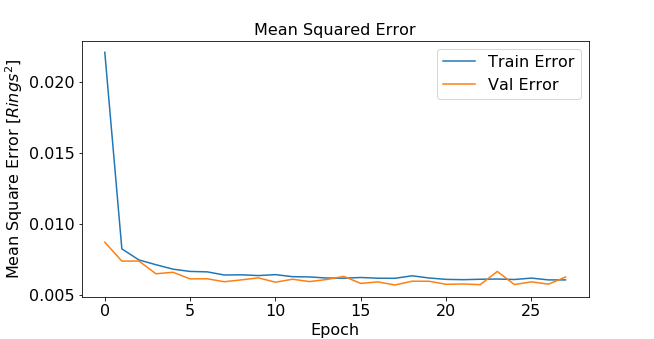
Stacking layers is executed with model.add(). We stack a dense layer of 10 nodes that has 10 inputs feeding into the layer. The activation function chosen for this layer is a ReLU (Rectified Linear Unit), a popular choice due to better gradient propagation and sparser activation than a sigmoidal function for example. A final output layer with a linear activation function is stacked to simply return the model output. This network architecture was picked rather arbitrarily, but can be tuned to achieve better performance. The model is compiled using model.compile(). Here, we specify the type of optimizer- in this case the Adam optimizer which has become a popular alternative to the more traditional stochastic gradient descent. A mean-squared-error loss function is specified and the metrics reported will be “mean squared error” and “mean absolute error”. Then we call model.fit() to iterate training in batch sizes. Batch size corresponds to the number of training instances that are processed before the model is updated. The number of epochs is the number of complete passes through the dataset. The more times that the model can see the dataset, the more chances it has to learn the patterns, but too many epochs can also lead to overfitting. The number of epochs appropriate for this case is unknown, so I can implement a validation set that is 20% of my current training set. I set a large value of 100 epochs and add early stopping criteria that stops training when the validation score stops improving and helps prevent overfitting.
Training and validation error can be plotted as a function of epochs4 .
Once our model is trained, we can use it to predict the age of the abalone in the test set. Once the values are predicted, then they must be re-scaled back which is performed using the inverse_transform function from Scikit-learn.
Then the predicted and actual ages are plotted along with a 1-to-1 line to visualize the performance of the model. An R-squared value and a RMSE are calculated as 0.554 and 2.20 rings respectively.
#visualize performance
fig, ax = plt.subplots()
ax.scatter(y_test_transformed, y_pred_transformed)
ax.plot([y_test_transformed.min(), y_test_transformed.max()], [y_test_transformed.min(), y_test_transformed.max()], 'k--', lw=4)
ax.set_xlabel('Measured (Rings)')
ax.set_ylabel('Predicted (Rings)')
plt.show()

#Calculate RMSE and R^2
from sklearn.metrics import mean_squared_error
from math import sqrt
rms = sqrt(mean_squared_error(y_test_transformed, y_pred_transformed))

from sklearn.metrics import r2_score
r_squared=r2_score(y_test_transformed,y_pred_transformed)
Predicted vs. Actual (Measured) Ages
The performance is not ideal, but the results are appropriate given that this dataset is notoriously hard to use for prediction without other relevant information such as weather or location. Ultimately, it is up to the user to decide if these are significant/acceptable values, otherwise the neural network hyperparameters can be further fine-tuned or more input data and more features can be added to the dataset to try to improve performance.
Sources:
[1]Dean, Jeff; Monga, Rajat; et al. (November 9, 2015). “TensorFlow: Large-scale machine learning on heterogeneous systems” (PDF). TensorFlow.org. Google Research.
The purpose of this blog post is to introduce dynamic emulation in the context of applications to hydrology. Hydrologic modelling involves implementing mathematical equations to represent physical processes such as precipitation, runoff, and evapotranspiration and to characterize energy and water flux within the hydrologic system (Abbott et al., 1986). Users of a model might be interested in using it to approach a variety of problems related to, for instance, modeling the rainfall-runoff process in a river basin. The user might try to validate the model, perform sensitivity or uncertainty analysis, determine optimal planning and management of the basin, or test how hydrology of the basin is affected by different climate scenarios. Each of these problems requires a numerically intensive Monte Carlo style approach for which a physical model is not conducive. A solution to this problem is to create an emulator for the physical model. An emulator is a computationally efficient model whose response characteristics mimic those of a complex model as closely as possible. This model can then replace the more complicated model in computationally intensive exercises (Tych & Young, 2012).
There are many different approaches to creating an emulator; one particularly unified approach is Dynamic Emulation Modelling (DEMo) (Castelletti et al., 2012). DEMo seeks to accomplish three goals when creating an emulator:
The emulator is less computationally intensive than the physical model.
The emulator’s input-output behavior approximates as well as possible the behavior of the physical model.
The emulator is credible to users.
DEMo has five main steps:
Design of Computer Experiments: Determine a set of input data to build the emulator off of that will cover the range of responses of the physical model
Variable Aggregation: Reduce dimensionality of the input data
Variable Selection: Select components of the reduced inputs that are most relevant to explaining the output data
Structure Identification and Parameter Estimation: In the case of a rainfall runoff model, choose a set of appropriate black box models that can capture the complex, non-linear process and fit the parameters of these models accordingly.
Evaluation and Physical Interpretation: Evaluate the model on a validation set and determine how well the model’s behavior and structure can be explained or attributed to physical processes.
The next section outlines two data-driven style models that can be used for hydrologic emulation.
Artificial Neural Networks (ANNs)
Rainfall-runoff modelling is one of the most complex and non-linear hydrologic phenomena to comprehend and model. This is due to tremendous spatial and temporal variability in watershed characteristics. Because ANNs can mimic high-dimensional non-linear systems, they are a popular choice for rainfall-runoff modeling (Maier at al., 2010). Depending on the time step of interest as well as the complexity of the hydrology of the basin, a simple feedforward network may be sufficient for accurate predictions. However, the model may benefit from having the ability to incorporate memory that might be inherent in the physical processes that dictate the rainfall-runoff relationship. Unlike feedforward networks, recurrent neural networks are designed to understand temporal dynamics by processing inputs in sequential order (Rumelhart et al., 1986) and by storing information obtained from previous outputs. However, RNNs have trouble learning long-term dependencies greater than 10 time steps (Bengio, 1994). The current state of the art is Long Short-Term Memory (LSTM) models. These RNN style networks contain a cell state that has the ability of learn long-term dependencies as well as gates to regulate the flow of information in and out the cell, as shown in Figure 1.
Figure 1: Long Short-Term Memory Module Architecture1
LSTMs are most commonly used in speech and writing recognition but have just begun to be implemented in hydrology applications with success especially in modelling rainfall-runoff in snow-influenced catchments. Kratzert et al., 2018, show that the LSTM is able to outperform the Sacramento Soil Moisture Accounting Model (SAC-SMA) coupled with a Snow-17 routine to compute runoff in 241 catchments.
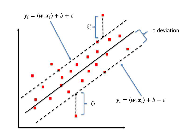
Support Vector Regression (SVR)
Support vector machines are commonly used for classification but have been successfully implemented for working with continuous values prediction in a regression setting. Support vector regression relies on finding a function within a user specified level of precision, ε, from the true value of every data point, shown in Figure 2.
Figure 2: Support Vector Regression Model2
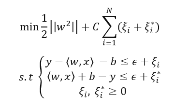
It is possible that this function may not exist, and so slack variables, ξ , are introduced which allow errors up to ξ to still exist. Errors that lie within the epsilon bounds are treated as 0, while points that lie outside of the bounds will have a loss equal to the distance between the point and the ε bound. Training an SVR model requires solving the following optimization problem:
Where w is the learned weight vector and xi and yi are training points. C is a penalty parameter imposed on observations that lie outside the epsilon margin and also serves as a method for regularization. In the case that linear regression is not sufficient for the problem, the inner products in the dual form of the problem above can be substituted with a kernel function that maps x to a higher dimensional space, This allows for estimation of non-linear functions. Work by Granata et al., 2016 compares an SVR approach with EPA’s Storm Water Management Model (SWMM) and finds comparable results in terms of RMSE and R2 value.
References
Abbott, M.b., et al. “An Introduction to the European Hydrological System — Systeme Hydrologique Europeen, ‘SHE’, 1: History and Philosophy of a Physically-Based, Distributed Modelling System.” Journal of Hydrology, vol. 87, no. 1-2, 1986, pp. 45–59., doi:10.1016/0022-1694(86)90114-9.
Bengio, Y., et al. “Learning Long-Term Dependencies with Gradient Descent Is Difficult.” IEEE Transactions on Neural Networks, vol. 5, no. 2, 1994, pp. 157–166., doi:10.1109/72.279181.
Castelletti, A., et al. “A General Framework for Dynamic Emulation Modelling in Environmental Problems.” Environmental Modelling & Software, vol. 34, 2012, pp. 5–18., doi:10.1016/j.envsoft.2012.01.002.
Castelletti, A., et al. “A General Framework for Dynamic Emulation Modelling in Environmental Problems.” Environmental Modelling & Software, vol. 34, 2012, pp. 5–18., doi:10.1016/j.envsoft.2012.01.002.
Granata, Francesco, et al. “Support Vector Regression for Rainfall-Runoff Modeling in Urban Drainage: A Comparison with the EPA’s Storm Water Management Model.” Water, vol. 8, no. 3, 2016, p. 69., doi:10.3390/w8030069.
Kratzert, Frederik, et al. “Rainfall–Runoff Modelling Using Long Short-Term Memory (LSTM) Networks.” Hydrology and Earth System Sciences, vol. 22, no. 11, 2018, pp. 6005–6022., doi:10.5194/hess-22-6005-2018.
Maier, Holger R., et al. “Methods Used for the Development of Neural Networks for the Prediction of Water Resource Variables in River Systems: Current Status and Future Directions.” Environmental Modelling & Software, vol. 25, no. 8, 2010, pp. 891–909., doi:10.1016/j.envsoft.2010.02.003.
Rumelhart, David E., et al. “Learning Representations by Back-Propagating Errors.” Nature, vol. 323, no. 6088, 1986, pp. 533–536., doi:10.1038/323533a0.
Tych, W., and P.c. Young. “A Matlab Software Framework for Dynamic Model Emulation.” Environmental Modelling & Software, vol. 34, 2012, pp. 19–29., doi:10.1016/j.envsoft.2011.08.008.
(2) Kleynhans, Tania, et al. “Predicting Top-of-Atmosphere Thermal Radiance Using MERRA-2 Atmospheric Data with Deep Learning.” Remote Sensing, vol. 9, no. 11, 2017, p. 1133., doi:10.3390/rs9111133.
Rhodium is a Python library for Many-Objective Robust Decision Making (MORDM), part of Project Platypus. Multiple past posts have addressed the use of Rhodium on various applications. This post mirrors this older post by Julie which demonstrated the MORDM functionality of Rhodium using a different model; I’ll be doing the same using the lake problem, a case study we often use for training purposes. In this post I will use Rhodium to replicate the analysis in the paper and discuss the importance of the various steps in the workflow, why they are performed and what they mean for MORDM. As this post will be quite long, I will be emphasizing discussion of results and significance and will be using previously written code found in the Rhodium repository (slightly adapted) and in Julie’s lake problem repository. In general, this post will not be re-inventing the wheel in terms of scripts, but will be an overview of why. For a more detailed description of the model, the reader is directed to the paper linked, Dave’s recent post, and the accompanying Powerpoint presentation for this training.
Problem Formulation
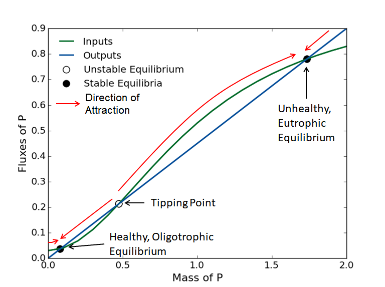
The system presents a hypothetical town that seeks to balance economic benefits resulting in phosphorus (P) emissions with the ecological benefits of a healthy lake. The lake naturally receives inflows of phosphorus from the surrounding area and recycles phosphorus in its system. The concentration of P in the lake at every timestep is described by the following equation:
Where a represents the anthropogenic phosphorus inputs from the town, Y ~ LN(mu, sigma) are natural P inputs to the lake, q is a parameter controlling the recycling rate of P from sediment, b is a parameter controlling the rate at which P is removed from the system and t is the time index in years. Looking at the intersections of the temporal fluxes of P, one can see there are three equilibria for this system, two of which are stable and attractive, and one unstable, a tipping point in this system.
Figure by Julie Quinn
Why this matters: We’re trying to decide on values of that maximize our economic benefits, but also increase P in the lake. If we increase P too much, and we cross a tipping point of no return. Even though this is vital to the design of the best possible management policy, this value of P is hard to know exactly because: – It depends on stochastic – The rate of inputs is non-linear – The system parameters determining this point might be (deeply) uncertain
The management of this hypothetical system is concerned in four objectives:
Maximize Expected Economic Benefits
Minimize Maximum P Concentration
Maximize Inertia (Measure of Stability)
Maximize Reliability (Fraction of Years Below Threshold)
To search for and identify solution, we will be using two strategies:
Open loop control (Intertemporal):
Each candidate solution is a set of T decision variables , representing the anthropogenic discharges at each timestep . This strategy necessitates 100 decision variables.
Closed loop control (DPS):
Each candidate solution is a control rule mapping the current P concentration, , to a decision . This strategy necessitates 6 decision variables.
Please refer to the paper for details on the formulations of the objectives and strategies.
Problem Formulation in Rhodium
In general, to set up any Rhodium model, you’d need to follow this template:
The scripts for the two formulations can be found here and here. In general, Rhodium is written in a declarative manner so after you define what everything is (model, parameter, lever, etc.), you only need to describe the operation to be performed (e.g., “optimize”), without needing to specify all the details of how that should be done.
Why this matters: This library is set up in a way that allows rapid and intuitive application of the MORDM framework. This is especially beneficial in situations were alternative problem formulations are tested (as is the case here with the two search strategies).
Exploring alternatives using J3
To explore the two sets of candidate strategies using the tools provided by Rhodium, we need to merge them into a single dataset. We can do so by adding a key to each solution identified by each strategy:
for i in range(len(output)):
    output[i]['strategy']=1
    dps_output[i]['strategy']=0

merged = DataSet(output+dps_output)
We can visualize the two sets using J3 (see my past post on it here):
from j3 import J3
J3(merged.as_dataframe(list(model.responses.keys())+['strategy']))
Why this matters: The DPS strategy was able to identify more non-dominated solutions than the intertemporal strategy. Many of the DPS solutions outperform intertemporal solutions in every objective. This is important because we’re trying to identify the best possible management policies for this system and had we only used the Intertemporal strategy we could potentially miss multiple viable solutions that are better.
Policy diagnostics
Now we have a set of candidate management policies, we should like to see what makes their performance different and how they affect the system when applied. Using J3, I can interactively explore the sets using the visualizations provided as well as the tables reporting on the performance of each solution. In the example figure below, I am highlighting the DPS solution with the highest reliability performance.
Using the script found here, I can draw two DPS policies, the one producing the highest reliability and the one resulting in the highest profits. What I am trying to do here is investigate more closely how the two policies prescribe action on the system and how they result in the performance that they do.
Both solutions map low P concentrations, , to higher P releases, , and prescribe decreased releases as the concentration increases. The most reliable policy is more conservative, starting to decrease its emissions earlier. Both policies start increasing discharges beyond some lake P concentration, with the benefits-maximizing solution doing so at lower values. This appears to be as the levels approach the tipping point, beyond which it is best to further maximize economic benefits.
Why this matters: Understanding how the candidate policies act on a system to achieve their performance gives us further insight on how the system behaves and reacts to our actions. The candidate policies are also not aware of where the critical P threshold is, but appear to “discover” it and when crossed, they prescribe increased emissions to maximize profits.
Robustness analysis and scenario discovery
Finally, we’d like to investigate how the candidate solutions perform under uncertainty. To do so using Rhodium, we need to define which parameters are exogenous uncertainties, including their distributions and ranges, sample them and re-evaluate either specific solutions or all of them in these sampled worlds. The script is simple and intuitive:
To perform scenario discovery, Rhodium supports Prim and Cart. We first need to classify the output into “success” and “failure”:
classification = scenario_discovery.apply("'Reliable' if reliability >= 0.95 and utility >=0.2 else 'Unreliable'")

p = Prim(scenario_discovery, classification, include=model.uncertainties.keys(), coi="Reliable")
box = p.find_box()
fig = box.show_tradeoff()

c = Cart(scenario_discovery, classification, include=model.uncertainties.keys(), min_samples_leaf=50)
c.show_tree()
Why this matters: Scenario discovery allows us to discover regions in the parametric space that cause our policies to fail. In this particular case, it appears thatthere is a non linear combination of b and q values that lead to failure in meeting the criterion. Both parameters shift the input and output fluxes of P, shifting the tipping point to lower levels.
In this blog post, I am going to introduce a powerful plotting package in R. The plotting package is called ggplo2. This library allows us to quickly create different plots (scatter plots, boxplots, histograms, density plots, time series plots: you name it!) while also customizing them to produce elegant graphics beyond regular line or bar charts. First, we need to download the library and then activate it:
install.packages("ggplot2")
library(ggplot2)
I am going to outline how to build two different types of map: (1) calendar heat map and (2) alluvial map. The first is used to present the variations of a variable or an activity over a long period of time through color coding so that we can easily recognize the trend, the seasonality, or any patterns or anomalies. The alluvial map provides better visualization for categorical and multidimensional data. They show the changes in magnitude of some variables at different situations that can be any discrete indexes. To create this type of map, we also need the “ggalluvial” library that has to be called with ggplot2.
The general code structure for plotting calendar heat map is the following:
ggplot ( dataframe , aes ( x , y , fill )) + geom_tile ( ) + facet_grid ( )
With “aes,” which stands for aesthetics, we describe how variables in the data frame are mapped to visual properties, so we specify the x- and y-axes. We use the fill in aesthetic to specify the fill color for different variables.
“Geom” specifies the geometric objects that define the graph type—which can be point, line, etc.—and show the value we assigned in “aes(fill)”. The “geom_tile” tiles plane with rectangles uses the center of the tile and its size. A rectangle can be divided into smaller rectangles or squares.
The “facet” command creates a trellis graph or panel by specifying two variables or one on top of “aes.”
We can show the daily, weekly, or monthly values in the calendar heat map. As an example of calendar heat map, I am using weather data for the Yakima River Basin in central Washington State; these data were originally downloaded from Northwest Knowledge Network. The data set includes three downscaled global climate models (GCMs) from 2019 to 2061 with the resolution of 1/24th degree; the data is also aggregated for the basin and monthly time step. You can download data here. Now, let’s read the data.
By running header(gcm1) or colnames(gcm1), you can see different columns in each data set, including “Year”; “Month”; name of the “GCM”; and weather variables including tasmin, tasmax, pr, PotEvap corresponded to minimum and maximum temperature, precipitation, and potential evapotranspiration. The goal is to visualize the difference between these realizations of monthly precipitation for 21 future years from 2020 to 2040. To lay out panels in a faced_grid, I want to show years and months. In each month, I am going to show precipitation values for each GCM.
gcms<- rbind(gcm1,gcm2,gcm3)  # Join three data frames into one

# Add a new column to the data frame and call it “Month_name”; then, fill it with the name of the months for each row
tst<- c("Jan","Feb","Mar","Apr","May","Jun","Jul","Aug","Sep","Oct",
"Nov","Dec")
gcms$Month_name <- tst[gcms$Month]
gcms$nmonth<- as.factor(1)  # add a new column to a data frame and fill it with value of 1, as a factor
gcm_2040<- subset(gcms, gcms$Year<2041) # select just the years before 2041
prec_fut<- ggplot(gcm_2040, aes(x=gcm_2040$gcm,nmonth,fill = pr)) +
  geom_tile()+
  facet_grid(Year~Month_name) +
  theme(strip.text.x = element_text(colour = "black",size =9 ,margin=margin(0.2,0,0.2,0,"cm")),
        strip.text.y = element_text(colour = "black",size = 9,angle =360),
        strip.background = element_rect(colour="black", size=1, linetype="solid"),
        axis.text.x=element_text(size=9,angle = 90),
        axis.text.y=element_blank(),
        axis.ticks.y=element_blank(),
        panel.background = element_rect(fill = "white"))+
scale_fill_gradient(low="green",high="red",limits=c(0,230),breaks=c(0,25,50,75,100,125,150,175,200,230),labels=c(0,25,50,75,100,125,150,175,200,230)) +
  labs(x="",
       y="",
       title = "Time-Series Calendar Heatmap",
       subtitle="Projected Monthly Precipitation-Yakima Rive Basin",
       fill="Precipitation (mm)")
ggsave("(your directory)/name.png", prec_fut)
With theme(), you can modify the non-data parts of your plot. For example, “strip.text.x and .y” and “strip.background“ adjust facet labels of each panel along horizontal and vertical directions and background format.
The “axis.text” and “axis.ticks” commands adjust the tick labels and marks along axes, and by using element_blank(), you can remove specific labels. With “panel.background,” the underlying background of the plot can be customized.
With argument “limits” in “scale_fill_gradient,” you can extend the color bar to the minimum and maximum values you need. In our example, these limits are obtained by the following commands.
max(gcm_2040$pr)
min(gcm_2040$pr)
With the labs() command, you can change axis labels, plot, and legend titles. Finally, ggsave() is used to save a plot; the scale, size, and resolution of the saved plot can also be specified. Ggsave() supports various formats including “eps,” “ps,” “tex” (pictex), “pdf,” “jpeg,” “tiff,” “png,” “bmp,” “svg,” and “wmf” (Windows only).
What can we learn from this graph? Well, we can see the interannual variability of precipitation based on three GCMs and how monthly precipitation varies in different GCMs. Compared to precipitation values for wet months, when variations are generally higher, precipitation values for dry months are more consistent among GCMs.
Now, let’s create an alluvial diagram. For that, we need to prepare the essential components. The data should be categorical, and for each row, there should be a frequency for a category that we are interested in presenting. In this example, I am going to show simulated (by a crop model) winter wheat yield changes in dryland low rainfall zone of the Pacific Northwest during the future period (2055–2085) compared to the historical period (1980–2010). The low zone in this region includes 1,384 grid cells with the dimension of 4 by 4 km. Different GCMs projected different weather scenarios, which we showed in the calendar heat map plot. As you can imagine, if you force your crop model with different GCMs, you will get different projections for the crop yield. The example data set can be read in R by the following:
This data set includes a few columns: “fre_yield,” “GCM,” “Zone,” “RCP,” and “Ratio.”
For each row, there is a GCM name
that corresponds to RCP and Zone. Then, there is a Ratio column, which shows
the category of the yield ratio. These yield ratio categories correspond to the
average winter wheat yield during the future period, divided by average yield
during the historical period. For each of the categories under the Ratio
column, the number of grid cells was counted and is reported under the “fre_
yield” column. For example, Row 2 (L_zones[2,]) shows that 976 grid cells out
of 1,384 cells in a low-rainfall zone are projected to have yield ratio between
1.2 and 1.5 during 2055–2085 compared to 1980–2010, under CanESM2 and RCP 4.5
future weather scenarios.
Ggplot and ggalluvial provide an easy way to illustrate this type of data set. At each category on the x-axis, we can have multiple groups, and they are called “strata.” Alluvial diagrams have horizontal splines that span across the categories at the x-axis, and they are called “alluvia.” A fixed value is assigned to an alluvium at each category at the x-axis that can be represented by a fill color.
install.packages("ggalluvial")
library(ggalluvial)

yield_ratio<- ggplot(data = L_zones, aes(axis=GCM, axis2=RCP, y = fre_yield)) +
 # We can add more (axis4, …) to have more groups in the x-axis
  scale_x_discrete(limits = c("GCM","RCP"), expand = c(.1, .1)) +
  geom_alluvium(aes(fill = Ratio)) +
  geom_stratum(width = 1/12, fill = "lightgrey", color = "black") +
  geom_label(stat = "stratum", label.strata = TRUE) +
  scale_fill_brewer(type = "qual", palette = "Set1")+
  labs(x="",
       y="Number of Grid cells in the Zone",
       title = "Average Change in Winter Wheat Yield During 2055-2085 Compared to 1980-2010",
       subtitle="Low Rainfall Zone in Pacific Northwest")
ggsave("(your directory)/Future_WW_Yield.jpeg",yield_ratio, width=10, height=10)
“Y” in the aes() controls the heights of the alluvia and is
aggregated across equivalent observations.
“Scale_x_discrete” allows you to place labels between discrete position scales. You can use “limit” to define values of the scale and also their order, and “expand” adds some space around each value of the scale.
“Geom_alluvium” receives the x and y from the data set from ggplot and plots the flows between categories.
“Geom_stratum” plots the rectangles for the
categories, and we can adjust their appearance.
Labels can be assigned to strata by adding “stat = stratum” and “label.strata = TRUE” to the geom_label. Then, the unique values within each stratum are shown on the map.
“Scale_fill_brewer” is useful for displaying discrete values on a map. The type can be seq (sequential), div (diverging), or qual (qualitative). The “palette” can be a string of the named palette or a number, which will index into the list of palettes of appropriate type.
Now, we
can easily see in this graph that the three GCMs used in the crop model produced
different results. The changes in winter wheat yield during the future period
compared to the historical period are not predicted with the same magnitude based
on different future weather scenarios, and these differences are more profound under
RCP 8.5 compared to RCP 4.5.
TDLR; A Python implementation of grouped radial convergence plots based on code from the Rhodium library. This script is will be added to Antonia’s repository for Radial Convergence Plots.
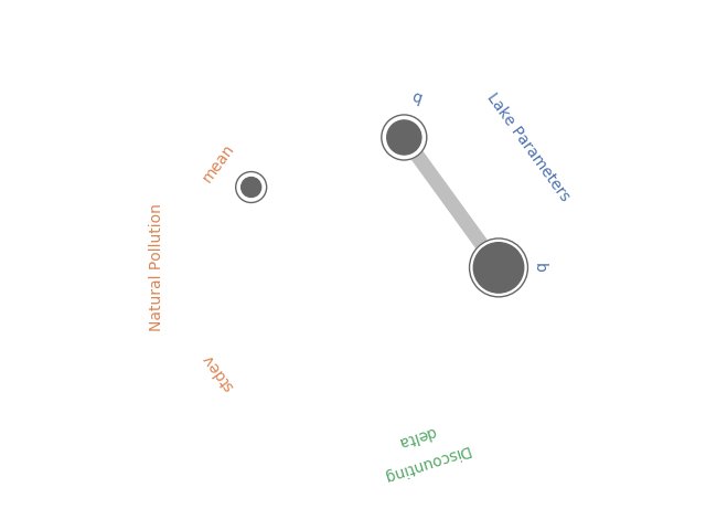
Radial convergence plots are a useful tool for visualizing results of Sobol Sensitivities analyses. These plots array the model parameters in a circle and plot the first order, total order and second order Sobol sensitivity indices for each parameter. The first order sensitivity is shown as the size of a closed circle, the total order as the size of a larger open circle and the second order as the thickness of a line connecting two parameters.
In May, Antonia created a new Python library to generate Radial Convergence plots in Python, her post can be found here and the Github repository here. I’ve been working with the Rhodium Library a lot recently and found that it contained a Radial Convergence Plotting function with the ability to plot grouped output, a functionality that is not present in Antonia’s repository. This function produces the same plots as Calvin’s R package. Adding a grouping functionality allows the user to color code the visualization to improve the interpretability of the results. In the code below I’ve adapted the Rhodium function to be a standalone Python code that can create visualizations from raw output of the SALib library. When used on a policy for the Lake Problem, the code generates the following plot shown in Figure 1.
Figure 1: Example Radial Convergence Plot for the Lake Problem reliability objective. Each of the points on the plot represents a sampled uncertain parameter in the model. The size of the filled circle represents the first order Sobol Sensitivity Index, the size of the open circle represents the total order Sobol Sensitivty Index and the thickness of lines between points represents the second order Sobol Sensitivity Index.
import numpy as np
import itertools
import matplotlib.pyplot as plt
import seaborn as sns
import math
sns.set_style('whitegrid', {'axes_linewidth': 0, 'axes.edgecolor': 'white'})

def is_significant(value, confidence_interval, threshold="conf"):
    if threshold == "conf":
        return value - abs(confidence_interval) > 0
    else:
        return value - abs(float(threshold)) > 0

def grouped_radial(SAresults, parameters, radSc=2.0, scaling=1, widthSc=0.5, STthick=1, varNameMult=1.3, colors=None, groups=None, gpNameMult=1.5, threshold="conf"):
    # Derived from https://github.com/calvinwhealton/SensitivityAnalysisPlots
    fig, ax = plt.subplots(1, 1)
    color_map = {}

    # initialize parameters and colors
    if groups is None:

        if colors is None:
            colors = ["k"]

        for i, parameter in enumerate(parameters):
            color_map[parameter] = colors[i % len(colors)]
    else:
        if colors is None:
            colors = sns.color_palette("deep", max(3, len(groups)))

        for i, key in enumerate(groups.keys()):
            #parameters.extend(groups[key])

            for parameter in groups[key]:
                color_map[parameter] = colors[i % len(colors)]

    n = len(parameters)
    angles = radSc*math.pi*np.arange(0, n)/n
    x = radSc*np.cos(angles)
    y = radSc*np.sin(angles)

    # plot second-order indices
    for i, j in itertools.combinations(range(n), 2):
        #key1 = parameters[i]
        #key2 = parameters[j]

        if is_significant(SAresults["S2"][i][j], SAresults["S2_conf"][i][j], threshold):
            angle = math.atan((y[j]-y[i])/(x[j]-x[i]))

            if y[j]-y[i] < 0:
                angle += math.pi

            line_hw = scaling*(max(0, SAresults["S2"][i][j])**widthSc)/2

            coords = np.empty((4, 2))
            coords[0, 0] = x[i] - line_hw*math.sin(angle)
            coords[1, 0] = x[i] + line_hw*math.sin(angle)
            coords[2, 0] = x[j] + line_hw*math.sin(angle)
            coords[3, 0] = x[j] - line_hw*math.sin(angle)
            coords[0, 1] = y[i] + line_hw*math.cos(angle)
            coords[1, 1] = y[i] - line_hw*math.cos(angle)
            coords[2, 1] = y[j] - line_hw*math.cos(angle)
            coords[3, 1] = y[j] + line_hw*math.cos(angle)

            ax.add_artist(plt.Polygon(coords, color="0.75"))

    # plot total order indices
    for i, key in enumerate(parameters):
        if is_significant(SAresults["ST"][i], SAresults["ST_conf"][i], threshold):
            ax.add_artist(plt.Circle((x[i], y[i]), scaling*(SAresults["ST"][i]**widthSc)/2, color='w'))
            ax.add_artist(plt.Circle((x[i], y[i]), scaling*(SAresults["ST"][i]**widthSc)/2, lw=STthick, color='0.4', fill=False))

    # plot first-order indices
    for i, key in enumerate(parameters):
        if is_significant(SAresults["S1"][i], SAresults["S1_conf"][i], threshold):
            ax.add_artist(plt.Circle((x[i], y[i]), scaling*(SAresults["S1"][i]**widthSc)/2, color='0.4'))

    # add labels
    for i, key in enumerate(parameters):
        ax.text(varNameMult*x[i], varNameMult*y[i], key, ha='center', va='center',
                rotation=angles[i]*360/(2*math.pi) - 90,
                color=color_map[key])

    if groups is not None:
        for i, group in enumerate(groups.keys()):
            print(group)
            group_angle = np.mean([angles[j] for j in range(n) if parameters[j] in groups[group]])

            ax.text(gpNameMult*radSc*math.cos(group_angle), gpNameMult*radSc*math.sin(group_angle), group, ha='center', va='center',
                rotation=group_angle*360/(2*math.pi) - 90,
                color=colors[i % len(colors)])

    ax.set_facecolor('white')
    ax.set_xticks([])
    ax.set_yticks([])
    plt.axis('equal')
    plt.axis([-2*radSc, 2*radSc, -2*radSc, 2*radSc])
    #plt.show()


    return fig
The code below implements this function using the SALib to conduct a Sobol Sensitivity Analysis on the Lake Problem to produce Figure 1.
import numpy as np
import itertools
import matplotlib.pyplot as plt
import math
from SALib.sample import saltelli
from SALib.analyze import sobol
from lake_problem import lake_problem
from grouped_radial import grouped_radial

# Define the problem for SALib
problem = {
	'num_vars': 5,
	'names': ['b', 'q', 'mean', 'stdev', 'delta'],
	'bounds': [[0.1, 0.45],
			   [2.0, 4.5],
			   [0.01, 0.05],
			   [0.001, 0.005],
			   [0.93, 0.99]]
}

# generate Sobol samples
param_samples = saltelli.sample(problem, 1000)

# extract each parameter for input into the lake problem
b_samples = param_samples[:,0]
q_samples = param_samples[:,1]
mean_samples = param_samples[:,2]
stdev_samples = param_samples[:,3]
delta_samples = param_samples[:,4]


# run samples through the lake problem using a constant policy of .02 emissions
pollution_limit = np.ones(100)*0.02

# initialize arrays to store responses
max_P = np.zeros(len(param_samples))
utility = np.zeros(len(param_samples))
inertia = np.zeros(len(param_samples))
reliability = np.zeros(len(param_samples))

# run model across Sobol samples
for i in range(0, len(param_samples)):
	print("Running sample " + str(i) + ' of ' + str(len(param_samples)))
	max_P[i], utility[i], inertia[i], reliability[i] = lake_problem(pollution_limit,
																	b=b_samples[i],
																	q=q_samples[i],
																	mean=mean_samples[i],
																	stdev=stdev_samples[i],
																	delta=delta_samples[i])

#Get sobol indicies for each response
SA_max_P = sobol.analyze(problem, max_P, print_to_console=False)
SA_reliability = sobol.analyze(problem, reliability, print_to_console=True)
SA_inertia = sobol.analyze(problem, inertia, print_to_console=False)
SA_utility = sobol.analyze(problem, utility, print_to_console=False)

# define groups for parameter uncertainties
groups={"Lake Parameters" : ["b", "q"],
        "Natural Pollution" : ["mean", "stdev"],
        "Discounting" : ["delta"]}


fig = grouped_radial(SA_reliability, ['b', 'q', 'mean', 'stdev', 'delta'], groups=groups, threshold=0.025)
plt.show()
Part 4 wraps up the MOEAFramework training by taking the metrics generated in Part 3 and visualizing them to gain general insight about algorithm behavior and assess strengths and weaknesses of the algorithms.
The .metrics files stored in the data_metrics folder look like the following:
Metrics are reported every 1000 NFE and a .metrics file will be created for each seed of each parameterization of each algorithm. There are different ways to proceed with merging/processing metrics depending on choice of visualization. Relevant scripts that aren’t in the repo can be found in this zipped folder along with example data.
Creating Control Maps
When creating control maps, one can average metrics across seeds for each parameterization or use best/worst metrics to try to understand the best/worse performance of the algorithm. If averaging metrics, it isn’t unusual to find that all metrics files may not have the same number of rows, therefore rendering it impossible to average across them. Sometimes the output is not reported as specified. This is not unusual and rather just requires you to cut down all of your metric files to the greatest number of common rows. These scripts are found in ./MOEA_Framework_Group/metrics
1.Drag your metrics files from data_metrics into ./MOEA_Framework_Group/metrics and change all extensions to .txt (use ren .metrics .txt in command prompt to do so)
2.Use Cutting_Script.R to find the maximum number of rows that are common among all seeds. This will create new metric files in the folder, Cut_Files
Now these files can be averaged and grouped with their corresponding parameter values.
1.Seed_Merge.R: Creates a text file with the average hypervolume for each parameterization for each algorithm (i.e. hypervolume_Borg.txt)
2.Add Borg_Samples.txt and NSGAII_Samples.txt to the folder
3.Make_Final_Table.R: takes the population values from the sample file and the hypervolume values for each parameterization and puts them into a final matrix in a form to be accepted by the control map code.
In order to create control maps, you need to first find the reference set hypervolume, because all metrics are normalized to this overall hypervolume. This can be done using the following command and the HypervolumeEval java class written by Dave Hadka.
Finally, use Control_Map_Borg.py and Control_Map_NSGAII.py make your control maps.
Control Maps for Borg and NSGAII
Initial population size on the x-axis can be regarded as a proxy for different parameterizations and the y-axis shows the number of NFE. The color represents the percentage of the overall reference hypervolume that is achieved. Control maps highlight a variety of information about an algorithm: Controllability (sensitivity to parameterization), Effectiveness (quality of approximation sets), and Efficiency (how many NFE it takes to achieve high quality solutions)
Ideally, we would want to see a completely dark blue map that would indicate that the algorithm is able to find high quality solutions very quickly for any parameterization. We can see that this is not the case for either of the algorithms above. Any light streaks indicate that for that particular parameterization, the algorithm had a harder time achieving high quality solutions. Borg is generally robust to parameterization and as seen, if allowed more NFE, it will likely result in a more even blue plot.
Creating Attainment Plots
To create attainment plots:
1.Drag metrics back from Cut_Files back into the data_metrics_new directory on the Cube.
2.Use the average_metrics.sh script to average out the metrics to obtain a set of average metrics across seeds for each algorithm.
4.Use Example_Attain.m to find the best metric values and to calculate the probability of attainment of the best metrics.
5.Create attainment vectors with build_attainment_matrix.py
6.Plot with color_mesh.py
Attainment plots for each metric and algorithm
Attainment plots highlight the following:
Reliability of the algorithm: In general, we would like to see minimal attainment variability which would suggest that our algorithm reliably produces solutions of high quality across seeds. The white circles show the algorithm’s single best run for each metric. The gradient shows the probability of obtaining the best metric value. You can see here that the algorithms are able to reliably obtain high generational distance metrics. However, remember that generational distance is an easy metric to meet. For the other two metrics, one can see that while NSGAII obtains the best metric values, Borg has a slightly higher reliability of obtaining high hypervolume values which arguably is a more important quality that demonstrates robustness in the algorithm.
There are some extra visualizations that can be made to demonstrate algorithmic performance.
Reference Set Contribution
How much of the reference set is contributed by each algorithm?
1.Copy MOEAFramework jar file into data_ref folder
2.Add a # at the end of the individual algorithm sets
lake_set_contribution.txt, as seen above, reports the percentage (as a decimal) of the reference set that is contributed by each algorithm and includes unique and non-unique solutions that could have been found by both algorithms. Typically, these percentages are shown in a bar chart and would effectively display the stark difference between the contribution made by Borg and NSGAII in this case.
Random Seed Analysis
A random seed analysis is a bit of a different experiment and requires just one parameterization, the default parameterization for each algorithm. Usually around 50 seeds of the defaults are run and the corresponding average hypervolume is shown as solid line while the 5th and 95th percentile confidence interval across seeds is shown as shading. Below is an example of such a plot for a different test case:
Random seed analysis plot of hypervolume as a function of NFE
This style of plot is particularly effective at showcasing default behavior, as most users are likely to use the algorithms “straight out of the box”. Ideally, the algorithms have monotonically increasing hypervolume that reaches close to 1 in a small number of functional evaluations and also thin shading to indicate low variability among seeds. Any fluctuations in hypervolume indicates deterioration in the algorithm, which is a result of losing non-dominated solutions and is an undesirable quality of an algorithm.
As promised, I am back with the second part of my blog post for variable infiltration capacity (VIC) model training. Before we start talking about how you can run the model, take a look at my first blog post on VIC; that post will hopefully give you a high-level understanding of the model as well as its application, theoretical background, and main processes.
In this blog post, we’ll go over model input and output files and things that you need to do to run the model. We’ll use a “popular among first-timers” real-world example provided by the VIC development team. I found the instructions provided by the VIC website clear and very helpful, and I recommend referring to the site for more information beyond this post. However, the goal of this blog post is to provide easy-to-follow hands-on instructions on how to run the VIC model. Lastly, before I forget, although many of these details are applicable to all VIC versions, this instruction is specifically for VIC-4.x and VIC-5 (classic mode) versions.
Input Files
The most important input to the VIC model is likely the global parameter file. The global parameter file has two main responsibilities: (1) setting the model’s main options and (2) providing the paths to other input files. The other input files include soil parameters, meteorological data, vegetation library, vegetation parameter file, and snow band file. The following sections start by providing more information about these input files and then discuss the global parameter file.
Soil File
Broadly speaking, the soil file provides two categories of information to the model. (1) Calibration parameters include the coefficient that adjusts the rainfall-runoff formulation (bi), and additional parameters control base flow generation (Ws, Ds, Dsmax, C). Calibrating the depths of the middle and last layers of VIC is also a standard practice. However, keep in mind that although the snow model of VIC can be calibrated, its parameters are not in the soil file. (2) Soil textural information includes the parameters of the Brooks-Corey/Campbell relationship, soil depth, soil bulk density, field capacity, permanent wilting point, and more. The soil file usually has multiple lines, and each line corresponds to a specific grid cell. The soil file also tells the model whether or not a specific grid cell should be part of the simulation, and the first number in each line indicates these data. If the number is zero (0), the cell will not be part of the simulation.
Met Data
Met data in VIC also has two options. (1) Users can only provide precipitation, maximum temperature, minimum temperature, and wind speed; VIC’s internal weather generator (MTCLIM; Bohn et al. 2013) calculates the rest of the parameters such as shortwave and longwave radiation, atmospheric pressure, and vapor pressure. (2) Users can provide a complete time series of input data.
Vegetation Parameter File
The vegetation parameter file tells the model what percentage of each grid cell is occupied by each vegetation cover type. If you have a soil file (see the test case for an example) and sum up all the fractions in each grid cell, you will probably notice that the figure is almost always less than one. This is because the rest of the grid cell is bare soil with no vegetation cover, but keep in mind that bare soil is part of simulations. The vegetation parameter file also includes information about root depth, root fraction, and other vegetation-related parameters.
Vegetation Library
The vegetation library provides the model with characteristics of each vegetation type—for example, albedo, LAI, canopy coverage, roughness, and other parameters that the model needs to calculate Penman-Monteith’s evapotranspiration. The original vegetation library comes with twelve vegetation classes, and users usually don’t need to modify this file unless they want to add a new class of vegetation. Keep in mind that the original vegetation file does not do a good job of representing different crop types. That’s one of the reasons that VIC-CropSyst exists.
Snow Band (aka Elevation Band) File
The snow band file divides each grid cell into different elevations. The model simulates each elevation band separately while lapsing temperature and precipitation for each elevation. VIC does this to improve the accuracy of the simulation. Remember that VIC is a large-scale model; a 50 km by 50 km grid cell might contain mountains and valleys with various climates. Although using the snow band file is optional (as specified in the global parameter file), doing so is usually recommended—especially over snow-dominant regions—because snow is very sensitive to elevation.
Global Parameter File
The global parameter file provides two things:
(1) Model main options such as output parameters of interest; whether or not the model should simulate frozen soil and full energy balance; and information related to start and end date of simulation, start date of met data file, parameters included in the met data file, number of soil layers, and maximum number of snow bands. (2) Path to different input files.
How to Download VIC
VIC works in the Linux/Unix environment. The VIC website has recently been updated and provides everything that you need to know about the model. To download the model, go to its GitHub page. The model comes with all necessary codes. You should explore different folders in your “VIC-master” folder. However, in this example, we are only interested in the “/VIC-master/vic/drivers/classic” directory, which provides the VIC code and executable files.
How to Download the Test Dataset
VIC has a test dataset, which is for Stehekin river basin in Pacific Northwest. You can download it from here. This provides you with all the input files needed for the test case.
How to Adjust the Global Parameter File
The global parameter file needs to be adjusted based on what
you want from the model. For example, if you need a specific output parameter, you
must include it in the list of outputs and modify the number of output parameters
accordingly. For this test case, let’s stick to the original setting of the
model. You just need to point the global parameter file to your directory. To
do so, open “VIC_sample_data-master/classic/Stehekin/parameters/global_param.STEHE.txt”
Create the Executable File
To run VIC, you need to have an executable file. To create an executable file, go to “/VIC-master/vic/drivers/classic,” and use Linux’s make command:
make clean
make
Run VIC
Finally, you’re ready to run the model. It’s super easy to type in the following command on your Linux terminal:
I think that’s enough for the VIC model. As I mentioned in my last blog post, there is a coupled agro-hydrologic model called VIC-CropSyst that simulates agricultural processes on top of hydrology. If time allows, I will post about VIC-CropSyst in the future.
Profiling refers to performing dynamic analysis on a script to measure its execution time, the execution time of its subcomponents, as well as how many times each subcomponent is being called. This produces data on where the script program is spending the most time, and can help with optimizing your script to minimize its execution time. This blog has had two past posts on profiling, one on C++ using Callgrind and one on Python using PyCharm. PyCharm is a Python IDE that’s very useful but unfortunately not free, so if you’re looking for some freeware profiling functionality in Python, this post is for you.
Python has a module called cProfile. A simple example on timing the multiplication of two matrices with cProfile:
this should print out something like the following:
         4 function calls in 0.000 seconds

   Ordered by: standard name

   ncalls  tottime  percall  cumtime  percall filename:lineno(function)
        1    0.000    0.000    0.000    0.000 <string>:1(<module>)
        1    0.000    0.000    0.000    0.000 {built-in method builtins.exec}
        1    0.000    0.000    0.000    0.000 {built-in method numpy.core.multiarray.dot}
        1    0.000    0.000    0.000    0.000 {method 'disable' of '_lsprof.Profiler' objects}
I have recently used cProfile on one of my own scripts which I’ll be using here to demonstrate how it can be used in your own work. I have a function called fish_game, which contained my model and took vars as input. This function also calls function hrvSTR which represented my action policy function (it’s extraneous to this post what these functions do exactly, one represents the system and the other represents a policy that we use to act on the system, you can see the full model here). The fish_game function was called by my optimization algorithm during optimization. Running cProfile on it produces this:
This tells me one run of my function takes 0.698 seconds in total (this might vary slightly every time, depending on your processor usage at the time and other factors), and that most of that time, 0.531 seconds, are consumed by the hrvSTR function. Even though 0.7 seconds might not seem long, in the context of optimization, where this function would need to be evaluated tens of thousands of times, an additional 0.1 seconds might add hours of process time to your workflow. Trying to bring that down is probably a worthwhile investment of time that will result in time savings later on. As a result I figured there could be something I could do to reduce the time hrvSTR took. I particularly intrigued by the fact that some numpy process numpy.core.multiarray.zeros was called 121208 times, an order of magnitude more than every other method in my script, which prompted me to think that I might be unnecessarily repeating a process.
Looking at my code more closely (this is a script I have been using for more than a year now), I realized that I was ordering and normalizing and creating arrays for my action policy every single time it was called, something that was unnecessary, as the same policy was used for all time steps. I could instead perform all those steps once, save the outputs and use them for every time step instead of recalculating every time. I spent some time to adjust my script to do that and running cProfile again, produced this:
I basically shaved 0.3 seconds off my function evaluation time by investing some time to look more closely at my script. If optimizing with 30000 function evaluations, this translates to some 2+ hours of processing time that I am saving (I spent far less figuring this out for the first time).
You can also run cProfile directly from the command line like so:
This post will introduce basic concepts regarding the parallelization of the Borg Multiobjective Evolutionary Algorithm (Borg MOEA). In this post I’ll assume the reader is familiar with the basic architecture of the Borg MOEA, if you’re unfamiliar with the algorithm or would like a refresher, see Hadka and Reed, (2013a) before reading further.
Parallelization Basics
Before we go into parallization of Borg, let’s quickly define some terminology. Modern High Performance Computing (HPC) resources are usually comprised of many multi-core processors, each consisting of two or more processing cores. For this post, I’ll refer to an individual processing core as a “processor”. Parallel computing refers to programs that utilize multiple processors to simultaneously perform operations that would otherwise be performed in serial on a single processor.
Parallel computing can be accomplished using either “distributed” or “shared” memory methods. Shared memory methods consist of parallelizing tasks across a group of processors that all read and write from the same memory space. In distributed memory parallelization, each processor maintains its own private memory and data is usually passed between processors using a message passing interface (MPI) library. Parallel Borg applications are coded using distributed memory parallelization, though it’s important to note that it’s possible to parallelize the simulation model that is coupled with Borg using shared memory parallelization. For additional reading on parallelization concepts see Bernardo’s post from April and Barney’s posts from 2017.
Hadka et al., (2012) showed that the quality of search results discovered by the Borg MOEA is strongly dependent on the number of function evaluations (NFE) performed in an optimization run. Efficient parallelization of search on HPC resources can allow not only for the search to be performed “faster” but also may allow more NFE to be run, potentially improving the quality of the final approximation of the Pareto front. Parallelization also offers opportunities to improve the search dynamics of the MOEA, improving the reliability and efficiency of multi-objective search (Hadka and Reed, 2015; Salazar et al., 2017).
Below I’ll discuss two parallel implementations of the Borg MOEA, a simple master-worker implementation to parallelize function evaluations across multiple processors and an advanced hybrid multi-population implementation that improves search dynamics and is scalable Petascale HPC resources.
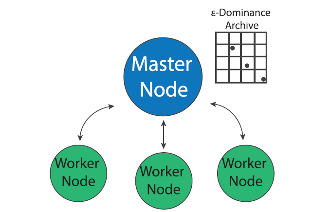
Master-worker Borg
Figure 1: The Master Worker implementation of the Borg MOEA. (Figure from Salazar et al., 2017)
MOEA search is “embarrassingly parallel” since the evaluation of each candidate solution can be done independently of other solutions in a population (Cantu-Paz, 2000). The master-worker paradigm of MOEA parallelization, which has been in use since early days of evolutionary algorithms (Grefenstette, 1981), utilizes this property to parallelize search. In the master worker implementation of Borg in a system of P processors, one processor is designated as the “master” and P-1 processors are designated as “workers”. The master processor runs the serial version of the Borg MOEA but instead of evaluating candidate solution, it sends the decision variables to an available worker which evaluates the problem with the given decision variables and sends the evaluated objectives and constraints back to the master processor.
Most MOEAs are generational, meaning that they evolve a population in distinct stages known as generations (Coello Coello et al., 2007). During one generation, the algorithm evolves the population to produce offspring, evaluates the offspring and then adds them back into the population (methods for replacement of existing members vary according to the MOEA). When run in parallel, generational MOEAs must evaluate every solution in a generation before beginning evaluation of the next generation. Since these algorithms need to synchronize function evaluations within a generation, they are known as synchronous MOEAs. Figure 2, from Hadka et al., (2013b), shows a timeline of events for a typical synchronous MOEA. Algorithmic time (TA) represents the time it takes the master processor to perform the serial components of the MOEA. Function evaluation time (TF) is the the time it takes to evaluate one offspring and communication time (TC) is the time it takes to pass information to and from worker nodes. The vertical dotted lines in Figure 2 represent the start of each new generation. Note the periods of idle time that each worker node experiences while it waits for the algorithm to perform serial calculations and communicate. If the function evaluation time is not constant across all nodes, this idle time can increase as the algorithm waits for all solutions in the generation to be evaluated.
Figure 2: Diagram of a synchronous MOEA. Tc represents communication time, TA represents algorithmic time and TF represents function evaluation time. (Figure from Hadka et al., 2013b).
The Borg MOEA is not generational but rather a steady-state algorithm. As soon as an offspring is evaluated by a worker and returned to the master, the next offspring is immediately sent to the worker for evaluation. This is accomplished through use of a queue, for details of Borg’s queuing process see Hadka and Reed, (2015). Since Borg is not bound by the need to synchronize function evaluations within generations, it is known as an asynchronous MOEA. Figure 3, from Hadka et al., (2013b), shows a timeline of a events for a typical Borg run. Note that the idle time has been shifted from the workers to the master processor. When the algorithm is parallelized across a large number of cores, the decreased idle time for each worker has the potential to greatly increase the algorithm’s parallel efficiency. Furthermore, if function evaluation times are heterogeneous, the algorithm is not bottlenecked by slow evaluations as generational MOEAs are.
Figure 3: Diagram of an asynchronous MOEA. Tc represents communication time, TA represents algorithmic time and TF represents function evaluation time. (Figure from Hadka et al., 2013b).
While the master-worker implementation of the Borg MOEA is an efficient means of parallelizing function evaluations, the search algorithm’s search dynamics remain the same as the serial version and as the number of processors increases, the search may suffer from communication bottlenecks. The multi-master implementation of the Borg MOEA uses parallelization to not only improve the efficiency of function evaluations but also improve the quality of the multi-objective search.
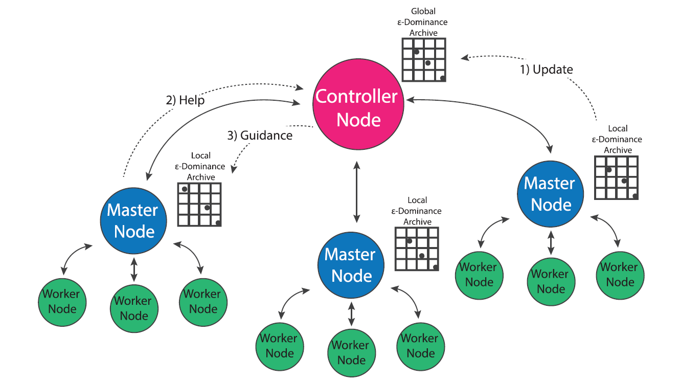
Multi-Master Borg
Figure 4: The multi-master implementation of the Borg MOEA. (Figure from Salazar et al., 2017)
In population genetics, the “island model” considers distinct populations that evolve independently but periodically interbreed via migration events that occur over the course of the evolutionary process (Cantu-Paz, 2000). Two independent populations may evolve very different survival strategies based on the conditions of their environment (i.e. locally optimal strategies). Offspring of migration events that combine two distinct populations have the potential to combine the strengths developed by both groups. This concept has been utilized in the development of multi-population evolutionary algorithms (also called multi-deme algorithms in literature) that evolve multiple populations in parallel and occasionally exchange individuals via migration events (Cantu-Paz, 2000). Since MOEAs are inherently stochastic algorithms that are influenced by their initial populations, evolving multiple populations in parallel has the potential to improve the efficiency, quality and reliability of search results (Hadka and Reed, 2015; Salazar et al., 2017). Hybrid parallelization schemes that utilize multiple versions of master-worker MOEAs may further improve the efficiency of multi-population search (Cantu-Paz, 2000). However, the use of a multi-population MOEA requires the specification of parameters such as the number of islands, number of processors per island and migration policy that whose ideal values are not apparent prior to search.
The multi-master implementation of the Borg MOEA is a hybrid parallelization of the MOEA that seeks to generalize the algorithm’s ease of use and auto-adaptivity while maximizing its parallel efficiency on HPC architectures (Hadka and Reed, 2015). In the multi-master implementation, multiple versions of the master-worker MOEA are run in parallel, and an additional processor is designated as the “controller”. Each master maintains its own epsilon dominance archive and operator probabilities, but regulatory updates its progress with the controller which maintains a global epsilon dominance archive and global operator probabilities. If a master processor detects search stagnation that it is not able to overcome via Borg’s automatic restarts, it requests guidance from the controller node which seeds the master with the contents of the global epsilon dominance archive and operator probabilities. This guidance system insures that migration events between populations only occurs when one population is struggling and only consists of globally non-dominated solutions. Borg’s adaptive population sizing ensures the injected population is resized appropriately given the global search state.
The use of multiple-populations presents an opportunity for the algorithm to improve the sampling of the initial population. The serial and master-worker implementations of Borg generate the initial population by sampling decision variables uniformly at random from their bounds, which has the potential to introduce random bias into the initial search population (Hadka and Reed, 2015). In the multi-master implementation of Borg, the controller node first generates a latin hypercube sample of the decision variables, then distributes these samples between masters uniformly at random. This initial sampling strategy adds some additional overhead to the algorithm’s startup, but ensures that globally the algorithm starts with a well-distributed, diverse set of initial solutions which can help avoid preconvergence (Hadka and Reed, 2015).
Conclusion
This post has reviewed two parallel implementations of the Borg MOEA. The next post in this series will discuss how to evaluate parallel performance of a MOEA in terms of search efficiency, quality and reliability. I’ll review recent literature comparing performance of master-worker and multi-master Borg and discuss how to determine which implementation is appropriate for a given problem.
References
Cantu-Paz, E. (2000). Efficient and accurate parallel genetic algorithms (Vol. 1). Springer Science & Business Media.
Hadka, D., Reed, P. M., & Simpson, T. W. (2012). Diagnostic assessment of the Borg MOEA for many-objective product family design problems. 2012 IEEE Congress on Evolutionary Computation (pp. 1-10). IEEE.
Hadka, D., & Reed, P. (2013a). Borg: An auto-adaptive many-objective evolutionary computing framework. Evolutionary computation, 21(2), 231-259.
Hadka, D., Madduri, K., & Reed, P. (2013b). Scalability analysis of the asynchronous, master-slave borg multiobjective evolutionary algorithm. In 2013 IEEE International Symposium on Parallel & Distributed Processing, Workshops and Phd Forum (pp. 425-434). IEEE.
Hadka, D., & Reed, P. (2015). Large-scale parallelization of the Borg multiobjective evolutionary algorithm to enhance the management of complex environmental systems. Environmental Modelling & Software, 69, 353-369.
Salazar, J. Z., Reed, P. M., Quinn, J. D., Giuliani, M., & Castelletti, A. (2017). Balancing exploration, uncertainty and computational demands in many objective reservoir optimization. Advances in water resources, 109, 196-210.


 that maximize our economic benefits, but also increase P in the lake. If we increase P too much, and we cross a tipping point of no return. Even though this is vital to the design of the best possible management policy, this value of P is hard to know exactly because:
 . This strategy necessitates 100 decision variables.
  , to a decision
  . This strategy necessitates 6 decision variables.