
In this blog post, I am going to go over a machine learning method that is used to visualize high dimensional datasets. The method is called T-distributed Stochastic Neighbor Embedding, or T-SNE for short. The method was developed by the Google Brain Team (van der Maaten & Hinton, 2008). In this blog post, I describe T-SNE and provide a simple example in R.
Two weeks ago, Dave introduced a few useful dimensionality reduction methods to visualize the Pareto front. Last week, Rohini’s blog post provided some very useful information about self-organizing maps. I guess this blog post will officially make this a series of posts on dimensionality reduction and the visualization of high dimensional datasets. If you haven’t already read these two super informative blog posts, I highly recommend you take a look at them.
T-SNE is an extension of the Local Linear Embedding technique, and it uses an interesting method to maintain the local relationships and similarities that exist in the original high-dimensional datasets when transferring that into a 2-D plane. As van der Maaten and Hinton (2008) argue, other dimensionality reduction techniques (e.g., PCA) usually focus on macro distances in the datasets, which might lead to overlooking short-distance relationships. However, T-SNE is able to capture both local and macro distances in the data structure. Therefore, it can give more reasonable results when you are dealing with non-linear high dimensional datasets.
T-SNE uses the following formula, which basically creates a Gaussian distribution over each data point and computes the density of all other data points in respect to the distribution around that point. The denominator of the equation normalizes the nominator.

In this equation, xi
is the reference point, and xj
is its neighboring points. Also, Sigma is the bandwidth that returns the same perplexity for each point. Perplexity is a measure of uncertainty that has a direct relationship with entropy. For more information about it, you can read this Wikipedia page. Basically, perplexity is a hyper parameter of T-SNE, and the final outcome might be very sensitive to its value. Also, in this equation, pij is the probability of the similarity of each two points in the high dimensional space. Basically, if two points are close to each other, pij will be high. If they are far from each other, the probability of similarity is low.
To make the low dimensional map consistent with its original high dimensional dataset, T-SNE also calculates a similar point-to-point probability of similarity in the 2D map.

Basically, T-SNE moves the point on the 2D plain to find the locations that minimize the Kullback-Leibler divergence metric between the Pi distributions of the original data and the Qi distributions of the 2D plane.

As you probably noticed, in the low dimensional space, T-SNE uses the Student T-distribution curve (with one degree of freedom). The reason is that Student T (compared to Gaussian) is a fat-tailed distribution. This allows the T-SNE to separate dissimilar points with higher margins, which makes the map easier to interpret.
T-SNE Example in R
Here, I provide a simple R code example that demonstrates how you can use T-SNE to visualize high dimensional datasets. This example only has four dimensions, so it doesn’t really represent a high dimensional problem. As such, keep in mind that T-SNE shows its true capabilities when there are tens or even hundreds of dimensions.
First, you need to install “tsne” library and load it.
install.packages("Rtsne”)
library(Rtsne)

# We also need to load ggplot2 and ggpubr libraries

library(ggplot2)
library(ggpubr)
In this example, I use R’s famous “iris” data set. Here is how you can activate it.
# Load the iris dataset
data(iris)
Now you can use the following scrip to visualize the data using T-SNE.
# Calculating T-SNE's Y values which indicate where each cluster is on the 2-D map
y_tsne <- Rtsne(iris[,1:4],pca=FALSE,perplexity=30, max_iter=1000, check_duplicates = FALSE) # Run TSNE

# Create a data frame using IRIS values and the T-SNE values
df_to_gg<-as.data.frame(cbind(iris$Species, as.data.frame(y_tsne$Y)))

# Specify column names
names(df_to_gg)<-c("Species", "Y.1", "Y.2")

# Show the objects in the 2D T-SNE representation
ggplot(df_to_gg, aes(x=Y.1, y=Y.2, color=Species))+geom_point()+theme_minimal() +
  labs(title=paste("T-SNE Visualization- Perplexity Number = 30" )) +
  scale_color_manual(values = c("darkblue", "orange", "pink3"))
Here is the 2-D map that our code generates

Although T-SNE is a powerful method and has become quite popular in recent years, it might have some pitfalls. This blog post discusses some of these issues, including the sensitivity of the final map to perplexity hyperparameters or the fact that it can be tricky to interpret T-SNE maps because they might not represent the actual relationships between different clusters.
To explore the impacts of the perplexity hyperparameter on the final clusters, I use the following code to create T-SNE maps for different perplexity values.
# Here are the perplexity values that I am taking into account in my T-SNE analysis
perplexity_number_values<-c(2,5,10, 15, 30, 40)

# Initializing a plot list object
plot_list = list()

# This loop explores the effect of perplexity values on the T-SNE results
for (i_prp in 1:6){

  # I am setting a seed to makes sure that my results for different perplexities are not sensitive to any random factors
  set.seed(10)

  # Perplexity number
  perplexity_number<- perplexity_number_values[i_prp]

  # Calculating T-SNE's Y values which indicate where each cluster is on the 2-D map
  y_tsne <- Rtsne(iris[,1:4],pca=FALSE,perplexity=perplexity_number, max_iter=1000, check_duplicates = FALSE) # Run TSNE

  # Create a data frame using IRIS values and the T-SNE values
  df_to_gg<-as.data.frame(cbind(iris$Species, as.data.frame(y_tsne$Y)))

  # Specify Column names
  names(df_to_gg)<-c("Species", "Y.1", "Y.2")

  # Show the objects in the 2D T-SNE representation
  plt<-ggplot(df_to_gg, aes(x=Y.1, y=Y.2, color=Species))+geom_point()+theme_minimal() +
    labs(title=paste("T-SNE Visualization- Perplexity Number = ", perplexity_number )) +
    scale_color_manual(values = c("darkblue", "orange", "pink3"))

  # Save figure in the plot list object
  plot_list[[i_prp]]=plt


}
# Combine all the plot objects
plt_combined<-ggarrange(plotlist = plot_list[1:6], ncol = 2, nrow = 3, common.legend = T)
Here is the final result that underlines the high sensitivity of the location of our clusters on 2-D map to the choice of the perplexity values. There are other hyperparameters that can be tried as well, for example, the maximum number of iterations might change the final output in some cases.

There are many other very good tutorials on T-SNE, such as here and here. Also, for example, this tutorial provides a nice and easy-to-follow Python code for T-SNE. Finally, there are some great YouTube videos that clearly explain the logic behind T-SNE and its algorithm (for example, here and here).


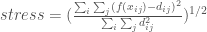
 is the euclidean distance between points
  and
and  in the full dimensional space. (Note: extensions of MDS have been developed that substitute this distance for a weakly monotonic transformation of the original points)
 is the euclidean distance between points


 : is the distance between points x_i and x_j in the full objective space
 : is the distance between points x_i and x_j in the lower dimensional space


