In this post, I will describe the motivation for and implementation of a nonstationary stochastic watershed modeling (SWM) approach that we developed in the Steinschneider group during the course of my PhD. This work is in final revision and should be published in the next month or so. This post will attempt to distill key components of the model and their motivation, saving the full methodological development for those who’d like to read the forthcoming paper.
SWMs vs SSM/SSG
Before diving into the construction of the model, some preliminaries are necessary. First, what are SWMs, what do they do, and why use them? SWMs are a framework that combine deterministic, process-based watershed models (think HYMOD, SAC-SMA, etc.; we’ll refer to these as DWMs from here forward) with a stochastic model that capture their uncertainty. The stochastic part of this framework can be used to generate ensembles of SWM simulations that both represent the hydrologic uncertainty and are less biased estimators of the streamflow observations (Vogel, 2017).

Figure 1: SWM conceptual diagram
SWMs were developed to address challenges to earlier stochastic streamflow modeling/generation techniques (SSM/SSG; see for instance Trevor’s post on the Thomas-Fiering SSG; Julie’s post and Lillian’s post on other SSG techniques), the most important of which (arguably) being the question of how to formulate them under non-stationarity. Since SSMs are statistical models fitted directly to historical data, any attempt to implement them in a non-stationary setting requires strong assumptions about what the streamflow response might look like under an alternate forcing scenario. This is not to say that such an approach is not useful or valid for exploratory analyses (for instance Rohini’s post on synthetic streamflow generation to explore extreme droughts). SWMs attempt to address this issue of non-stationarity by using DWMs in their stochastic formulation, which lend some ‘physics-based’ cred to their response under alternate meteorological forcings.
Construction of an SWM
Over the years, there have been many SWM or SWM-esque approaches devised, ranging from simple autoregressive models to complex Bayesian approaches. In this work, we focus on a relatively straightforward SWM approach that models the hydrologic predictive uncertainty directly and simply adds random samples of it to the DWM simulations. The assumption here being that predictive uncertainty is an integrator of all traditional component modeling uncertainties (input, parameter, model/structural), so adding it back in can inject all these uncertainties into the SWM simulations at once (Shabestanipour et al., 2023).

Figure 2: Uncertainty components
By this straightforward approach, the fitting and parameter estimation of the DWM is accomplished first (and separately) via ‘standard’ fitting procedures; for instance, parameter optimization to minimize Nash-Sutcliffe Efficiency (NSE). Subsequently, we develop our stochastic part of the model on the predictive uncertainty that remains, which in this case, is defined simply by subtracting the target observations from the DWM predictions. This distribution of differenced errors is the ‘predictive uncertainty distribution’ or ‘predictive errors’ that form the target of our stochastic model.
Challenges in modeling predictive uncertainty
Easy, right? Not so fast. There is a rather dense and somewhat unpalatable literature (except for the masochists out there) on the subject of hydrologic uncertainty that details the challenges in modeling these sorts of errors. Suffice it to say that they aren’t well behaved. Any model we devise for these errors must be able to manage these bad behaviors.
So, what if we decide that we want to try to use this SWM thing for planning under future climates? Certainly the DWM part can hack it. We all know that lumped, conceptual DWMs are top-notch predictors of natural streamflow… At the least, they can produce physically plausible simulations under alternate forcings (we think). What of the hydrologic predictive uncertainty then? Is it fair or sensible to presume that some model we constructed to emulate historical uncertainty is appropriate for future hydrologic scenarios with drastically different forcings? My line of rhetorical questioning should clue you in on my feelings on the subject. YES!, of course. ‘Stationarity is immortal!’ (Montanari & Koutsoyiannis, 2014).
Towards a hybrid, state-variable dependent SWM
No, actually, there are a number of good reasons why this statement might not hold for hydrologic predictive uncertainty under non-stationarity. You can read the paper for the laundry list. In short, hydrologic predictive uncertainty of a DWM is largely a reflection of its structural misrepresentation of the true process. Thus, the historical predictive uncertainty that we fit our model to is a reflection of that structural uncertainty propagated through historical model states under historical, ‘stationary’ forcings. If we fundamentally alter those forcings, we should expect to see model states that do not exist under historical conditions. The predictive errors that result from these fundamentally new model states are thus likely to not fall neatly into the box carved out by the historical scenarios.

Figure 3: Structural uncertainty
To bring this back to the proposition for a nonstationary SWM approach. The intrinsic link between model structure and its predictive uncertainty raises an interesting prospect. Could there be a way to leverage a DWM’s structure to understand its predictive uncertainty? Well, I hope so, because that’s the premise of this work! What I’ll describe in the ensuing sections is the implementation of a hybrid, state-variable dependent SWM approach. ‘Hybrid’ because it couples both machine learning (ML) and traditional statistical techniques. ‘State-variable dependent’ because it uses the timeseries of model states (described later) as the means to infer the hydrologic predictive uncertainty. I’ll refer to this as the ‘hybrid SWM’ for brevity.
Implementation of the hybrid SWM
So, with backstory in hand, let’s talk details. The remainder of this post will describe the implementation of this hybrid SWM. This high-level discussion of the approach supports a practical training exercise I put together for the Steinschneider group at the following public GitHub repo: https://github.com/zpb4/hybrid-SWM_training. This training also introduces a standard implementation of a GRRIEN repository (see Rohini’s post). Details of implementing the code are contained in the ‘README.md’ and ‘training_exercise.md’ files in the repository. My intent in this post is to describe the model implementation at a conceptual level.
Model-as-truth experimental design
First, in order to address the problem of non-stationary hydrologic predictive uncertainty, we need an experimental design that can produce it. There is a very real challenge here of not having observational data from significantly altered climates to compare our hydrologic model against. We address this problem by using a ‘model-as-truth’ experimental design, where we fit one hydrologic model (‘truth’ model) to observations, and a second hydrologic model (‘process’ model) to the first truth model. The truth model becomes a proxy for the true, target flow of the SWM modeling procedure, while the process model serves as our proposed model, or hypothesis, about that true process. Under this design, we can force both models with any plausible forcing scenario to try to understand how the predictive uncertainty between ‘truth’ and ‘process’ models might change.

Figure 4: Conceptual diagram of ‘model-as-truth’ experimental design
For the actual work, we consider a very simple non-stationary scenario where we implement a 4oC temperature shift to the temperature forcing data, which we refer to as the ‘Test+4C’ scenario. We choose this simple approach to confine non-stationarity to a high-confidence result of anthropogenic climate change, namely, thermodynamic warming. We compare this Test+4C scenario to a ‘Test’ scenario, which is the same out-of-sample temporal period (WY2005-2018) of meteorological inputs under historical values. SAC-SMA and HYMOD are the truth model and process model for this experiment, respectively. Other models could have been chosen. We chose these because they are conceptually similar and commonly used.

Figure 5: Errors between truth and process models in 5 wettest years of Test/Test+4C scenarios.
Hybrid SWM construction
The core feature of the hybrid SWM is a model for the predictive errors (truth model – process model) that uses the hydrologic model state-variables as predictors. We implement this model in two steps that have differing objectives, but use the same state-variable predictor information. An implicit assumption in using state-variable dependencies in both steps is that these dependencies can exist in both stages. In other words, we do not expect the error-correction step to produce independent and identically distributed residuals. We call the first step an ‘error-correction model’ and the second step a ‘dynamic residual model’. Since we use HYMOD as our process model, we use its state-variables (Table 1) as the predictors for these two steps.
Table 1: HYMOD state variables
| Short Name | Long Name | Description |
| sim | Simulation | HYMOD predicted streamflow in mm |
| runoff | Runoff | Upper reservoir flow of HYMOD in mm |
| baseflow | Baseflow | Lower reservoir flow of HYMOD in mm |
| precip | Precipitation | Basin averaged precipitation in mm |
| tavg | Average temperature | Basin averaged temperature in oC |
| et | Evapotranspiration | Modeled evapotranspiration (Hamon approach) in mm |
| upr_sm | Upper soil moisture | Basin averaged soil moisture content (mm) in upper reservoir |
| lwr_sm | Lower soil moisture | Basin averaged soil moisture (mm) in lower reservoir |
| swe | Snow water equivalent | Basin averaged snow water equivalent simulated by degree day snow module (mm) |
Hybrid SWM: Error correction
The error-correction model is simply a predictive model between the hydrologic model (HYMOD) state-variables and the raw predictive errors. The error-correction model also uses lag-1 to 3 errors as covariates to account for autocorrelation. The objective of this step is to infer state-dependent biases in the errors, which are the result of the predictive errors subsuming the structural deficiencies of the hydrologic model. This ‘deterministic’ behavior in the predictive errors can also be conceived as the ‘predictive errors doing what the model should be doing’ (Vogel, 2017). Once this error-correction model is fit to its training data, it can be implemented against any new timeseries of state-variables to predict and debias the errors. We use a Random Forest (RF) algorithm for this step because they are robust to overfitting, even with limited training data. This is certainly the case here, as we consider only individual basins and a ~15 year training period (WY1989-2004). Moreover, we partition the training period into a calibration and validation subset and fit the RF error-correction model only to the calibration data (WY1989-1998), reducing available RF algorithm training data to 9 years.
Hybrid SWM: Dynamic residual model
The dynamic residual model (DRM) is fit to the residuals of the error correction result in the validation subset. We predict the hydrologic model errors for the validation subset from the fitted RF model and subtract them from the empirical errors to yield the residual timeseries. By fitting the DRM to this separate validation subset (which the RF error-correction model has not seen), we ensure that the residuals adequately represent the out-of-sample uncertainty of the error-correction model.
A full mathematical treatment of the DRM is outside the scope of this post. In high-level terms, the DRM is built around a flexible distributional form particularly suited to hydrologic errors, called the skew exponential power (SEP) distribution. This distribution has 4 parameters (mean: mu, stdev: sigma, kurtosis: beta, skew: xi) and we assume a mean of zero (due to error-correction debiasing), while setting the other 3 parameters as time-varying predictands of the DRM model (i.e. sigmat, betat, xit). We also include a lag-1 autocorrelation term (phit) to account for any leftover autocorrelation from the error-correction procedure. We formulate a linear model for each of these parameters with the state-variables as predictors. These linear models are embedded in a log-likelihood function that is maximized (i.e. MLE) against the residuals to yield the optimal set of coefficients for each of the linear models.
With a fitted model, the generation of a new residual at each timestep t is therefore a random draw from the SEP with parameters (mu=0, sigmat, betat, xit) modified by the residual at t-1 (epsilont-1) via the lag-1 coefficient (phit).

Figure 6: Conceptual diagram of hybrid SWM construction.
Hybrid SWM: Simulation
The DRM is the core uncertainty modeling component of the hybrid SWM. Given a timeseries of state-variables from the hydrologic model for any scenario, the DRM simulation is implemented first, as described in the previous section. Subsequently, the error-correction model is implemented in ‘predict’ mode with the timeseries of random residuals from the DRM step. Because the error-correction model includes lag-1:3 terms, it must be implemented sequentially using errors generated at the previous 3 timesteps. The conclusion of these two simulation steps yields a timeseries of randomly generated, state-variable dependent errors that can be added to the hydrologic model simulation to produce a single SWM simulations. Repeating this procedure many times will produce an ensemble of SWM simulations.
Final thoughts
Hopefully this discussion of the hybrid SWM approach has given you some appreciation for the nuanced differences between SWMs and SSM/SSGs, the challenges in constructing an adequate uncertainty model for an SWM, and the novel approach developed here in utilizing state-variable information to infer properties of the predictive uncertainty. The hybrid SWM approach shows a lot of potential for extracting key attributes of the predictive errors, even under unprecedented forcing scenarios. It decouples the task of inferring predictive uncertainty from features of the data like temporal seasonality (e.g. day of year) that may be poor predictors under climate change. When linked with stochastic weather generation (see Rohini’s post and Nasser’s post), SWMs can be part of a powerful bottom-up framework to understand the implications of climate change on water resources systems. Keep an eye out for the forthcoming paper and check out the training noted above on implementation of the model.
References:
Brodeur, Z., Wi, S., Shabestanipour, G., Lamontagne, J., & Steinschneider, S. (2024). A Hybrid, Non‐Stationary Stochastic Watershed Model (SWM) for Uncertain Hydrologic Simulations Under Climate Change. Water Resources Research, 60(5), e2023WR035042. https://doi.org/10.1029/2023WR035042
Montanari, A., & Koutsoyiannis, D. (2014). Modeling and mitigating natural hazards: Stationarity is immortal! Water Resources Research, 50, 9748–9756. https://doi.org/10.1002/ 2014WR016092
Shabestanipour, G., Brodeur, Z., Farmer, W. H., Steinschneider, S., Vogel, R. M., & Lamontagne, J. R. (2023). Stochastic Watershed Model Ensembles for Long-Range Planning : Verification and Validation. Water Resources Research, 59. https://doi.org/10.1029/2022WR032201
Vogel, R. M. (2017). Stochastic watershed models for hydrologic risk management. Water Security, 1, 28–35. https://doi.org/10.1016/j.wasec.2017.06.001


 is the frequency at which data for a time series is collected. It is equivalent to the inverse of the time difference between two consecutive data points,
  . It has units of Hertz (
 ). Higher values of
  is equal to
  . As a rule of thumb, you should sample your time series at a frequency
  , as sampling at a higher frequencies will result in the time series signals overlapping. This is a phenomenon called aliasing, where t
 . The value of


 .
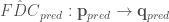
. donor locations, nearest to the target point.
 ) from the donor site(s) to the target.
 , and set of observed streamflow timeseries
  at
at ![Q_{obs} = [\mathbf{q_1}, \mathbf{q_2}, ..., \mathbf{q_k}]](https://s0.wp.com/latex.php?latex=Q_%7Bobs%7D+%3D+%5B%5Cmathbf%7Bq_1%7D%2C+%5Cmathbf%7Bq_2%7D%2C+...%2C+%5Cmathbf%7Bq_k%7D%5D&bg=ffffff&fg=444444&s=0&c=20201002)
![FDC = [FDC_1, FDC_2, ..., FDC_k]](https://s0.wp.com/latex.php?latex=FDC+%3D+%5BFDC_1%2C+FDC_2%2C+...%2C+FDC_k%5D&bg=ffffff&fg=444444&s=0&c=20201002)
 , to non-exceedance probability timeseries,
  .
.

 where
where  is the distance from the observation
  to the ungauged location, and
  .
.

 gages using the
 .
.


 .
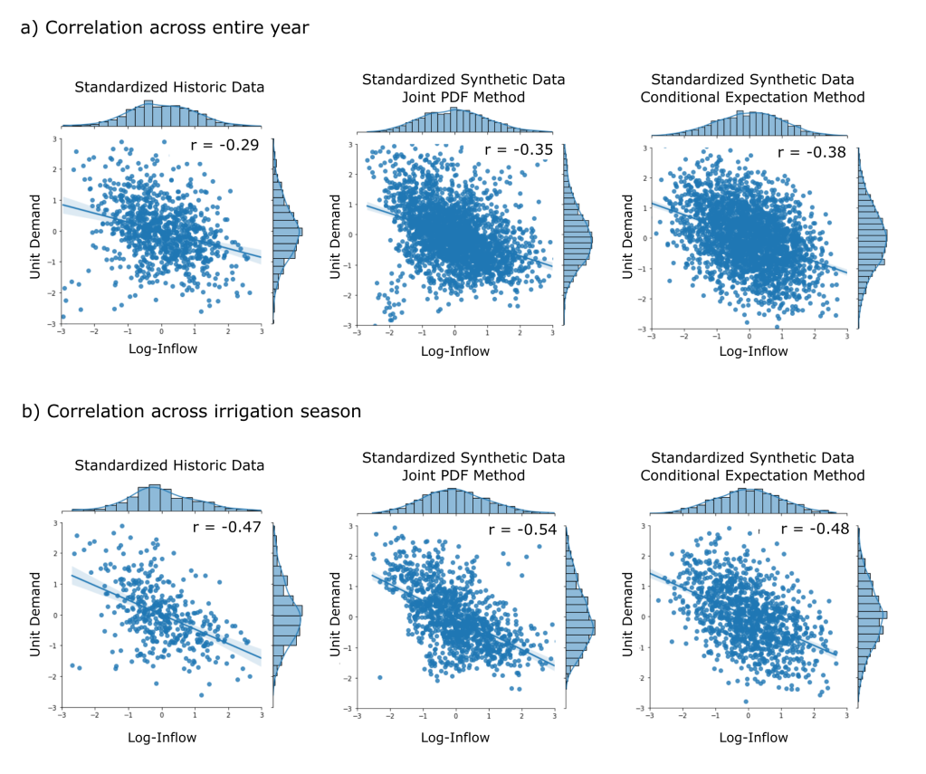
. , the historic weekly demand mean,
  , and standard deviation,
  , are applied to convert to a synthetic unit demand,
  .
.
![E[D|Q_{s_i}]](https://s0.wp.com/latex.php?latex=E%5BD%7CQ_%7Bs_i%7D%5D&bg=ffffff&fg=444444&s=0&c=20201002) , given a specific synthetic streamflow,
, given a specific synthetic streamflow,  , is:
, is:![E[D|Q_{s_i}] = E[D] + \rho \frac{\sigma_Q}{\sigma_D} (Q_i - \mu_Q)](https://s0.wp.com/latex.php?latex=E%5BD%7CQ_%7Bs_i%7D%5D+%3D+E%5BD%5D+%2B+%5Crho+%5Cfrac%7B%5Csigma_Q%7D%7B%5Csigma_D%7D+%28Q_i+-+%5Cmu_Q%29+&bg=ffffff&fg=444444&s=0&c=20201002)
 is the Pearson correlation coefficient of the weekly standardized historic inflow and demand data. Since the data is standardized, (
 ![E[d] = 0](https://s0.wp.com/latex.php?latex=E%5Bd%5D+%3D+0&bg=ffffff&fg=444444&s=0&c=20201002) and
and  ) the above form of the equation simplifies to:
![E[d|Z_{s_i}] = \rho (Z_{s_i})](https://s0.wp.com/latex.php?latex=E%5Bd%7CZ_%7Bs_i%7D%5D+%3D+%5Crho+%28Z_%7Bs_i%7D%29&bg=ffffff&fg=444444&s=0&c=20201002)
 is standard synthetic demand and
  is the standard synthetic streamflow for the
  week. The variance of the standard demand conditional upon the standard streamflow is then:
 , is then randomly sampled from a normal distribution centered around the conditional expectation with standard deviation equal to the square root of the conditional variance.
![d_{s_i} \approx N(E[d|Z_{s_i}], Var(d|Z_{s_i})^{1/2})](https://s0.wp.com/latex.php?latex=d_%7Bs_i%7D+%5Capprox+N%28E%5Bd%7CZ_%7Bs_i%7D%5D%2C+Var%28d%7CZ_%7Bs_i%7D%29%5E%7B1%2F2%7D%29&bg=ffffff&fg=444444&s=0&c=20201002)