A Python Implementation of grouped Radial Convergence Plots to visualize Sobol Sensitivity Analysis results

TDLR; A Python implementation of grouped radial convergence plots based on code from the Rhodium library. This script is will be added to Antonia’s repository for Radial Convergence Plots.

Radial convergence plots are a useful tool for visualizing results of Sobol Sensitivities analyses. These plots array the model parameters in a circle and plot the first order, total order and second order Sobol sensitivity indices for each parameter. The first order sensitivity is shown as the size of a closed circle, the total order as the size of a larger open circle and the second order as the thickness of a line connecting two parameters.

In May, Antonia created a new Python library to generate Radial Convergence plots in Python, her post can be found here and the Github repository here. I’ve been working with the Rhodium Library a lot recently and found that it contained a Radial Convergence Plotting function with the ability to plot grouped output, a functionality that is not present in Antonia’s repository. This function produces the same plots as Calvin’s R package. Adding a grouping functionality allows the user to color code the visualization to improve the interpretability of the results. In the code below I’ve adapted the Rhodium function to be a standalone Python code that can create visualizations from raw output of the SALib library. When used on a policy for the Lake Problem, the code generates the following plot shown in Figure 1.

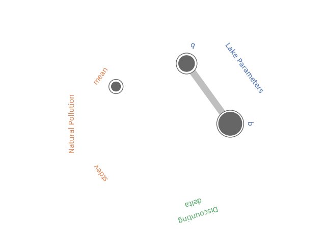
Figure 1: Example Radial Convergence Plot for the Lake Problem reliability objective. Each of the points on the plot represents a sampled uncertain parameter in the model. The size of the filled circle represents the first order Sobol Sensitivity Index, the size of the open circle represents the total order Sobol Sensitivty Index and the thickness of lines between points represents the second order Sobol Sensitivity Index.

import numpy as np
import itertools
import matplotlib.pyplot as plt
import seaborn as sns
import math
sns.set_style('whitegrid', {'axes_linewidth': 0, 'axes.edgecolor': 'white'})

def is_significant(value, confidence_interval, threshold="conf"):
    if threshold == "conf":
        return value - abs(confidence_interval) > 0
    else:
        return value - abs(float(threshold)) > 0

def grouped_radial(SAresults, parameters, radSc=2.0, scaling=1, widthSc=0.5, STthick=1, varNameMult=1.3, colors=None, groups=None, gpNameMult=1.5, threshold="conf"):
    # Derived from https://github.com/calvinwhealton/SensitivityAnalysisPlots
    fig, ax = plt.subplots(1, 1)
    color_map = {}
    
    # initialize parameters and colors
    if groups is None:
        
        if colors is None:
            colors = ["k"]
        
        for i, parameter in enumerate(parameters):
            color_map[parameter] = colors[i % len(colors)]
    else:        
        if colors is None:
            colors = sns.color_palette("deep", max(3, len(groups)))
        
        for i, key in enumerate(groups.keys()):
            #parameters.extend(groups[key])
            
            for parameter in groups[key]:
                color_map[parameter] = colors[i % len(colors)]
    
    n = len(parameters)
    angles = radSc*math.pi*np.arange(0, n)/n
    x = radSc*np.cos(angles)
    y = radSc*np.sin(angles)
    
    # plot second-order indices
    for i, j in itertools.combinations(range(n), 2):
        #key1 = parameters[i]
        #key2 = parameters[j]
        
        if is_significant(SAresults["S2"][i][j], SAresults["S2_conf"][i][j], threshold):
            angle = math.atan((y[j]-y[i])/(x[j]-x[i]))
                
            if y[j]-y[i] < 0:
                angle += math.pi
                
            line_hw = scaling*(max(0, SAresults["S2"][i][j])**widthSc)/2
                
            coords = np.empty((4, 2))
            coords[0, 0] = x[i] - line_hw*math.sin(angle)
            coords[1, 0] = x[i] + line_hw*math.sin(angle)
            coords[2, 0] = x[j] + line_hw*math.sin(angle)
            coords[3, 0] = x[j] - line_hw*math.sin(angle)
            coords[0, 1] = y[i] + line_hw*math.cos(angle)
            coords[1, 1] = y[i] - line_hw*math.cos(angle)
            coords[2, 1] = y[j] - line_hw*math.cos(angle)
            coords[3, 1] = y[j] + line_hw*math.cos(angle)

            ax.add_artist(plt.Polygon(coords, color="0.75"))
        
    # plot total order indices
    for i, key in enumerate(parameters):
        if is_significant(SAresults["ST"][i], SAresults["ST_conf"][i], threshold):
            ax.add_artist(plt.Circle((x[i], y[i]), scaling*(SAresults["ST"][i]**widthSc)/2, color='w'))
            ax.add_artist(plt.Circle((x[i], y[i]), scaling*(SAresults["ST"][i]**widthSc)/2, lw=STthick, color='0.4', fill=False))
    
    # plot first-order indices
    for i, key in enumerate(parameters):
        if is_significant(SAresults["S1"][i], SAresults["S1_conf"][i], threshold):
            ax.add_artist(plt.Circle((x[i], y[i]), scaling*(SAresults["S1"][i]**widthSc)/2, color='0.4'))
           
    # add labels
    for i, key in enumerate(parameters):                
        ax.text(varNameMult*x[i], varNameMult*y[i], key, ha='center', va='center',
                rotation=angles[i]*360/(2*math.pi) - 90,
                color=color_map[key])
        
    if groups is not None:
        for i, group in enumerate(groups.keys()):
            print(group)
            group_angle = np.mean([angles[j] for j in range(n) if parameters[j] in groups[group]])
            
            ax.text(gpNameMult*radSc*math.cos(group_angle), gpNameMult*radSc*math.sin(group_angle), group, ha='center', va='center',
                rotation=group_angle*360/(2*math.pi) - 90,
                color=colors[i % len(colors)])
            
    ax.set_facecolor('white')
    ax.set_xticks([])
    ax.set_yticks([])
    plt.axis('equal')
    plt.axis([-2*radSc, 2*radSc, -2*radSc, 2*radSc])
    #plt.show()

    
    return fig

The code below implements this function using the SALib to conduct a Sobol Sensitivity Analysis on the Lake Problem to produce Figure 1.

import numpy as np
import itertools
import matplotlib.pyplot as plt
import math
from SALib.sample import saltelli
from SALib.analyze import sobol
from lake_problem import lake_problem
from grouped_radial import grouped_radial

# Define the problem for SALib
problem = {
	'num_vars': 5,
	'names': ['b', 'q', 'mean', 'stdev', 'delta'],
	'bounds': [[0.1, 0.45],
			   [2.0, 4.5],
			   [0.01, 0.05],
			   [0.001, 0.005],
			   [0.93, 0.99]]
}

# generate Sobol samples
param_samples = saltelli.sample(problem, 1000)

# extract each parameter for input into the lake problem
b_samples = param_samples[:,0]
q_samples = param_samples[:,1]
mean_samples = param_samples[:,2]
stdev_samples = param_samples[:,3]
delta_samples = param_samples[:,4]


# run samples through the lake problem using a constant policy of .02 emissions
pollution_limit = np.ones(100)*0.02

# initialize arrays to store responses
max_P = np.zeros(len(param_samples))
utility = np.zeros(len(param_samples))
inertia = np.zeros(len(param_samples))
reliability = np.zeros(len(param_samples))

# run model across Sobol samples
for i in range(0, len(param_samples)):
	print("Running sample " + str(i) + ' of ' + str(len(param_samples)))
	max_P[i], utility[i], inertia[i], reliability[i] = lake_problem(pollution_limit,
																	b=b_samples[i],
																	q=q_samples[i],
																	mean=mean_samples[i],
																	stdev=stdev_samples[i],
																	delta=delta_samples[i])

#Get sobol indicies for each response
SA_max_P = sobol.analyze(problem, max_P, print_to_console=False)
SA_reliability = sobol.analyze(problem, reliability, print_to_console=True)
SA_inertia = sobol.analyze(problem, inertia, print_to_console=False)
SA_utility = sobol.analyze(problem, utility, print_to_console=False)

# define groups for parameter uncertainties
groups={"Lake Parameters" : ["b", "q"],
        "Natural Pollution" : ["mean", "stdev"],
        "Discounting" : ["delta"]}


fig = grouped_radial(SA_reliability, ['b', 'q', 'mean', 'stdev', 'delta'], groups=groups, threshold=0.025)
plt.show()

MOEAFramework Training Part 4: Processing Metrics and Creating Visualizations

Part 4 wraps up the MOEAFramework training by taking the metrics generated in Part 3 and visualizing them to gain general insight about algorithm behavior and assess strengths and weaknesses of the algorithms.

The .metrics files stored in the data_metrics folder look like the following:

Picture1

Metrics are reported every 1000 NFE and a .metrics file will be created for each seed of each parameterization of each algorithm. There are different ways to proceed with merging/processing metrics depending on choice of visualization. Relevant scripts that aren’t in the repo can be found in this zipped folder along with example data.

Creating Control Maps

When creating control maps, one can average metrics across seeds for each parameterization or use best/worst metrics to try to understand the best/worse performance of the algorithm. If averaging metrics, it isn’t unusual to find that all metrics files may not have the same number of rows, therefore rendering it impossible to average across them. Sometimes the output is not reported as specified. This is not unusual and rather just requires you to cut down all of your metric files to the greatest number of common rows. These scripts are found in ./MOEA_Framework_Group/metrics

1.Drag your metrics files from data_metrics into ./MOEA_Framework_Group/metrics and change all extensions to .txt (use ren .metrics .txt in command prompt to do so)

2.Use Cutting_Script.R to find the maximum number of rows that are common among all seeds. This will create new metric files in the folder, Cut_Files

Now these files can be averaged and grouped with their corresponding parameter values.

1.Seed_Merge.R: Creates a text file with the average hypervolume for each parameterization for each algorithm (i.e. hypervolume_Borg.txt)

2.Add Borg_Samples.txt and NSGAII_Samples.txt to the folder

3.Make_Final_Table.R: takes the population values from the sample file and the hypervolume values for each parameterization and puts them into a final matrix in a form to be accepted by the control map code.

In order to create control maps, you need to first find the reference set hypervolume, because all metrics are normalized to this overall hypervolume. This can be done using the following command and the HypervolumeEval java class written by Dave Hadka.

$ java -cp MOEAFramework-2.12-Demo.jar HypervolumeEval ./data_ref/lake.ref >> lake_ref.hypervolume

Finally, use Control_Map_Borg.py and Control_Map_NSGAII.py make your control maps.

Picture1

Control Maps for Borg and NSGAII

Initial population size on the x-axis can be regarded as a proxy for different parameterizations and the y-axis shows the number of NFE. The color represents the percentage of the overall reference hypervolume that is achieved. Control maps highlight a variety of information about an algorithm: Controllability (sensitivity to parameterization), Effectiveness (quality of approximation sets), and Efficiency (how many NFE it takes to achieve high quality solutions)

Ideally, we would want to see a completely dark blue map that would indicate that the algorithm is able to find high quality solutions very quickly for any parameterization. We can see that this is not the case for either of the algorithms above. Any light streaks indicate that for that particular parameterization, the algorithm had a harder time achieving high quality solutions. Borg is generally robust to parameterization and as seen, if allowed more NFE, it will likely result in a more even blue plot.

Creating Attainment Plots

To create attainment plots:

1.Drag metrics back from Cut_Files back into the data_metrics_new directory on the Cube.

2.Use the average_metrics.sh script to average out the metrics to obtain a set of average metrics across seeds for each algorithm.

3.Concatenate parameter files using: cat NSGAII_lake_*.average >> NSGAII_Concatenate_Average_Metrics.txt

4.Use Example_Attain.m to find the best metric values and to calculate the probability of attainment of the best metrics.

5.Create attainment vectors with build_attainment_matrix.py

6.Plot with color_mesh.py

Picture1

Attainment plots for each metric and algorithm

Attainment plots highlight the following:

Reliability of the algorithm: In general, we would like to see minimal attainment variability which would suggest that our algorithm reliably produces solutions of high quality across seeds. The white circles show the algorithm’s single best run for each metric. The gradient shows the probability of obtaining the best metric value. You can see here that the algorithms are able to reliably obtain high generational distance metrics. However, remember that generational distance is an easy metric to meet. For the other two metrics, one can see that while NSGAII obtains the best metric values, Borg has a slightly higher reliability of obtaining high hypervolume values which arguably is a more important quality that demonstrates robustness in the algorithm.

There are some extra visualizations that can be made to demonstrate algorithmic performance.

Reference Set Contribution

How much of the reference set is contributed by each algorithm?

1.Copy MOEAFramework jar file into data_ref folder

2.Add a # at the end of the individual algorithm sets

3.java -cp MOEAFramework-2.12-Demo.jar org.moeaframework.analysis.sensitivity.SetContribution -e 0.01,0.01,0.0001,0.001 -r lake.ref Borg_lake.set NSGAII_lake.set > lake_set_contribution.txt

ReferenceSet.PNG

lake_set_contribution.txt, as seen above, reports the percentage (as a decimal) of the reference set that is contributed by each algorithm and includes unique and non-unique solutions that could have been found by both algorithms. Typically, these percentages are shown in a bar chart and would effectively display the stark difference between the contribution made by Borg and NSGAII in this case.

Random Seed Analysis

A random seed analysis is a bit of a different experiment and requires just one parameterization, the default parameterization for each algorithm. Usually around 50 seeds of the defaults are run and the corresponding average hypervolume is shown as solid line while the 5th and 95th percentile confidence interval across seeds is shown as shading. Below is an example of such a plot for a different test case:

Picture3.jpg

Random seed analysis plot of hypervolume as a function of NFE

This style of plot is particularly effective at showcasing default behavior, as most users are likely to use the algorithms “straight out of the box”. Ideally, the algorithms have monotonically increasing hypervolume that reaches close to 1 in a small number of functional evaluations and also thin shading to indicate low variability among seeds. Any fluctuations in hypervolume indicates deterioration in the algorithm, which is a result of losing non-dominated solutions and is an undesirable quality of an algorithm.

Variable Infiltration Capacity (VIC) Model- Part 2

As promised, I am back with the second part of my blog post for variable infiltration capacity (VIC) model training. Before we start talking about how you can run the model, take a look at my first blog post on VIC; that post will hopefully give you a high-level understanding of the model as well as its application, theoretical background, and main processes.

In this blog post, we’ll go over model input and output files and things that you need to do to run the model. We’ll use a “popular among first-timers” real-world example provided by the VIC development team. I found the instructions provided by the VIC website clear and very helpful, and I recommend referring to the site for more information beyond this post. However, the goal of this blog post is to provide easy-to-follow hands-on instructions on how to run the VIC model. Lastly, before I forget, although many of these details are applicable to all VIC versions, this instruction is specifically for VIC-4.x and VIC-5 (classic mode) versions.

Input Files

The most important input to the VIC model is likely the global parameter file. The global parameter file has two main responsibilities: (1) setting the model’s main options and (2) providing the paths to other input files. The other input files include soil parameters, meteorological data, vegetation library, vegetation parameter file, and snow band file. The following sections start by providing more information about these input files and then discuss the global parameter file.

Soil File

Broadly speaking, the soil file provides two categories of information to the model. (1) Calibration parameters include the coefficient that adjusts the rainfall-runoff formulation (bi), and additional parameters control base flow generation (Ws, Ds, Dsmax, C). Calibrating the depths of the middle and last layers of VIC is also a standard practice. However, keep in mind that although the snow model of VIC can be calibrated, its parameters are not in the soil file. (2) Soil textural information includes the parameters of the Brooks-Corey/Campbell relationship, soil depth, soil bulk density, field capacity, permanent wilting point, and more. The soil file usually has multiple lines, and each line corresponds to a specific grid cell. The soil file also tells the model whether or not a specific grid cell should be part of the simulation, and the first number in each line indicates these data. If the number is zero (0), the cell will not be part of the simulation.

Met Data

Met data in VIC also has two options. (1) Users can only provide precipitation, maximum temperature, minimum temperature, and wind speed; VIC’s internal weather generator (MTCLIM; Bohn et al. 2013) calculates the rest of the parameters such as shortwave and longwave radiation, atmospheric pressure, and vapor pressure. (2) Users can provide a complete time series of input data.

Vegetation Parameter File

The vegetation parameter file tells the model what percentage of each grid cell is occupied by each vegetation cover type. If you have a soil file (see the test case for an example) and sum up all the fractions in each grid cell, you will probably notice that the figure is almost always less than one. This is because the rest of the grid cell is bare soil with no vegetation cover, but keep in mind that bare soil is part of simulations. The vegetation parameter file also includes information about root depth, root fraction, and other vegetation-related parameters.

Vegetation Library

The vegetation library provides the model with characteristics of each vegetation type—for example, albedo, LAI, canopy coverage, roughness, and other parameters that the model needs to calculate Penman-Monteith’s evapotranspiration. The original vegetation library comes with twelve vegetation classes, and users usually don’t need to modify this file unless they want to add a new class of vegetation. Keep in mind that the original vegetation file does not do a good job of representing different crop types. That’s one of the reasons that VIC-CropSyst exists.

Snow Band (aka Elevation Band) File

The snow band file divides each grid cell into different elevations. The model simulates each elevation band separately while lapsing temperature and precipitation for each elevation. VIC does this to improve the accuracy of the simulation. Remember that VIC is a large-scale model; a 50 km by 50 km grid cell might contain mountains and valleys with various climates. Although using the snow band file is optional (as specified in the global parameter file), doing so is usually recommended—especially over snow-dominant regions—because snow is very sensitive to elevation.

Global Parameter File

The global parameter file provides two things:

(1) Model main options such as output parameters of interest; whether or not the model should simulate frozen soil and full energy balance; and information related to start and end date of simulation, start date of met data file, parameters included in the met data file, number of soil layers, and maximum number of snow bands. (2) Path to different input files.

How to Download VIC

VIC works in the Linux/Unix environment. The VIC website has recently been updated and provides everything that you need to know about the model. To download the model, go to its GitHub page. The model comes with all necessary codes. You should explore different folders in your “VIC-master” folder. However, in this example, we are only interested in the “/VIC-master/vic/drivers/classic” directory, which provides the VIC code and executable files.

How to Download the Test Dataset

VIC has a test dataset, which is for Stehekin river basin in Pacific Northwest. You can download it from here. This provides you with all the input files needed for the test case.

How to Adjust the Global Parameter File

The global parameter file needs to be adjusted based on what you want from the model. For example, if you need a specific output parameter, you must include it in the list of outputs and modify the number of output parameters accordingly. For this test case, let’s stick to the original setting of the model. You just need to point the global parameter file to your directory. To do so, open “VIC_sample_data-master/classic/Stehekin/parameters/global_param.STEHE.txt”

Create the Executable File

To run VIC, you need to have an executable file. To create an executable file, go to “/VIC-master/vic/drivers/classic,” and use Linux’s make command:

make clean
make

Run VIC

Finally, you’re ready to run the model. It’s super easy to type in the following command on your Linux terminal:

/VIC-master/vic/drivers/classic/vic_classic.exe -g VIC_sample_data-master/classic/Stehekin/parameters/global_param.STEHE.txt

I think that’s enough for the VIC model. As I mentioned in my last blog post, there is a coupled agro-hydrologic model called VIC-CropSyst that simulates agricultural processes on top of hydrology. If time allows, I will post about VIC-CropSyst in the future.

Profiling your Python script using cProfile

Profiling refers to performing dynamic analysis on a script to measure its execution time, the execution time of its subcomponents, as well as how many times each subcomponent is being called. This produces data on where the script program is spending the most time, and can help with optimizing your script to minimize its execution time. This blog has had two past posts on profiling, one on C++ using Callgrind and one on Python using PyCharm. PyCharm is a Python IDE that’s very useful but unfortunately not free, so if you’re looking for some freeware profiling functionality in Python, this post is for you.

Python has a module called cProfile. A simple example on timing the multiplication of two matrices with cProfile:

import cProfile
import numpy as np

mat1 = ([1, 6, 3],[3, 6, 3],[2, 8, 3]) 
mat2 = ([2, 7, 6],[5, 4, 7],[6, 1, 9]) 
  
cProfile.run('np.dot(mat1,mat2)')

this should print out something like the following:

         4 function calls in 0.000 seconds

   Ordered by: standard name

   ncalls  tottime  percall  cumtime  percall filename:lineno(function)
        1    0.000    0.000    0.000    0.000 <string>:1(<module>)
        1    0.000    0.000    0.000    0.000 {built-in method builtins.exec}
        1    0.000    0.000    0.000    0.000 {built-in method numpy.core.multiarray.dot}
        1    0.000    0.000    0.000    0.000 {method 'disable' of '_lsprof.Profiler' objects}

I have recently used cProfile on one of my own scripts which I’ll be using here to demonstrate how it can be used in your own work. I have a function called fish_game, which contained my model and took vars as input. This function also calls function hrvSTR which represented my action policy function (it’s extraneous to this post what these functions do exactly, one represents the system and the other represents a policy that we use to act on the system, you can see the full model here). The fish_game function was called by my optimization algorithm during optimization. Running cProfile on it produces this:

cProfile.run('fish_game(vars)',sort='cumulative')
         282814 function calls in 0.698 seconds

   Ordered by: cumulative time

   ncalls  tottime  percall  cumtime  percall filename:lineno(function)
        1    0.000    0.000    0.698    0.698 {built-in method builtins.exec}
        1    0.000    0.000    0.698    0.698 <string>:1(<module>)
        1    0.166    0.166    0.698    0.698 <ipython-input-4-df258d5a749f>:55(fish_game)
    20200    0.385    0.000    0.531    0.000 <ipython-input-4-df258d5a749f>:1(hrvSTR)
    20200    0.016    0.000    0.089    0.000 fromnumeric.py:1821(sum)
    20200    0.021    0.000    0.069    0.000 fromnumeric.py:64(_wrapreduction)
   121208    0.055    0.000    0.055    0.000 {built-in method numpy.core.multiarray.zeros}
    20200    0.046    0.000    0.046    0.000 {method 'reduce' of 'numpy.ufunc' objects}
    20200    0.003    0.000    0.003    0.000 {built-in method builtins.isinstance}
    40400    0.003    0.000    0.003    0.000 {built-in method builtins.len}
    20200    0.002    0.000    0.002    0.000 {method 'items' of 'dict' objects}
        2    0.000    0.000    0.000    0.000 {method 'normal' of 'mtrand.RandomState' objects}
        1    0.000    0.000    0.000    0.000 {method 'disable' of '_lsprof.Profiler' objects}

This tells me one run of my function takes 0.698 seconds in total (this might vary slightly every time, depending on your processor usage at the time and other factors), and that most of that time, 0.531 seconds, are consumed by the hrvSTR function. Even though 0.7 seconds might not seem long, in the context of optimization, where this function would need to be evaluated tens of thousands of times, an additional 0.1 seconds might add hours of process time to your workflow. Trying to bring that down is probably a worthwhile investment of time that will result in time savings later on. As a result I figured there could be something I could do to reduce the time hrvSTR took. I particularly intrigued by the fact that some numpy process numpy.core.multiarray.zeros was called 121208 times, an order of magnitude more than every other method in my script, which prompted me to think that I might be unnecessarily repeating a process.

Looking at my code more closely (this is a script I have been using for more than a year now), I realized that I was ordering and normalizing and creating arrays for my action policy every single time it was called, something that was unnecessary, as the same policy was used for all time steps. I could instead perform all those steps once, save the outputs and use them for every time step instead of recalculating every time. I spent some time to adjust my script to do that and running cProfile again, produced this:

 cProfile.run('fish_game(vars)',sort='cumulative')
         79282 function calls in 0.379 seconds

   Ordered by: cumulative time

   ncalls  tottime  percall  cumtime  percall filename:lineno(function)
        1    0.000    0.000    0.379    0.379 {built-in method builtins.exec}
        1    0.000    0.000    0.379    0.379 <string>:1(<module>)
        1    0.150    0.150    0.379    0.379 <ipython-input-16-3c528334eb55>:62(fish_game)
    19800    0.193    0.000    0.229    0.000 <ipython-input-16-3c528334eb55>:35(hrvSTR)
    59414    0.036    0.000    0.036    0.000 {built-in method numpy.core.multiarray.zeros}
        4    0.000    0.000    0.000    0.000 fromnumeric.py:2817(mean)
        4    0.000    0.000    0.000    0.000 _methods.py:58(_mean)
        2    0.000    0.000    0.000    0.000 <ipython-input-16-3c528334eb55>:4(generate_policy)
        6    0.000    0.000    0.000    0.000 {method 'reduce' of 'numpy.ufunc' objects}
        2    0.000    0.000    0.000    0.000 {method 'normal' of 'mtrand.RandomState' objects}
        2    0.000    0.000    0.000    0.000 fromnumeric.py:1821(sum)
        2    0.000    0.000    0.000    0.000 fromnumeric.py:64(_wrapreduction)
        4    0.000    0.000    0.000    0.000 {built-in method builtins.hasattr}
        4    0.000    0.000    0.000    0.000 _methods.py:48(_count_reduce_items)
        2    0.000    0.000    0.000    0.000 {method 'clip' of 'numpy.generic' objects}
        4    0.000    0.000    0.000    0.000 numeric.py:504(asanyarray)
       10    0.000    0.000    0.000    0.000 {built-in method builtins.isinstance}
        8    0.000    0.000    0.000    0.000 {built-in method builtins.issubclass}
        4    0.000    0.000    0.000    0.000 {built-in method numpy.core.multiarray.array}
        2    0.000    0.000    0.000    0.000 {method 'items' of 'dict' objects}
        4    0.000    0.000    0.000    0.000 {built-in method builtins.len}
        1    0.000    0.000    0.000    0.000 {method 'disable' of '_lsprof.Profiler' objects}

I basically shaved 0.3 seconds off my function evaluation time by investing some time to look more closely at my script. If optimizing with 30000 function evaluations, this translates to some 2+ hours of processing time that I am saving (I spent far less figuring this out for the first time).

You can also run cProfile directly from the command line like so:

python -m cProfile -s cumtime fish_game.py