Last year Dave Hadka introduced OpenMORDM (Hadka et al., 2015), an open source R package for Multi-Objective Robust Decision Making (Kasprzyk et al., 2013). If you liked the capabilities of OpenMORM but prefer coding in Python, you’ll be happy to hear Dave has also written an open source Python library for robust decision making (RDM) (Lempert et al., 2003), including multi-objective robust decision making (MORDM): Rhodium.
Rhodium is part of Project Platypus, which also contains Python libraries for multi-objective optimization (Platypus), a standalone version of the Patient Rule Induction method (PRIM) algorithm (Friedman and Fisher, 1999) implemented in Jan Kwakkel’s EMA Workbench, and a cross-language automation tool for running models (Executioner). Rhodium uses functions from both Platypus and PRIM, as I will briefly show here, but Jazmin will describe Platypus in more detail in a future blog post.
Dave provides an ipython notebook file with clear instructions on how to use Rhodium, with the lake problem given as an example. To give another example, I will walk through the fish game. The fish game is a chaotic predator-prey system in which the population of fish, x, and their predators, y, are co-dependent. Predator-prey systems are typically modeled by the classic Lotka-Volterra equations:
1) 
2) 
where α is the growth rate of the prey (fish), β is the rate of predation on the prey, δ is the growth rate of the predator, and γ is the death rate of the predator. This model assumes exponential growth of the prey, x, and exponential death of the predator. Based on a classroom exercise given at RAND, I modify the Lotka-Volterra model of the prey population for logistic growth (see the competitive Lotka-Volterra equations):
3) 
Discretizing equations 1 and 3 yields:
4)  and
and
5) 
RAND simplifies equation 4 by letting a = α + 1, r/(α + 1) = 1 and β = 1, and simplifies equation 5 by letting b = 1/δ and γ = 1. This yields the following equations:
6) 
7) 
In this formulation, the parameter a controls the growth rate of the fish and b controls the growth rate of the predators. The growth rate of the predators is dependent on the temperature, which is increasing due to climate change according to the following equation:
8) 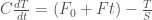
where C is the heat capacity, assumed to be 50 W/m2/K/yr, F0 is the initial value of radiative forcing, assumed to be 1.0 W/m2, F is the rate of change of radiative forcing, S is the climate sensitivity in units of K/(W/m2), and T is the temperature increase from equilibrium, initialized at 0. The dependence of b on the temperature increase is given by:
9) 
The parameters a, b, F, and S could all be considered deeply uncertain, but for this example I will use (unrealistically optimistic) values of F = 0 and S = 0.5 and assume possible ranges for a and b0 of 1.5 < a < 4 and 0.25 < b0 < 0.67. Within these bounds, different combinations of a and b parameters can lead to point attractors, strange attractors, or collapse of the predator population.
The goal of the game is to design a strategy for harvesting some number of fish, z, at each time step assuming that only the fish population can be observed, not the prey. The population of the fish then becomes:
10) 
For this example, I assume the user employs a strategy of harvesting some weighted average of the fish population in the previous two time steps:
11) 
where 0 ≤ α ≤ 1 and 0 ≤ β ≤ 1. The user is assumed to have two objectives: 1) to maximize the net present value of their total harvest over T time steps, and 2) to minimize the standard deviation of their harvests over T time steps:
12) Maximize: 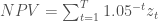
13) Minimize: 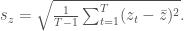
As illustrated in the figure below, depending on the values of a and b0, the optimal Pareto sets for each “future” (each with initial populations of x0 = 0.48 and y0 = 0.26) can have very different shapes and attainable values.
| Future |
1 |
2 |
3 |
4 |
5 |
| a |
1.75 |
1.75 |
3.75 |
3.75 |
2.75 |
| b0 |
0.6 |
0.3 |
0.6 |
0.3 |
0.45 |

For this MORDM experiment, I first optimize to an assumed state of the world (SOW) in which a = 1.75 and b = 0.6. To do this, I first have to write a function that takes in the decision variables for the optimization problem as well as any potentially uncertain model parameters, and returns the objectives. Here the decision variables are represented by the vector ‘vars’, the uncertain parameters are passed at default values of a=1.75, b0 = 0.6, F = 0 and S = 0.5, and the returned objectives are NPVharvest and std_z.
import os
import math
import json
import numpy as np
import pandas as pd
import matplotlib as mpl
import matplotlib.pyplot as plt
from scipy.optimize import brentq as root
from rhodium import *
from rhodium.config import RhodiumConfig
from platypus import MapEvaluator
RhodiumConfig.default_evaluator = MapEvaluator()
def fishGame(vars,
a = 1.75, # rate of prey growth
b0 = 0.6, # initial rate of predator growth
F = 0, # rate of change of radiative forcing per unit time
S = 0.5): # climate sensitivity)
# Objectives are:
# 1) maximize (average NPV of harvest) and
# 2) minimize (average standard deviation of harvest)
# x = population of prey at time 0 to t
# y = population of predator at time 0 to t
# z = harvested prey at time 1 to t
tSteps = 100
x = np.zeros(tSteps+1)
y = np.zeros(tSteps+1)
z = np.zeros(tSteps)
# initialize predator and prey populations
x[0] = 0.48
y[0] = 0.26
# Initialize climate parameters
F0 = 1
C = 50
T = 0
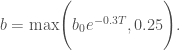
b = max(b0*np.exp(-0.3*T),0.25)
# find harvest at time t based on policy
z[0] = harvest(x, 0, vars)
#Initialize NPV of harvest
NPVharvest = 0
for t in range(tSteps):
x[t+1] = max(a*x[t]*(1-x[t]) - x[t]*y[t] - z[t],0)
y[t+1] = max(x[t]*y[t]/b,0)
if t < tSteps-1:
z[t+1] = harvest(x, t+1, vars)
NPVharvest = NPVharvest + z[t]*(1+0.05)**(-(t+1))
#Calculate next temperature and b values
T = T + (F0 + F*(t+1) - (1/S)*T)/C
b = max(b0*np.exp(-0.3*T),0.25)
# Calculate minimization objectives
std_z = np.std(z)
return (NPVharvest, std_z)
def harvest(x, t, vars):
if t > 0:
harvest = min(vars[0]*vars[1]*x[t] + vars[0]*(1-vars[1])*x[t-1],x[t])
else:
harvest = vars[0]*vars[1]*x[t]
return harvest
Next, the model class must be defined, as well as its parameters, objectives (or “responses”) and whether they need to be minimized or maximized, decision variables (or “levers”) and uncertainties.
model = Model(fishGame)

# define all parameters to the model that we will be studying
model.parameters = [Parameter("vars"), Parameter("a"), Parameter("b0"), Parameter("F"), Parameter("S")]

# define the model outputs
model.responses = [Response("NPVharvest", Response.MAXIMIZE), Response("std_z", Response.MINIMIZE)]

# some parameters are levers that we control via our policy
model.levers = [RealLever("vars", 0.0, 1.0, length=2)]

# some parameters are exogeneous uncertainties, and we want to better
# understand how these uncertainties impact our model and decision making
# process
model.uncertainties = [UniformUncertainty("a", 1.5, 4.0), UniformUncertainty("b0", 0.25, 0.67)]
The model can then be optimized using a multi-objective evolutionary algorithm (MOEA) in Platypus, and the output written to a file. Here I use NSGA-II.
output = optimize(model, "NSGAII", 100)
with open("data.txt", "w") as f:
    json.dump(output, f)
The results can be easily visualized with simple commands. The Pareto sets can be plotted with ‘scatter2D’ or ‘scatter3D’, both of which allow brushing on one or more objective thresholds. Here I first brush on solutions with a NPV of harvest ≥ 1.0, and then add a condition that the standard deviation of harvest be ≤ 0.01.
# Use Seaborn settings for pretty plots
sns.set()

# Plot the points in 2D space
scatter2d(model, output)
plt.show()

# The optional interactive flag will show additional details of each point when
# hovering the mouse
# Most of Rhodiums's plotting functions accept an optional expr argument for
# classifying or highlighting points meeting some condition
scatter2d(model, output, x="NPVharvest", brush=Brush("NPVharvest >= 1.0"))
plt.show()

scatter2d(model, output, brush="NPVharvest >= 1.0 and std_z <= 0.01")
plt.show()
The above code creates the following images:


Rhodium can also plot Kernel density estimates of the solutions, or those attaining certain objective values.
# Kernel density estimation plots show density contours for samples. By
# default, it will show the density of all sampled points
kdeplot(model, output, x="NPVharvest", y="std_z")
plt.show()

# Alternatively, we can show the density of all points meeting one or more
# conditions
kdeplot(model, output, x="NPVharvest", y="std_z", brush=["NPVharvest >= 1.0", "std_z <= 0.01"], alpha=0.8)
plt.show()


Scatterplots of all pairwise objective combinations can also be plotted, along with histograms of the marginal distribution of each objective illustrated in the pairwise scatterplots. These can also be brushed by objective thresholds specified by the user.
# Pairwise scatter plots shown 2D scatter plots for all outputs
pairs(model, output)
plt.show()

# We can also highlight points meeting one or more conditions
pairs(model, output, brush=["NPVharvest >= 1.0", "std_z <= 0.01"])
plt.show()

# Joint plots show a single pair of parameters in 2D, their distributions using
# histograms, and the Pearson correlation coefficient
joint(model, output, x="NPVharvest", y="std_z")
plt.show()


Finally, tradeoffs can also be viewed on parallel axes plots, which can also be brushed on user-specified objective values.
# A parallel coordinates plot to view interactions among responses
parallel_coordinates(model, output, colormap="rainbow", zorder="NPVharvest", brush=Brush("NPVharvest > 1.0"))
plt.show()

But the real advantage of Rhodium is not visualization but uncertainty analysis. First, PRIM can be used to identify “boxes” best describing solutions meeting user-specified criteria. I define solutions with a NPV of harvest ≥ 1.0 as profitable, and those below unprofitable.
# The remaining figures look better using Matplotlib's default settings
mpl.rcdefaults()

# We can manually construct policies for analysis. A policy is simply a Python
# dict storing key-value pairs, one for each lever.
#policy = {"vars" : [0.02]*2}

# Or select one of our optimization results
policy = output[8]

# construct a specific policy and evaluate it against 1000 states-of-the-world
SOWs = sample_lhs(model, 1000)
results = evaluate(model, update(SOWs, policy))
metric = ["Profitable" if v["NPVharvest"] >= 1.0 else "Unprofitable" for v in results]

# use PRIM to identify the key uncertainties if we require NPVharvest >= 1.0
p = Prim(results, metric, include=model.uncertainties.keys(), coi="Profitable")
box = p.find_box()
box.show_details()
plt.show()
This will first show the smallest box with the greatest density but lowest coverage.

Clicking on “Back” will show the next largest box with slightly lower density but greater coverage, while “Next” moves in the opposite direction. In this case, since the smallest box is shown, “Next” moves full circle to the largest box with the lowest density, but greatest coverage, and clicking “Next” from this figure will start reducing the box size.

Classification And Regression Trees (CART; Breiman et al., 1984) can also be used to identify hierarchical conditional statements classifying successes and failures in meeting the user-specified criteria.
# use CART to identify the key uncertainties
c = Cart(results, metric, include=model.uncertainties.keys())
c.print_tree(coi="Profitable")
c.show_tree()
plt.show()

Finally, Dave has wrapped Rhodium around Jon Herman’s SALib for sensitivity analysis. Here’s an example of how to run the Method of Morris.
# Sensitivity analysis using Morris method
print(sa(model, "NPVharvest", policy=policy, method="morris", nsamples=1000, num_levels=4, grid_jump=2))

You can also create tornado and spider plots from one-at-a-time (OAT) sensitivity analysis.
# oat sensitivity
fig = oat(model, "NPVharvest",policy=policy,nsamples=1000)

Finally, you can visualize the output of Sobol sensitivity analysis with bar charts of the first and total order sensitivity indices, or as radial plots showing the interactions between parameters. In these plots the filled circles on each parameter represent their first order sensitivity, the open circles their total sensitivity, and the lines between them the second order indices of the connected parameters. You can even create groups of similar parameters with different colors for easier visual analysis.
Si = sa(model, "NPVharvest", policy=policy, method="sobol", nsamples=1000, calc_second_order=True)
fig1 = Si.plot()
fig2 = Si.plot_sobol(threshold=0.01)
fig3 = Si.plot_sobol(threshold=0.01,groups={"Prey Growth Parameters" : ["a"],
            "Predator Growth Parameters" : ["b0"]})


As you can see, Rhodium makes MORDM analysis very simple! Now if only we could reduce uncertainty…
Works Cited
Breiman, L., J. H. Friedman, R. A. Olshen, and C. J. Stone (1984). Classification and Regression Trees. Wadsworth.
Friedman, J. H. and N. I. Fisher (1999). Bump-hunting for high dimensional data. Statistics and Computing, 9, 123-143.
Hadka, D., Herman, J., Reed, P., and Keller, K. (2015). An open source framework for many-objective robust decision making. Environmental Modelling & Software, 74, 114-129.
Kasprzyk, J. R., S. Nataraj, P. M. Reed, and R. J. Lempert (2013). Many objective robust decision making for complex environmental systems undergoing change. Environmental Modelling & Software, 42, 55-71.
Lempert, R. J. (2003). Shaping the next one hundred years: new methods for quantitative, long-term policy analysis. Rand Corporation.


