An overview of the National Hydrologic Model

Over the past several months, I have been working with data from the US Geological Survey’s (USGS) National Hydrologic Model (NHM), a valuable resource that required some time to become familiar with. The goal of this post is to provide an overview of the NHM, incorporating as many links as possible, with the hope of encouraging others to utilize these resources and serving as a springboard for further investigation.

Why should you care about the NHM?

Water systems modelers are consistently in need of data. You might find that the specific streamflow data you seek does not exist, or perhaps you have some data but want to expand your training set. You may also wish to broaden your data to include not only streamflow but also estimates of various geophysical, hydrological, or environmental variables such as catchment area, vegetation classifications, and evapotranspiration.

The NHM can quench your data thirst by offering Continental US (CONUS) scale estimates of different geo-hydro-climatic variables synthesized from multiple datasets.

You can access these NHM datasets (simulated streamflow, land-cover parameter values, etc.) yourself through the ScienceBase website. However, it is first beneficial to understand the various components of the NHM infrastructure more broadly.


Introduction

The National Hydrologic Model (NHM) infrastructure is designed with the goal…

“… to facilitate hydrologic model parameterization on the basis of datasets that characterize geology, soil, vegetation, contributing area, topography, growing season, snow dynamics, climate, solar radiation, and evapotranspiration across the CONUS.”

The NHM includes several different components

  1. The Geospatial Fabric
  2. Model input datasets
  3. Physical models used to simulate hydrologic processes

In this post, I will delve into each of these components, providing more information, and conclude by pointing out ways you can access the model outputs yourself.

The Geospatial Fabric

The geospatial fabric contains spatial data that serves as the skeletal structure of the NHM, facilitating the routing of modeled streamflow across across catchments. The image below shows the CONUS-scale geospatial fabric.

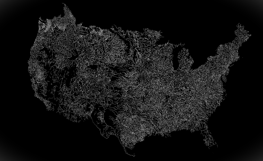
The geospatial fabric contains individual stream reaches (called “segments”), delineated sub-catchments (called “Hydrologic Response Units”, or HRUs), and many specific points of interest which correspond to USGS observational gauge locations.

The raw data for version 1.1 of the Geospatial Fabric can be found here.

The spatial data is largely drawn from the National Hydrography Dataset (NHD) which defines the high-resolution stream linkages and provides a unique identifier (called “ComID”) for each stream segment.

If you are looking to set up a workflow which uses NHM streamflow data, you will need to specify the ComID numbers for your locations of interest. You can then retrieve the data for each ComID location.

If you are doing this with Python, then I suggest you check out PyNHD package which I previously highlighted on this blog, and which can identify NHD ComID numbers based on coordinate points.

For more information on the geospatial fabric, you can see Bock et al. (2020).

PRMS

The Precipitation-Runoff Modeling System (PRMS) is described by the USGS as being:

“a deterministic, distributed-parameter, physical process based modeling system developed to evaluate the response of various combinations of climate and land use on streamflow and general watershed hydrology.”

The PRMS simulates many different hydrologic processes such as snowmelt, infiltration, groundwater recharge, surface runoff, and finally streamflow. A conceptual representation of the PRMS, taken from Markstrom et al. (2015) shows the modeled relationships between these processes:

The input data for the PRMS is flexible, but requires some combination of precipitation, air temperature, and solar radiation timeseries. Historic Daymet data provide the climate forcings for the historic period, but future climate projections can also be used.

Additionally, the model requires a set of catchment-delineated parameter values which quantify things such as soil types, types of vegetation coverage, percentage of impervious surfaces, etc. These data can be provided by the National Land Cover Database (NLCD), or alternative land cover change scenarios can be used to assess the impact of land surface on hydrology.

The PRMS is thus able to provide a strong physical processes basis when coupled with the NHM. The combination of these two models is simply referred to as the NHM-PRMS.

You can access the user manual for the PRMS here, and a report describing the latest version (PRMS-IV) from Markstrom et al (2015) here.

Accessing NHM datasets

The NHM infrastructure is great in the sense that it is flexible and incorporates so many different datasets. However, this may introduce difficulty in running the models yourself (I have not attempted this, and don’t have guidance on that).

Fortunately, there are some datasets which have been shared by the USGS, and which conveniently provide various model outputs or calibrated parameters without the need to interact with the model directly.

You can access and explore available datasets from the NHM through the ScienceBase website.

A few notable datasets that you might be interest in using are:

NHM-PRMS simulated streamflow from 1980-2016

Here I want to highlight one of these datasets that I have the most experience working with, and which I believe may be the most interesting to the WaterProgramming crowd: the “Application of the National Hydrologic Model Infrastructure with the Precipitation-Runoff Modeling System (NHM-PRMS), 1980-2016, Daymet Version 3 calibration“.

This dataset contains daily streamflow values across CONUS for the period from 1980-2016, at each HRU and segment contained in the geospatial fabric, and is available through the link here.

Note: Given the scale of this dataset, the file is rather large (92 GB).

Here I want to show how easy in can be to access the streamflow timeseries from this dataset. Assuming that you have downloaded full NHM-PRMS dataset file, for the fully observed-calibrated and Muskingum routing simulation (byHRU_musk_obs.tar), you can extract the segment streamflow timeseries using just a few lines of Python code:

## Example of how to extract streamflow data from NHM-PRMS
import tarfile
import netCDF4 as nc
import pandas as pd

# Open file and extract just segment outflow
tar = tarfile.open('your_data_directory/byHRU_musk_obs.tar')
tar.extract('seg_outflow', path= './extracted/')

# Open the extracted netCDF
segment_outflow = nc.Dataset(f'./extracted/seg_outflow.nc')

# Store values and segment IDs
vals = segment_outflow['seg_outflow'][:]
segment_ids = segment_outflow['segment'][:]

# Make a dataframe
segment_outflow_df = pd.DataFrame(vals, columns = segment_ids)

At this point, segment_outflow_df will contain data from all of CONUS, and you will likely want to choose a subset of this data using the ComID numbers for each segment; I’ll have to leave that part up to you!

I hope this post helped to shine some light on this great resource, and encourages you to consider leveraging the NHM in your own work. As always, thanks for reading!

References

  1. Bock, A.E, Santiago,M., Wieczorek, M.E., Foks, S.S., Norton, P.A., and Lombard, M.A., 2020, Geospatial Fabric for National Hydrologic Modeling, version 1.1 (ver. 3.0, November 2021): U.S. Geological Survey data release, https://doi.org/10.5066/P971JAGF.
  2. Regan, R.S., Markstrom, S.L., Hay, L.E., Viger, R.J., Norton, P.A., Driscoll, J.M., LaFontaine, J.H., 2018, Description of the National Hydrologic Model for use with the Precipitation-Runoff Modeling System (PRMS): U.S. Geological Survey Techniques and Methods, book 6, chap B9, 38 p., https://doi.org/10.3133/tm6B9.
  3. Leavesley, G. H. (1984). Precipitation-runoff modeling system: User’s manual (Vol. 83, No. 4238). US Department of the Interior.
  4. Markstrom, S. L., Regan, R. S., Hay, L. E., Viger, R. J., Webb, R. M., Payn, R. A., & LaFontaine, J. H. (2015). PRMS-IV, the precipitation-runoff modeling system, version 4. US Geological Survey Techniques and Methods6, B7.
  5. Hay, L.E., and LaFontaine, J.H., 2020, Application of the National Hydrologic Model Infrastructure with the Precipitation-Runoff Modeling System (NHM-PRMS),1980-2016, Daymet Version 3 calibration: U.S. Geological Survey data release, https://doi.org/10.5066/P9PGZE0S.

Creating Interactive Geospatial Maps in Python with Folium

Interactive mapping and data visualization provide data scientists and researchers with a unique opportunity to explore and analyze geospatial data, and to share their work with stakeholders in a more engaging and accessible way.

Personally, I’ve found that constructing an interactive map for my own research, and iteratively updating it as the work progresses, has been great for improving my own understanding of my project. My project map (not the one in this demo) has been a helpful narrative aid when introducing someone to the project.

I’ve had a lot of success using the folium Python package to create interactive maps, and want to share the tool with you all here.

In this post, I provide a demonstration on how to use the folium package to create an HTML based interactive map of a hydrologic watershed.

Folium: a quick introduction

Folium is a Python package that is used to create interactive maps.

It is built on top of the Leaflet JavaScript library and can be used to visualize geospatial data in unique ways. Using folium, users construct maps by adding various features including lines, markers, pop-up text boxes, and different base-maps (aka, tiles), and can export maps as interactive HTML documents.

The full Folium documentation is here, however I think it is best to learn through an example.

Demo: Mapping a hydrologic basin data with Folium

All of the code and data used in this post is located in a GitHub repository: trevorja/Folium_Interactive_Map_Demo.

To interact with the demo map directly, download the file here: basin_map.html

The folium_map_demo.ipynb Jupyter Notebook steps through the process shown below and will re-create the map shown above. You can create a similar plot for a different basin by changing the station_id number inside ‘retrieve_basin_data.ipynb’ to a specific USGS gauge of interest.

Here is a brief video showcasing the interaction with the final map:

Map Data

For this demo, I am plotting various features within a hydrologic basin in northern New Mexico.

All of the data in the map is retrieved using the pynhd package from the HyRiver suite for python. For more information about these packages, see my previous post, Efficient hydroclimatic data accessing with HyRiver for Python.

The script ‘retrieve_basin_data.ipynb’ is set up to retrieve several features from the basin, including:

  • Basin boundary
  • Mainstem river
  • Tributary rivers
  • USGS gauge locations
  • New Mexico Water Data Initiative (NMWDI) Sites
  • HUC12 pour points

The geospatial data (longitude and latitudes) for each of these features are exported to data/basin_data.csv and used later to generate the folium map.

Constructing a folium hydrologic map

Like many other data visualization programs, folium maps are constructed by iteratively adding features or map elements to the main map object. It is easy to add a map feature, however it takes more care to ensure that the features are well-organized and respond to user interaction the way you want them to.

In this demo, I deconstruct the process into five parts:

  1. Initializing the map
  2. Initializing feature groups (layers)
  3. Adding points to feature layers
  4. Adding polygons & lines to feature layers
  5. Adding layers onto the map

Before going any further, we need to import the necessary packages, load our basin data, and convert the geospatial data to geopandas.GeoDataFrame() geometry objects:

# Import packages
import pandas as pd
import folium
from folium.plugins import MarkerCluster
import geopandas as gpd
from shapely.geometry import Point, LineString
from shapely import wkt

# Specify the coordinate reference system (CRS)
crs = 4386

# Load the basin data
basin_data = pd.read_csv('./data/basin_data.csv', sep = ',', index_col=0)

# Convert to a geoDataFrame and geometry objects
basin_data['geometry'] = basin_data['geometry'].apply(wkt.loads)
geodata = gpd.GeoDataFrame(basin_data, crs = crs)

Additionally, I start by specifying a couple design options before getting started (colors, line widths, etc.). I do this at the start so that I can easily test different colors, and I store all of these specifications in a dict. This step is not necessary, but just helps to stay organized. The following code block shows some of these specifications, but some are left out just to make this post shorter:

## Plot options
# Line widths
basin_linewidth = 2
mainstem_linewidth = 3
tributary_linewidth = 1

# ...
# More color and design specs here...
# ...

# Combine options into a dictionary
plot_options = {
    'station':{'color': usgs_color,
               'size': usgs_size},
    'pourpoint': {'color': pourpoint_color,
                  'size': pourpoint_size},
    'nmwdi': {'color': nmwdi_color,
              'size': nmwdi_size}
              }

With that out of the way, we will start mapping.

Initializing the map

We start to construct our map using the folium.Map() function:

# Initialize the map
geomap = folium.Map(location = [36.5, -106.5],
                    zoom_start = 9.2,
                    tiles = 'cartodbpositron',
                    control_scale = True)

The location and zoom_start arguments set the default view; the user will be able to pan and zoom around the map, but this will be the starting location.

The tile argument in the initial folium.Map() calls sets the default base-map style, but different styles can be added using the folium.TileLayer() function. Each TileLayer() call adds a different base-map style that is then available from the drop-down menu in the final figure.

## Add different tiles (base maps)
folium.TileLayer('openstreetmap').add_to(geomap)
folium.TileLayer('stamenwatercolor').add_to(geomap)
folium.TileLayer('stamenterrain').add_to(geomap)

Here is a side-by-side comparison of the four different tiles used in this demo:

Initializing feature groups (layers)

Before we add any lines or makers to the map, it is best to set up different layers using folium.FeatureGroup(). When the map is complete, the different feature groups can be toggled on-and-off using the drop-down menu.

Below, I initialize a folium.FeatureGroup for each of the six feature types in the map.

# Start feature groups for toggle functionality
basin_layer = folium.FeatureGroup(name = 'Basin Boundary', show=True)
usgs_layer = folium.FeatureGroup(name = 'USGS Gauges', show=True)
mainstem_layer = folium.FeatureGroup(name = 'Mainstem River', show=True)
tributary_layer = folium.FeatureGroup(name='Tributary Rivers', show=False)
pourpoint_layer = folium.FeatureGroup(name= 'HUC12 Pour Points', show=False)
nmwdi_layer = folium.FeatureGroup(name='NM Water Data Initiative Gauge', show=True)

The name argument is what will be displayed on the drop-down menu. The show argument indicates whether that layer is visible by default (when the map is first opened), or whether it first needs to be selected using the drop-down menu.

Now that the layers are initialized, we can begin adding the features (polygons, lines, and point markers) to each layer.

Adding points to feature layers

The folium.CircleMarker() is used to add circle points using a specific coordinate location.

The following code shows how I am iteratively adding different points to the different layers of the map based upon the feature type.

For each point, I extract the latitude and longitude (coords = [point.geometry.y, point.geometry.x]) and pass it to the folium.CircleMarker() function with colors and sizes specific to each of the three different point features (USGS gauge stations (station), NMWDI (nmwdi), and HUC12 pourpoints (pourpoint)):

plot_types = ['station', 'nmwdi', 'pourpoint']
plot_layers = [usgs_layer, nmwdi_layer, pourpoint_layer]

# Loop through the different feature point types
for i, feature_type in enumerate(plot_types):

	# Specify the correct feature layer to add the point too
	map_layer = plot_layers[i]

	# Add each point
    for _, point in geodata.loc[geodata['type'] == feature_type].iterrows():    
        coords = [point.geometry.y, point.geometry.x]
        
        # Add the popup box with description
        textbox = folium.Popup(point.description,
                               min_width= popup_width,
                               max_width= popup_width)

		# Add the marker at the coordinates with color-coordination
        folium.CircleMarker(coords,
                            popup= textbox,
                            fill_color = plot_options[feature_type]['color'],
                            fill = True,
                            fill_opacity = fill_opacity,
                            radius= plot_options[feature_type]['size'],
                            color = plot_options[feature_type]['color']).add_to(map_layer)

Adding polygons & lines to feature layers

I’ve found that it can be difficult to add Polygons or Lines to a folium map if the coordinate geometry are not formatted correctly. For me, the best method has been to convert the polygon or line data to a geopandas.GeoSeries and then converting this to JSON format data using the .to_json() method.

Once in JSON format, the data can be added to the map using the folium.GeoJson() method similar to other features. Although, rather than adding it to the map directly, we add it to the specific feature layer so that we can toggle things later.

Below, I show how I add the basin boundary polygon to the map. This needs to be repeated for the mainstem and tributary river lines, and the full code is included in folium_map_demo.ipynb.

## Plot basin border
for i,r in geodata.loc[geodata['type'] == ].iterrows():
	# Convert the Polygon or LineString to geoJSON format
    geo_json = gpd.GeoSeries(r['geometry']).simplify(tolerance = 0.000001).to_json()
    geo_json = folium.GeoJson(data= geo_json,
                              style_function=lambda x: {'fillcolor': 'none',
                                                        'weight': basin_linewidth,
                                                        'color': basin_color,
                                                        'opacity': 1,
                                                        'fill_opacity': 1,
                                                        'fill': False})
	# Add popup with line description
    folium.Popup(r.description,
                 min_width = popup_width,
                 max_width= popup_width).add_to(geo_json)
    
    # Add the feature to the appropriate layer
    geo_json.add_to(basin_layer)

And with that, the hard part is done.

Last step: adding layers onto map

Now, if you try to visualize the map it will be empty! This is because we have not added the feature layers to the map. In this last step, we add each of the six feature layers to the map and also add the folium.LayerControl() which will allow for us to toggle the different layers on-and-off:

# Add all feature layers to the map
basin_layer.add_to(geomap)
usgs_layer.add_to(geomap)
mainstem_layer.add_to(geomap)
tributary_layer.add_to(geomap)
pourpoint_layer.add_to(geomap)
nmwdi_layer.add_to(geomap)

# Add the toggle option for layers
folium.LayerControl().add_to(geomap)

Ready for the grand reveal?

Viewing, saving, and sharing the map

Viewing your map is as easy as calling the map name at any point in the script (i.e., geomap), and folium makes it easy to save the map as an HTML using the map.save() function as shown here:

# Save and view the map
geomap.save("basin_map.html")
geomap

Once you have your HTML saved, and you’ve taken a moment to open it on your computer and made sure that the features are situated nicely, then it comes time to share. Other users can view the maps simply by opening the HTML file on their local machine, or you can add the HTML to a website.

Concluding thoughts

I hope you’ve found some inspiration here, and find a way to incorporate interactive geospatial mapping in your project. I don’t think it can be overstated how much an interactive visual such as a folium map can serve to broaden the access to your dataset or model.

Thanks for reading!

Introducing the GRRIEn Analysis Framework: Defining standards for reproducible and robust supervised learning of earth surface processes at large spatial scales

I’m very excited to write this blogpost to highlight the GRRIEn framework that was developed in part by Dr. Elizabeth Carter at Syracuse University, along with collaborators Carolynne Hultquist and Tao Wen. I first saw Liz present the GRRIEn framework at the Frontiers in Hydrology conference last year and I knew it was a framework that I wanted to eventually demo on the blog. The associated manuscript (now published here) that introduces the GRRIEn (Generalizable, Reproducible, Robust, and Interpreted Environmental) framework is a cheat sheet of best management practices to extract generalizable insight on environmental systems using supervised learning of global environmental observations (EOs; satellites and coupled earth systems models), including standards for reproducible data engineering, robust model training, and domain-specialist interpreted model diagnostics (Carter et al., 2023).

In short, this is a paper that I wish existed when I first started diving into data science and machine learning in graduate school. If you are a student/have a student who is new to statistics, data science, and machine learning for environmental applications, I highly recommend this paper as the single most useful one-stop shop read. Below, I will introduce a bit about Liz and her group, the steps of the framework, and include some of the awesome ways that Liz has incorporated GRRIEn into her classes.

The CHaRTS Lab

Dr. Carter is based at Syracuse University and runs the Climate Hazards Research Team Syracuse (CHaRTS). CHaRTS uses proxy observations of the hydrologic cycle from satellites, photographs, and earth systems models to support fair and stable management of water resources and hydroclimatic risk in the twenty-first century. I talked to Liz about creating the GRRIEn framework and the results that she has seen in the classroom.

Why did you decide to create GRRIen?

“GRRIEn was created as a teaching tool for my graduate class, Environmental Data Science (EDS). EDS was intended to equip students with the computation tools they would need to use global earth observations for thesis/dissertation research. Some of my students have an interest in spatial statistics and machine learning, but most of them are domain specialists who want to use global earth observations to learn more about very specific environmental processes. The GRRIEn method was created for these students, the domain specialists. The goal is to reduce barriers to accessing insight from global earth observations associated with computational methods and advanced statistical techniques. For example, many students struggle to find and process spatial data. In EDS, they adopt a standard reproducible computational pipeline in the form of a GitHub repository for accessing raw data and creation of an analysis-ready dataset. For students who have limited statistical skills, I teach a few simple model-agnostic tools to diagnose and control for feature and observation dependence in multivariate observational spatiotemporal datasets. Most importantly, I teach methods in model interpretation. We need domain specialists to evaluate whether data-driven models are a physically plausible representation of environmental processes if we want to use global earth observations for knowledge discovery.”

What kind of results have you seen as you incorporate GRRIen in the classroom?

“My favorite part of EDS is seeing students going from never having written a line of code to processing massive volumes of data. Because so much of the process has been constrained by the GRRIEn method, students can really spread their wings in terms of application. For the past three years, I’ve had several students take their EDS project to conferences like AGU, or submit it for publication.”

Overview of the GRRIEn Framework

As the volume of earth observations from satellites, global models, and the environmental IoT continues to grow, so does the potential of these observations to help scientists discover trends and patterns in environmental systems at large spatial scales. Because many emerging global datasets are too large to store and process on personal computers, and because of scale-dependent qualities of spatial processes that can reduce the robustness of traditional statistical methods, domain specialists need targeted and accessible exposure to skills in reproducible scientific computing and spatial statistics to allow the use of global observations from satellites, earth systems models, and the environmental IoT to generalize insights from in-situ field observations across unsampled times and locations. The GRRIEn framework (which stands for generalizable, robust, reproducible, and interpretable environmental analytic framework) was developed for this purpose (Carter al., 2023). Below are the four key components of the framework, but please refer to the manuscript for full descriptions and examples. 

Generalizable: How well do your experimental results from a sample extend to the population as a whole?

Three common sources of global gridded earth observations (EOs) include active satellite remote sensing data, such as synthetic aperture radar imagery (left), passive satellite remote sensing data, including optical and passive microwave imagery (center), and gridded outputs from global coupled earth system models (right).

A primary motivation to generate global EOs is to allow scientists to translate insight from our limited field measurements to unsampled times and locations to improve the generalizability of our earth systems theories. As global EOs are (approximately) spatiotemporally continuous observations, the overall objective of GRRIEn analysis is to train a supervised learning algorithm that can predict an environmental process using globally available EOs as input data. This algorithm can be used to generalize insights from direct observations of an environmental process sampled experimentally or in-situ across unlabeled times or locations where global EOs are available (i.e. through interpolation, extrapolation, and diagnostic modeling)

Robust: Do your statistics show good performance on data drawn from a wide range of probability and joint probability distributions?

In order for your model to generalize well, you must quantify and account for scale-dependent multicollinearity and spatial/temporal dependence in your data. For example, multicollinearity occurs when one or more predictor variables are linearly related to each other. It is a problem for prediction and inference because the accuracy of predictions depends on the exact structure of multicollinearity that was present in the training dataset being present in the prediction dataset. Since it is associated with model instability in most machine learning and some deep learning applications, it also impacts diagnostic modeling; the model is less likely to interpret the system in a physically plausible way, and small changes in training data can lead to big changes in model weights and parameters.

Furthermore, correlation structure tends to be dynamic in space and time. The figure below shows an example of correlation structure between summertime air temperature and precipitation from 1950-2000 (left) and projected from 2050-2100 (right). One can see that the correlation between air temperature and precipitation will change for many locations in the US under climate change. This suggests that statistical models trained using temperature and precipitation under 20th century conditions will not make robust estimates in the 21st century.

Pearson’s correlation coefficient [scaled between -1 and 1, color bar (Benesty et al.
2009)] between bias-corrected statistically downscaled Climate Model Intercomparison
Project 5 ensemble mean monthly precipitation and daily max temperature. Historical
observations 1950-1999 (left) and moderate emissions forecast (RCP 4.5) for 2050-2099 (right) both indicate spatiotemporal variability collinearity between summertime maximum temperature and precipitation. Covariance of meteorological variables is a signature of local climate. As local climates shift due to global warming, so will the local covariability of meteorological variables (right). This generates complexity for predicting environmental process response to meteorological variables under climate change (Taylor et al. 2012)

We can’t expect to collect a sample of future covariability structure because these conditions haven’t happened yet. So how do we address these issues? The manuscript summarizes a great checklist of steps to make sure your model development is robust to both dependent features and observations.  

Checklist for robust data engineering and model development with dependent
features (left) and observations (right) in spatiotemporal systems.

Reproducible: Can other scientists understand and replicate your analysis and yield the same results?

The best way to facilitate this is to create a clear repository structure which contains a README, a container image that has specified versions of all packages that are used, and code that facilitates both the download of larger geospatial datasets that can’t be stored in a repository and code to reproduce analyses and figures.

In Liz’s Environmental Data Science class at Syracuse (CEE 609), she has her students complete a semester long project where every piece of the project is documented in a GRRIEn repository structure (see here for a great example). By the end of the semester, she noted that her students have a written paper, fully documented workflow, and a populated repository that often has served as a basis for a journal publication for students in her research group. 

Interpretable: Do your model parameters reflect a physically plausible diagnosis of the system?

The most important step to ensuring that your model will make the right predictions in different contexts is to make sure those predictions are happening for the right reason: have your model weights and parameters diagnosed the importance of your predictors, and their relationship to the environmental process that serves as your predictand, in a physically plausible way? The authors suggest forming a set of interpretable hypotheses before modeling that denotes the data that you are using and the relationships you expect to find and then utilizing local and global interpretation methods to confirm or reject the original hypotheses.   

Conclusion/Resources

I think the GRRIEn framework is a really great tool for young researchers embarking on data science and machine learning projects. If you are a newer faculty that is interested in incorporating some of these concepts into your class, Liz has made “Code Sprints” from her class available here. There are Jupyter Notebooks on working with Python, raster data, vector data, regressions, autocorrelation, and multicollinearity. Be sure to keep up with the work coming out of the CHaRTS lab on Twitter here!

Find the paper here: https://doi.org/10.1175/AIES-D-22-0065.1

Efficient hydroclimatic data accessing with HyRiver for Python

This tutorial highlights the HyRiver software stack for Python, which is a very powerful tool for acquiring large sets of data from various web services.

I have uploaded a Jupyter-Notebook version of this post here if you would like to execute it yourself.

HyRiver Introduction

The HyRiver software suite was developed by Taher Chegini who, in their own words, describes HyRiver as:

“… a software stack consisting of seven Python libraries that are designed to aid in hydroclimate analysis through web services.”

This description does not do justice to the capability of this software. Through my research I have spent significant amounts of time wrangling various datasets – making sure that dates align, or accounting for spatial misalignment of available data. The HyRiver suite streamlines this process, and makes acquisition of different data from various sources much more efficient.

Here, I am going walk through a demonstration of how to easily access large amounts of data (streamflow, geophysical, and meteorological) for a basin of interest.

Before going through the code, I will highlight the three libraries from the HyRiver stack which I have found most useful: PyGeoHydro, PyNHD, and PyDaymet.

PyGeohydro

PyGeoHydro allows for interaction with eight different online datasets, including:

In this tutorial, I will only be interacting with the USGS NWIS, which provides daily streamflow data.

PyNHD

The PyNHD library is designed to interact with the National Hydrography Dataset (NHD)and the Hydro Network-Linked Data Index (NLDI).

NHDPlus (National Hydrography Dataset)

The NHD defines a high-resolutioon network of stream linkages, each with a unique idenfier (ComID).

NLDI (Network-Linked Data Index)

The NLDI aids in the discovery of indexed information along some NHD-specified geometry (ComIDs). The NLDI essentially tranverses the linkages specified by the NHD geometry and generates data either local or basin-aggregated data relative to a specific linkage (ComID).

As will be seen later in the tutorial, the NLDI is able to retrieve at least 126 different types of data for a given basin…

PyDaymet

The PyDaymet GirHub repository summarizes the package as:

“[providing] access to climate data from Daymet V4 database using NetCDF Subset Service (NCSS). Both single pixel (using get_bycoords function) and gridded data (using get_bygeom) are supported which are returned as pandas.DataFrame and xarray.Dataset, respectively.”

Tutorial outline:

  1. Installation
  2. Retrieving USGS Water Data
  3. Retrieving Geophysical (NLDI) Data
  4. Retrieving Daymet Data

The HyRiver repository contains various examples demonstrating the use of the various libraries. I would definitely recommend digging in deeper to these, and other HyRiver documentation if this post piques your interest.

Step 0: Installation

In this tutorial, I only only interact with the PyNHD, PyGeoHydro, and PyDaymet libraries, so I do not need to install all of the HyRiver suite.

If you operate through pip, you can install these libraries using:

pip install pynhd pygeohydro pydaymet

If you use Anaconda package manager, you can install these packages using:

conda install -c conda-forge pynhd pygeohydro pydaymet

For more information on installation, refer to the HyRiver GitHub repository and related documentation.

Now, onto the fun part!

Step 1: Retreiving USGS Water Data

I am beginning here because streamflow data is typically the first point of interest for most hydrologic engineers or modelers.

Personally, I have gone through the process of trying to download data manually from the USGS NWIS website… My appreciation for the USGS prevents me from saying anything too negative, but let’s just say it was not a pleasant experience.

Pygeohydro allows for direct requests from the USGS National Water Information System (NWIS), which provides daily streamflow data from all USGS gages. The data is conveniently output as a Pandas DataFrame.

With this functionality alone, the PyGeoHydro library is worth learning.

1.1 Initialize PyGeoHydro NWIS tool

# Import common libraries
import numpy as np
import pandas as pd
import matplotlib.pyplot as plt

# Import the PyGeohydro libaray tools
import pygeohydro as gh
from pygeohydro import NWIS, plot

# Use the national water info system (NWIS)
nwis = NWIS()

1.2 Requesting USGS Streamflow Data

The get_streamflow() function does exactly as the name entails and will retrieve daily streamflow timeseries, however USGS gage station IDs must be provided. If you are only interested in a single location, then you can enter 8-digit gage ID number along with a specified date range to generate the data:

get_streamflow('########', dates = ('Y-M-D', 'Y-M-D'))

However, I am want to explore larger sets of data over an entire region. Thus, I am going to use PyGeoHydro's get_info() function to identify all gages within some region of interest.

First, I specify a region via (latitude, longitude) bounds, then I send a query which retrieves meta-data information on all the gages in the specified region. In this case, I am exploring the data available near Ithaca, NY.

# Query specifications
region = (-76.7, 42.3, -76, 42.6) # Ithaca, NY

# Send a query for all gage info in the region
query = {"bBox": ",".join(f"{b:.06f}" for b in region),
         "hasDataTypeCd": "dv",
         "outputDataTypeCd": "dv"}

info_box = nwis.get_info(query)

print(f'PyGeoHydro found {len(set(info_box.site_no))} unique gages in this region.')

# [Out]: PyGeoHydro found #N unique gages in this region.

Although, this info_box identify many gages in the region which have very old or very brief data records. Knowing this, I want to filter out data which does not have a suitable record length.

For the sake of this tutorial, I am considering data between January 1st, 2020 and December 31st, 2020.

# Specify date range of interest
dates = ("2020-01-01", "2020-12-31") 

# Filter stations to have only those with proper dates
stations = info_box[(info_box.begin_date <= dates[0]) & (info_box.end_date >= dates[1])].site_no.tolist()

# Remove duplicates by converting to a set
stations = set(stations)

Now, I am ready to use the gage IDs contained in stations to request the streamflow data!

# Retrieve the flow data
flow_data = nwis.get_streamflow(stations, dates, mmd=False)

# Remove gages with nans
flow_data = flow_data.dropna(axis = 1, how = 'any')

After removing duplicates and gages with nans, I have data from five unique gages in this region.

Additionally, PyGeoHydro has a convenient plotting feature to help quickly visualize the streamflow data.

from pygeohydro import plot

# Plot flow data summary
plot.signatures(flow_data)
Summary of flow data for the 5 gages found with PyGeoHydro.

There is a lot more to be explored in the PyGeoHydro library, but I will leave that up to the curious reader.

Step 2: Retrieving Geophysical (NLDI) Data

So, you’ve got some streamflow data but you don’t know anything about the physical watershed…

This is where the PyNHD library comes in. Using this library, I can identify entire upstream network from a gage, then extract the NLDI data associated with the watershed linkages.

# Import the PyNHD library
import pynhd as pynhd
from pynhd import NHD
from pynhd import NLDI, WaterData

First, we can take a look at all possible local basin characteristic data that are available:

# Get list of local data types (AKA characteristics, or attributes)
possible_attributes = NLDI().get_validchars("local").index.to_list()

There are 126 characteristics available from the NLDI! These characteristics range from elevation, to reservoir capacity, to bedrock depth. Many if these are not of immediate interest to me, so I will specify a subset of select_attributes to retrieve (basin area, max elevation, and stream slope).

I then loop through all of my USGS stations for which I have data in flow_data, identifying the upstream basin linkages using NLDI().navigate_byid(). Once the basin is identified, I extract the ComID numbers for each linkage and use that number to retrieve the NLDI data of interest. I then store the data in nldi_data. This process is done by the following:

# Specify characteristics of interest
select_attributes = ['CAT_BASIN_AREA', 'CAT_ELEV_MAX', 'CAT_STREAM_SLOPE']

# Initialize a storage matrix
nldi_data = np.zeros((len(flow_data.columns), len(select_attributes)))

# Loop through all gages, and request NLDI data near each gage
for i, st in enumerate(flow_data.columns):

    # Navigate up all flowlines from gage
    flowlines = NLDI().navigate_byid(fsource = 'nwissite',
                                    fid = f'{st}',
                                    navigation="upstreamTributaries",
                                    source = 'flowlines',
                                    distance = 10)

    # Get the nearest comid
    station_comid = flowlines.nhdplus_comid.to_list()[0]

    # Source NLDI local data
    nldi_data[i,:] = NLDI().getcharacteristic_byid(station_comid, "local", char_ids = select_attributes)

So far, I have timeseries streamflow data for five locations in the Ithaca, NY area, along with the basin area, max basin elevation, and stream slope for each stream. If I can access hydro-climate data, maybe I could begin studying the relationships between streamflow and physical basin features after some rain event.

Step 3: Meteorological data

The PyDaymet library allows for direct requests of meteorological data across an entire basin.

The available data includes:

  • Minimum and maximum temperature (tmin, tmax)
  • Precipitation (prcp)
  • Vapor pressure (vp)
  • Snow-Water Equivalent (swe)
  • Shortwave radiation (srad)

All data are reported daily at a 1km x 1km resolution. Additionally, the PyDaymet library has the ability to estimate potential evapotranspiration, using various approximation methods.

Here, I choose to only request precipitation (prcp) and max temperature (tmax).

NOTE:
So far, the Daymet data retrieval process has been the slowest aspect of my HyRiver workflow. Due to the high-resolution, and potential for large basins, this may be computationally over-intensive if you try to request data for many gages with long time ranges.

# Import the  PyDayment library
import pydaymet as daymet

## Specify which data to request
met_vars = ["prcp", "tmax"]
met_data_names = np.array(['mean_prcp','sd_prcp','mean_tmax','sd_tmax'])

## Initialize storage
daymet_data = np.zeros((len(flow_data.columns), len(met_data_names)))

Similar to the NLDI() process, I loop through each gage (flow_data.columns) and (1) identify the up-gage basin, (2) source the Daymet data within the basin, (3) aggregate and store the data in daymet_data.

## Loop through stations from above
for i, st in enumerate(flow_data.columns):

    # Get the up-station basin geometry
    geometry = NLDI().get_basins(st).geometry[0]

    # Source Daymet data within basin
    basin_met_data = daymet.get_bygeom(geometry, dates, variables= met_vars)

    ## Pull values, aggregate, and store
    # Mean and std dev precipitation
    daymet_data[i, 0] = np.nan_to_num(basin_met_data.prcp.values).mean()
    daymet_data[i, 1] = np.nan_to_num(basin_met_data.prcp.values).std()

    # Mean and std dev of max temperature
    daymet_data[i, 2] = np.nan_to_num(basin_met_data.tmax.values).mean()
    daymet_data[i, 3] = np.nan_to_num(basin_met_data.tmax.values).std()

daymet_data.shape

# [Out]: (5, 4)

Without having used a web-browsers, I have been able to get access to a set of physical basin characteristics, various climate data, and observed streamflow relevant to my region of interest!

Now this data can be exported to a CSV, and used on any other project.

Conclusion

I hope this introduction to HyRiver has encouraged you to go bigger with your hydroclimate data ambitions.

If you are curious to learn more, I’d recommend you see the HyRiver Examples which have various in-depth Jupyter Notebook tutorials.

Citations

Chegini, Taher, et al. “HyRiver: Hydroclimate Data Retriever.” Journal of Open Source Software, vol. 6, no. 66, 27 Oct. 2021, p. 3175, 10.21105/joss.03175. Accessed 15 June 2022.

Tips for Creating Watershed Maps in R

There have been a few posts on this blog on creating watershed maps (here, here, and here), but this post is going to be focused on some of my recent experiences on creating watershed maps in R with files that may be missing attributes, are in the wrong projection, and contain data that need to be clipped to a specific boundary shapefile. There are lots of packages that exist to do one or more of these things, but anyone who has ever tried to create watershed maps in R knows that there isn’t one package that does it all. My main goal for this post is to outline the most efficient workflow and use of packages that also allow for the most compatibility when plotting shapefiles and raster files in one figure.

In this post, we are going to be creating a map of the Tuolumne River Basin boundary and plot elevation data within the basin. All the data are found here. First we will read in the Tuolumne boundary shape file (.shp) and the elevation raster file (.asc which is an ASCII file) using the appropriate functions and do some preliminary plotting to see what we have.

#Import libraries 

library(rgdal)
library(ggplot2)
library(raster)

#Read in Tuolumne shapefile

tuolumne.basin <- readOGR(dsn = "doi_10.6071_M3FH3D__v5/tuolumne_merced_data_2009-2015/Merced_Tuolumne_Dataset_SpatialData/SpatialData/Tuolumne_utm.shp")

#Read in elevation raster

elevation.raster = raster("doi_10.6071_M3FH3D__v5/tuolumne_merced_data_2009-2015/Merced_Tuolumne_Dataset_SpatialData/SpatialData/merced_tuolumne_100mdem_utm.asc")

#Plot the files
 
ggplot() +  geom_polygon(data = tuolumne.basin, aes(x = long, y = lat, group = group), colour = "dark red", fill = NA)
plot(elevation.raster)
Raw shapefile and raster data

So we have the pieces that we need to build the map, but notice that the latitude and longitude are in the wrong projection. We can use the following command to check what projection the shapefile is in:

proj4string(tuolumne.basin) 

We see that the output is: “+proj=utm +zone=11 +datum=NAD83 +units=m +no_defs”. So we are in the Universal Transverse Mercator coordinate system, but we should change to WGS 84. We can do this using the function “spTransform” which will swap out the projection by adjusting the CRS (Coordinate Reference System) attribute of the shapefile. You can use “proj4string” to verify that the transformation took place.

 tuolumne.basin.transformed <- spTransform(tuolumne.basin, CRS("+proj=longlat +ellps=WGS84 +datum=WGS84"))

Now we need to transform the raster files coordinates. Note that the raster file doesn’t have an associated coordinate reference system listed. If you try to change the projection at this point, you will get an error. This is a minor inconvenience since we know that the coordinate system should match that of the raw Tuolumne shapefile and we can just insert the original coordinate system as a string under the projargs attribute. Then we can transform it to match the coordinate system of the transformed shapefile using “projectRaster”.

elevation.raster@crs@projargs <- "+proj=utm +zone=11 +datum=NAD83 +units=m +no_defs" 
  
elevation.raster.transformed <- projectRaster(elevation.raster,crs=crs(tuolumne.basin.transformed))

Great, now we have all the data in the right projection. Now we have to clip the raster layer to show only the data in the bounds of our shapefile. We first use the “crop” function in the raster library to clip the layer based on the extent of the shapefile boundary as well as the mask function. It is important to do both otherwise the clip will not work!

elevation.raster.transformed.cropped <- crop(elevation.raster.transformed, extent(tuolumne.basin.transformed))
elevation.raster.transformed.cropped <- mask(elevation.raster.transformed, tuolumne.basin.transformed)

Now we need to get the appropriate elevation values and coordinates from the raster object so that we can plot it using ggplot.When we use ggplot here, notice that we only need to use geom_raster and elevation data since the clipped data will perfectly follow the shapefile boundary.

#Isolate elevation values from the raster file

val <- getValues(elevation.raster.transformed.cropped)
xy <-as.data.frame(xyFromCell(elevation.raster.transformed.cropped,1:ncell(elevation.raster.transformed.cropped)))
xy <- cbind(xy,val)

#Plot it!

ggplot()+geom_raster(data=xy, aes(x=x, y=y, fill=val))+ scale_fill_viridis_c()+theme_bw()
A not so pretty watershed figure

It’s almost perfect aside from that gray box that results from clipping and masking. After we clip, we are converting all values outside the boundary of the shapefile to NAs, which falls out of the bounds of our color scale. To fix this, we simply insert an additional argument to scale_fill_viridis_c() and we also make some additional aesthetic changes to the theme.

#Final plot function

ggplot()+geom_raster(data=xy, aes(x=x, y=y, fill=val))+ scale_fill_viridis_c(na.value=NA,name = "Elevation (m)")+theme_bw()+ggtitle("Tuolumne River Basin Elevation (m)")+xlab("Longitude") + ylab("Latitude")+theme(text = element_text(size = 20)) 
A pretty watershed figure!

Networks on maps: exploring spatial connections using NetworkX and Basemap

This blogpost is about generating network graphs interlaid on spatial maps. I’ll be using the data provided by this paper (in the supplementary material) which estimates flows of food across US counties. All the code I’m using here can be found here.

The dataset included in erl_14_8_084011_sd_3.csv of the supplementary material lists the tons of food transported per food category, using the standard classification of transported goods (SCTG) food categories included in the study. The last two columns, ori and des, indicate the origin and destination counties of each flow, using FIPS codes.

To draw the network nodes (the counties) in their geographic locations I had to identify lat and lon coordinates for each county using its FIPS code, which can be found here 1.

Now, let’s these connections in Python, using NetworkX and Basemap. The entire script is here, I’ll just be showing the important snippets below. In the paper, they limit the visualization to the largest 5% of food flows, which I can confirm is necessary otherwise the figure would be unreadable. We first load the data using pandas (or other package that reads csv files), identify the 95th percentile and restrict the data to only those 5% largest flows.

data = pd.read_csv('erl_14_8_084011_sd_3.csv')
threshold = np.percentile(data['total'], 95)
data = data.loc[(data['total'] > threshold)]

Using NetworkX, we can directly create a network out of these data. The most important things I need to define are the dataframe column that lists my source nodes, the column that lists my destination nodes and which attribute makes up my network edges (the connections between nodes), in this case the total food flows.

G = nx.from_pandas_edgelist(df=data, source='ori', target='des', edge_attr='total',create_using = nx.DiGraph())

Drawing this network without the spatial information attached (using the standard nx.draw(G)) looks something like below, which does hold some information about the structure of this network, but misses the spatial information we know to be associated with those nodes (counties).

To associate the spatial information with those nodes, we’ll employ Basemap to create a map and use its projection to convert the lat and lon values of each county to x and y positions for our matplotlib figure. When those positions are estimated and stored in the pos dictionary, I then draw the network using the specific positions. I finally also draw country and state lines. You’ll notice that I didn’t draw the entire network but only the edges (nx.draw_networkx_edges) in an effort to replicate the style of the figure from the original paper and to declutter the figure.

plt.figure(figsize = (12,8))
m = Basemap(projection='merc',llcrnrlon=-160,llcrnrlat=15,urcrnrlon=-60,
urcrnrlat=50, lat_ts=0, resolution='l',suppress_ticks=True)
mx, my = m(pos_data['lon'].values, pos_data['lat'].values)
pos = {}
for count, elem in enumerate(pos_data['nodes']):
     pos[elem] = (mx[count], my[count])
nx.draw_networkx_edges(G, pos = pos, edge_color='blue', alpha=0.1, arrows = False)
m.drawcountries(linewidth = 2)
m.drawstates(linewidth = 0.2)
m.drawcoastlines(linewidth=2)
plt.tight_layout()
plt.savefig("map.png", dpi = 300)
plt.show()

The resulting figure is the following, corresponding to Fig. 5B from the original paper.

I was also interested in replicating some of the analysis done in the paper, using NetworkX, to identify the counties most critical to the structure of the food flow network. Using the entire network now (not just the top 5% of flows) we can use NetworkX functions to calculate each node’s degree and between-ness centrality. The degree indicates the number of nodes a node is connected to, between-ness centrality is an indicator of the fraction of shortest paths between two nodes that pass through a specific node. These are network metrics that are unrelated to the physical distance between two counties and can be used (along with several other metrics) to make inferences about the importance and the position of a specific node in a network. We can calculate them in NetworkX as shown below and plot them using simple pyplot commands:

connectivity = list(G.degree())
connectivity_values = [n[1] for n in connectivity]
centrality = nx.betweenness_centrality(G).values()

plt.figure(figsize = (12,8))
plt.plot(centrality, connectivity_values,'ro')
plt.xlabel('Node centrality', fontsize='large')
plt.ylabel('Node connectivity', fontsize='large')
plt.savefig("node_connectivity.png", dpi = 300)
plt.show()

The resulting figure is shown below, matching the equivalent Fig. 6 of the original paper. As the authors point out, there are some counties in this network, those with high connectivity and high centrality, that are most critical to its structure: San Berndardino, CA; Riverside, CA; Los Angeles, CA; Shelby, TN; San Joaquin, CA; Maricopa, AZ; San Diego, CA; Harris, TX; and Fresno, CA.

1 – If you are interested in how this is done, I used the National Counties Gazetteer file from the US Census Bureau and looked up each code to get its lat and lon.

Spatial statistics (Part 3): Geographically Weighted (GW) models

Geographically weighted (GW) models are useful when there is non-stationarity across the spatial region. In this case global models cannot represent the local variations across the region. Instead locally weighted regression coefficients, based on specific distance, could be used to adjust their global values. In this blog pot, I am going to introduce an R package “GWmodel” that handles this procedure and has more functionality such as principal components analysis that can be used as an exploratory tool for evaluating data spatial heterogeneity. It also provides some summary statistics that I will cover in this post.

The spatial weighting function is the most important part in GW modeling as it defines the spatial dependency between target data. We can define a matrix with the same dimension of target data to indicate the geographical weighting of each data point for each location.  Users have to specifying type of distance, kernel function, and bandwidth to build this matrix. We can consider different methods of distance calculation (Euclidean, Manhattan, Great Circle distance, or generalized Minkowski distance) and commonly used kernel functions (Gaussian, Exponential, Box-car, Bi-square, Tri-cube).

Gaussian and exponential kernels are continuous functions of the distance between two observation points, while Box-car, Bi-square, and Tri-cube are discontinuous functions. This mean that observations that are further than the specified distance (bandwidth) are excluded. The bandwidth can be a fixed distance, or as a fixed number of local data, for both types of functions, but the actual local sample size is the same as the sample size for the continuous functions.

We can examine the potential local relationships between the variables by applying summary statistics function gwss (), which includes GW mean, standard deviation, a measure of skew and a Pearson’s correlation coefficient for any locations. In addition to this basic summary, we can consider a robust statistics where the effects of outliers on the local statistics are excluded. The robust statistics include GW medians, inter-quartile ranges, and quantile imbalances. Also, local bivariate summary statistics including Pearson’s and Spearman’s are available (basic and robust forms, respectively). I am going to use this function to explore some statistics. The sample data that is similar to my previous blog post is here. First we need to convert it to spatial data that has coordinates, by specifying the latitude and longitude columns:

data<- read.table("---your path---/data_new.csv",header = T)
sample_dataset <- SpatialPointsDataFrame(data[, 1:2], data)

Now, I am going to calculate the summary statistics for a few variables by considering three kernels. For this function we need to specify the bandwidth. Ideally this should be estimated by applying cross-validation across a range of bandwidths to reach the most accurate predictions.

library("GWmodel")
sample_dataset_bx <- gwss(sample_dataset, vars = c("WW_Yield","ET_pot", "T_act", "Soil_evap","Soil_water"), kernel = "boxcar", adaptive = TRUE, bw = 300, quantile = TRUE)
sample_dataset_bs <- gwss(sample_dataset, vars = c("WW_Yield","ET_pot", "T_act", "Soil_evap","Soil_water"),  kernel = "bisquare", adaptive = TRUE, bw = 300, quantile = TRUE)
sample_dataset_gu <- gwss(sample_dataset, vars = c("WW_Yield","ET_pot", "T_act", "Soil_evap","Soil_water"),  kernel = "gaussian", adaptive = TRUE, bw = 300, quantile = TRUE)

As an example we can compare the basic measures of the local variability in yield based on three kernels.

library("RColorBrewer")
spplot(sample_dataset_bx$SDF, "WW_Yield_LSD", key.space = "right",col.regions = brewer.pal(8, "Set1") ,cuts = c(345,525,705,885,1065,1245,1425,1605,1770),  main = "GW Standard Deviations for Yield (boxcar)")

Or we can plot the basic local correlation between yield and soil water profile using a box-car kernel. The graphs below present the same concept for all three kernels.

mypalette= c("#FFFFCC","#C7E9B4","#7FCDBB","#41B6C4","#1D91C0","#225EA8","#0C2C84")
spplot(sample_dataset_bx$SDF, "Corr_WW_Yield.Soil_water", key.space = "right",col.regions = mypalette, cuts=c(-1,-0.8,-0.6,-0.4,-0.2,0,0.2,0.4,0.6,0.8,1),
        main = "GW correlations: WW Yield and Soil-water Profile (boxcar)")

As we see in standard deviation graphs, yield appears highly variable. It looks like bi-square kernels with 300 bandwidths (~ 26% of data) is more efficient, compared to two other kernels and the relationship between yield and soil water profile is non-stationary.

I am going to compare the robust GW correlations between yield and soil water profile using a bi-square kernel, with the basic one, that we just created, with the new color scheme for better visualization:

spplot(sample_dataset_bs$SDF, "Corr_WW_Yield.Soil_water", key.space = "right", cuts=c(-1,-0.8,-0.6,-0.4,-0.2,0,0.2,0.4,0.6,0.8,1),
       main = "GW correlations: WW Yield and Soil-water Profile (bisquare_basic)")
spplot(sample_dataset_bs$SDF, "Spearman_rho_WW_Yield.Soil_water",key.space = "right",cuts=c(-1,-0.8,-0.6,-0.4,-0.2,0,0.2,0.4,0.6,0.8,1),
        main = "GW correlations: WW Yield and Soil-water Profile (bisquare_robust)")

Principle components is another type of analysis that we can apply on our multivariate data to evaluate potential linear combinations of variables that allow sources of variation to be recognized. The “GWmodel” package provides the functionality to account for the spatial heterogeneity in PCA analysis. Here is an example of command lines for basic and robust PCA analysis. But before that, we need to standardize or independent variables by re-scaling them to have a similar magnitude and therefore equal importance for all variables, in the analysis.

scaled_dataset <- scale(as.matrix(sample_dataset@data[,3:10]))
#basic
pca_basic <- princomp(scaled_dataset, cor = F)
(pca_basic$sdev^2 / sum(pca_basic$sdev^2))*100    #percentage of total variance’ (PTV)
Comp.1       Comp.2       Comp.3       Comp.4       Comp.5       Comp.6 
5.956296e+01 1.891630e+01 1.202148e+01 6.965907e+00 2.219094e+00 3.114074e-01 
Comp.7       Comp.8 
2.586703e-03 2.653528e-04 

#robust
pca_robust <- covMcd(scaled_dataset, cor = F)
pca.robust <- princomp(scaled_dataset, covmat = R.COV, cor = F)
(pca.robust$sdev^2 / sum(pca.robust$sdev^2))*100   #percentage of total variance’ (PTV)
pca.robust$loadings

   Comp.1    Comp.2    Comp.3    Comp.4    Comp.5    Comp.6    Comp.7    Comp.8 
42.758379 32.184879 11.967754  5.399829  4.168437  1.731579  1.190092  0.599050 

With bw.gwpca () we can automatically select the bandwidth for GW PCA analysis. The function uses a cross- validation approach to find the optimal bandwidth. However, we need to decide the number of components (k) to include in the analysis. We also need to convert our scaled dataset to a spatial data.

Coords <- as.matrix(cbind(sample_dataset$LON, sample_dataset$LAT))
scaled_dataset.spdf <- SpatialPointsDataFrame(Coords,as.data.frame(scaled_dataset))
bw.gwpca.basic <- bw.gwpca(scaled_dataset.spdf,vars = colnames(scaled_dataset.spdf@data), k = 4, robust = FALSE,adaptive = TRUE)
#bw.gwpca.basic = 986
bw.gwpca.robust <- bw.gwpca(scaled_dataset.spdf,vars=colnames(scaled_dataset.spdf@data), k = 4, robust = TRUE, adaptive = TRUE)
#bw.gwpca.robust = 767

Once the bandwidth is estimated, we can use gwpca()  to calibrate the basic and robust GW PCA fits. It should be noted that we use all of the components in the fitted model at this step.

gwpca.basic <- gwpca(scaled_dataset.spdf,vars = colnames(scaled_dataset.spdf@data), bw = bw.gwpca.basic, k = 8,robust = FALSE, adaptive = TRUE)
gwpca.robust <- gwpca(scaled_dataset.spdf,vars = colnames(scaled_dataset.spdf@data), bw = bw.gwpca.robust, k = 8,robust = TRUE, adaptive = TRUE)

Now, as an example, we can visualize how data dimensionality varies spatially for the first two components, by extracting the sum of total variance (%) or PTV at each location.

var_pca_basic <- (rowSums(gwpca.basic$var[, 1:2])/rowSums(gwpca.basic$var))*100
sample_dataset$var_pca_basic <- var_pca_basic
var_pca_robust <- (rowSums(gwpca.robust$var[, 1:2])/rowSums(gwpca.robust$var))*100
sample_dataset$var_pca_robust <- var_pca_robust
spplot(sample_dataset, "var_pca_basic", key.space = "right",col.regions = brewer.pal(8, "YlGnBu"), cuts=8, main = "PTV for local components 1 to 2 (basic)")
spplot(sample_dataset, "var_pca_robust", key.space = "right",col.regions = brewer.pal(8, "YlGnBu"), cuts=8, main = "PTV for local components 1 to 2 (robust)")

The differences between these two plots show the effect of local multivariate outliers.

References:

Gollini, I., Lu, B., Charlton, M., Brunsdon, C., Harris, P., 2015. GWmodel: An R Package for Exploring Spatial Heterogeneity Using Geographically Weighted Models. Journal of Statistical Software 63, 1–50. https://doi.org/10.18637/jss.v063.i17

Lu, B., Harris, P., Charlton, M., Brunsdon, C., Nakaya, T., Murakami, D., Gollini, I., 2020. GWmodel: Geographically-Weighted Models.

Spatial statistics (Part 2): Spatial Regression Models

Regression is one of the main techniques of data analysis. A regression model that can incorporate spatial dependency in a dependent variable is called a spatial regression model. It can be used as a simple surrogate model for prediction when the data are not available for some locations, or for understanding the factors behind patterns. In this blogpost, I am going to create a simple regression model for a crop yield, check the residuals for signs of relationships with nearby areas, and try to remove the potential spatial dependencies in the residuals by applying a spatial regression model. The autocorrelation in the residuals is a sign that the underlying process being studied varies systematically across the study area. In this situation, the resulting estimates of a fitted model are biased. Spatial regression models have applications in different fields such as agriculture (e.g., farm management, policy issues), natural sciences (e.g., species patterns), public health (e.g., air pollution), and social sciences (e.g., forecast population).The datasets that I am going to use (ww.* and WW_ave_hist.txt ) are available here. The .txt file includes historical winter wheat yield for some locations (4*4 km grid cells) with distinct IDs, and the “ww” shapefile (which includes 6 files) has some information for each location based on its ID as well. We will merge these two files, apply linear regression, and check whether we can use some explanatory variables from our data (predictors) to explain the variation in yield (dependent variable) across the region. We assume that we can predict yield by knowing annual potential evapotranspiration, precipitation, and available water in the soil profile.

library("rgdal")
setwd("---your path--- ")
Annual_var<- readOGR(".","ww") # This is  SpatialPolygonsDataFrame objects that brings the spatial representations of the polygons with the  data.
yield_ww<- read.table("---your path---/ww_ave_hist.txt",header = T)
yield<- merge(Annual_var,yield_ww,by="ID")
names (yield)
# fit the linear model
lm_yield <- lm(ww_ave_yield ~  ET_pot  +  precipitat +soil_water, data=yield) 
summary(lm_yield)
Coefficients:
             Estimate Std. Error t value Pr(>|t|)    
(Intercept) 5058.6326   291.9022   17.33   <2e-16 ***
ET_pot        -5.0868     0.2147  -23.70   <2e-16 ***
precipitat    12.8215     0.1626   78.86   <2e-16 ***
soil_water    -5.9440     0.5295  -11.23   <2e-16 ***
Adjusted R-squared:  0.9035

After fitting a regression, and checking the coefficients to ensure that all the variables are statistically significant, one should check the the residuals to make sure they are independent. If there is any correlation, it means that our regression’s coefficient estimates could be wrong and they can not be  assumed constant across the study area. Therefore, the fitted model is not a good representation of the dependent variable.From our fitted model, we can extract the residuals:

yield$residuals_lm <- residuals(lm_yield)

Here, we look at the spatial patterning in the distribution of the residuals:

library("magrittr")
library("ggplot2")
yield %>% as.data.frame %>% 
  ggplot(aes(LON, LAT)) + geom_tile(aes(fill=residuals_lm), alpha=3/4) + 
  ggtitle("") + coord_equal() + theme_bw()+scale_fill_gradientn(colours=c("black","yellow","red"),breaks=seq(-1660,1360,400)) 

Beside the visual inspection of the residuals, a more formal test would be required to decide whether spatial autocorrelation is present. In the first part of this blogpost, we used the linkages based on the physical distance to examine the spatial autocorrelation. Similar as before, we are going to create a list of neighbors using the Queen criteria. In my previous blog post, we calculated the local Moran’s I test statistic for the actual data. Here, we want to apply it on the residuals, so we need to use another function that takes into account that the variable under consideration is a residual of a regression. Also, in this example, we look at the global rather than the local Moran’s which is based on both feature locations and feature values simultaneously.

library("spdep")
neighbor <- poly2nb(yield)
lw <- nb2listw(neighbor)
lm.morantest(lm_yield, lw) 
# 0.7908136752

The result shows statistically significant value for Moran’s I. We can also use the “neighbor” object to get the average value for the neighbors of each location (grid cell), and look at the correlations between these and the residuals or create a scatter plot for visual inspection.

mean_function <- sapply(neighbor, function(x) mean(yield$residuals_lm[x]))
cor(yield$residuals_lm, mean_function) 
# 0.8847948
plot(yield$residuals_lm, mean_function, xlab='Residuals', ylab='Mean adjacent residuals')

We clearly see that the spatial dependencies in the residuals are significant. This means that, if we use this model, the predicted values are systematically underestimated or overestimated. Therefore, we need to use spatial autoregressive models that account for spatial dependencies. There are two models used as spatial regression models: the spatially lagged model and the spatial error model. The first model uses a spatial lag variable that averages the neighboring values for each location and accounts for autocorrelation using a weights matrix. In the second model, the spatial dependence is handled through the errors rather than through the systematic component of the model. In order to decide whether to fit the spatial error or lagged model, the Lagrange Multiplier (LM) test is used to distinguish which is more appropriate. The R function lm.LMtests() would perform this test by considering these statistics: the LM test for the error dependence (LMerr) and the spatially lagged dependent variable (LMlag), as well as for their robust forms (RLMerr and RLMlag; e.g., RLMerr examines the spatially autocorrelated residuals in the possible presence of an omitted lagged dependent variable).

 lm.LMtests(lm_yield, lw, test = c("LMerr","LMlag","RLMerr","RLMlag"))
#LMerr = 2142.1, df = 1, p-value < 2.2e-16
#LMlag = 1025, df = 1, p-value < 2.2e-16
#RLMerr = 1121.8, df = 1, p-value < 2.2e-16
#RLMlag = 4.6952, df = 1, p-value = 0.03025

Since both LMerr and LMlag have significant p-values, we compare the p-values of the robust forms RLMerr and RLMlag. In doing so, it can be seen that RLMerr is significant. Therefore, the LM test suggests that we should run a spatial error model.

fit_err <- errorsarlm(ww_ave_yield ~  ET_pot  +  precipitat +soil_water, data=yield, lw)
# lagsarlm() is a function that creates a  spatial lag model
summary(fit_err)
#Lambda: 0.93674, LR test value: 1912.7, p-value: < 2.22e-16
#AIC: 15166, (AIC for lm: 17077)

The results show that the Likelihood Ratio (LR) test is highly significant (p value 2.22e-16).This shows further evidence that the spatial error model is a good fit. Also, the  Akaike Information Criterion (AIC:an estimate of out-of-sample prediction error and therefore the relative quality of statistical models for a given dataset) in this new model has a AIC of 15166 and has a better fit compared to the original linear model, with no spatial error dependencies (AIC of 17077).

We can now check the residuals of this new model. In addition, we can take a look at the Moran’s I statistic one more time. Note that we previously used a Moran’s I test for spatial autocorrelation in residuals from an estimated linear model. Now, we don’t have a linear model, so we can use a Permutation test for the Moran’s I statistic: the moran.mc() function uses random permutations of x for the given spatial weighting scheme. The residuals graph and Moran’s I statistic both show that there is no correlation in the residuals:

yield$residuals_error_model <- residuals(fit_err)
mean_function_error_model <- sapply(neighbor, function(x) mean(yield$residuals_error_model[x]))
cor(yield$residuals_error_model, mean_function_error_model)
plot(yield$residuals_error_model, mean_function_error_model, xlab='Residuals', ylab='Mean adjacent residuals')
moran.mc(yield$residuals_error_model, lw, 1000)   
# 1000 is a number of permutations

If we used the other model, the residuals would show some correlations:

References

Srinivasan, S., 2008. Spatial Regression Models, in: Shekhar, S., Xiong, H. (Eds.), Encyclopedia of GIS. Springer US, Boston, MA, pp. 1102–1105. https://doi.org/10.1007/978-0-387-35973-1_1294 https://rspatial.org/raster/analysis/index.html

Spatial statistics (Part 1): Spatial Autocorrelation

Exploratory spatial data analysis and statistics help us to interpret maps in a more efficient way by finding trends, enabling pattern mining in space and time, identifying spatial outliers, etc. This information beyond the maps can help us to understand the characteristics of places, phenomena, and the relationships between them. Therefore, we can use it for predication and, decision-making.

For analyzing the spatial data, many tools and libraries are available such as ArcGIS, Gdal , etc. that utilize raster and vector geospatial data formats. In my next blogposts, I am going to introduce some types of spatial statistics using different libraries in R. In this blogpost, I am going to explore an auto-correlation between county-level 10-years average (2006-2016) of total potential evapotranspiration (ET) from March to the end of August. These datasets are aggregated from 4*4 km grid cells for each county across the US and can be downloaded from here. Applying spatial autocorrelation explores if the potential ET in counties near each other are more similar. In other word, it measures how distance can affect our variable of interest. The existence of autocorrelation in data might lead to incorrect statistical inferences for some spatial statistical analysis. Therefore, it is important to test for spatial autocorrelation.

First, we are going to inspect the distribution of the data. To read the spatial data (shapefile), we need to use the “rgdal” library. Set your working directory to the path where you downloaded the data.

install.packages("rgdal")
library(“rgdal”)
setwd("---your path---")
ET<- readOGR(".","US_ETp_County")

We can see the name of columns by names(ET), and the coordinate system of the data by  crs(ET).To plot the spatial objects, I am using “spplot” from the “sp” library, which is the specialized plot methods for spatial data with attributes. The first argument is object of spatial-class, which has coordinates, and the second argument “zcol” is the attribute name or column number in the attribute table associated with the data.

library("sp")
spplot(ET, zcol='MEAN_ETp_n',col.regions = topo.colors(20), main="Average Potential ET during March-August (mm)") 

We can also use quantiles in order to better distinguish the distribution of data and potentially dilute the effect of outliers. To do this we need another library:

library("classInt")
breaks_quantile <- classIntervals(ET$MEAN_ETp_n, n = 10, style = "quantile")
breaks <- breaks_quantile $brks 

ET$MEAN_ETp_qun<- cut(ET$MEAN_ETp_n, breaks)
p2<- spplot(ET, "MEAN_ETp_qun", col.regions = topo.colors(20), main = "Average Potential ET during March-August (mm)_Quantile")

As shown in both maps, the counties in the southern half of the US have higher potential ET during March-August. To explore the spatial autocorrelation we need to define the neighbors of counties.

install.packages("spdep ")
library(“spdep”)
neighbor<- poly2nb(ET,queen = FALSE)
#With “queen” option we define if a single shared boundary point meets the contiguity condition (queen =TRUE), or more than one shared point is required (queen =FALSE).
plot(ET, border = 'lightgrey')
plot(neighbor, coordinates(ET), add=TRUE, col='red')

Now, we are going to present local spatial autocorrelation that explores spatial clustering across the US. First, we need to convert the neighbor data to a listw object. The “nb2listw” adds a neighbor list with spatial weights for the chosen coding scheme. Here, I chose “W”, which is row standardized (sums over all links to n).

lw <- nb2listw(neighbor, style = "W")

To get the autocorrelations a Moran’s test is used. The local spatial statistic Moran’s index estimates a correlation for each county based on the spatial weight object used. It is a statistical way to find out the potential local clusters and spatial outliers. A positive index indicates that a feature has neighboring features with similar high or low attributes that can be part of a cluster. A negative value indicates the outlier feature.

local_moran <- localmoran(x = ET$MEAN_ETp_n, listw = nb2listw(neighbor, style = "W"))

From this, we get some statistical measures: Ii: local moran statistic, E.Ii: expectation of local moran statistic, Var.Ii: variance of local moran statistic, Z.Ii: standard deviate of local moran statistic, and Pr() p-value of local moran statistic. Now we can add this result to our shapefile (ET) and plot the local moran statistic. I am going to add the Us_States boundary to the map.

moran_local_map <- cbind(ET, local_moran)
States<- readOGR(".","US_States")
spplot(moran_local_map, zcol='Ii',col.regions = topo.colors(20),main="Local Moran's I statistic for Potential ET (March-August)", sp.layout =list("sp.polygons",states,lwd=3, first = FALSE))

Again, we can present this data with quantiles:

breaks_quantile_new  <- classIntervals(moran_local_map$Ii, n = 10, style = "quantile")
breaks_new  <- breaks_quantile_new$brks 
moran_local_map$Ii_qun <- cut(moran_local_map$Ii, breaks_new)
spplot(moran_local_map, zcol='Ii_qun',col.regions = topo.colors(20),main="Local Moran's I statistic for Potential ET (March-August)_Quantile", sp.layout =list("sp.polygons",states,lwd=3, first = FALSE))

Since the indices include negative and zero values and there are a large variations between the positive values, I modified the breaks manually in order to be able to see the variations and potential clustering with the higher Moran values:

breaks_fix<- classIntervals(moran_local_map$Ii, n=17, style="fixed",fixedBreaks=c(-0.2, -0.0001, 0.0001, 0.2, 0.4,0.6,0.8,1,4,5,6,7,8,9,10,11,12,13))

Note that the p-value should be small enough (statistically significant) for the feature to be considered as part of a cluster.

References

Anselin, L. 1995. Local indicators of spatial association, Geographical Analysis, 27, 93–115; Getis, A. and Ord, J. K. 1996 Local spatial statistics: an overview. In P. Longley and M. Batty (eds) Spatial analysis: modelling in a GIS environment (Cambridge: Geoinformation International), 261–277; Sokal, R. R, Oden, N. L. and Thomson, B. A. 1998. Local Spatial Autocorrelation in a Biological Model. Geographical Analysis, 30. 331–354; Bivand RS, Wong DWS 2018 Comparing implementations of global and local indicators of spatial association. TEST, 27(3), 716–748 https://doi.org/10.1007/s11749-018-0599-x

Geospatial Mapping in R

Introduction

Let me start this blog post by stating the obvious: Geospatial maps are interesting to look at and certainly make papers and presentations prettier and more impressive; however, those are not the only reasons that such maps exist. They are used to communicate various types of information including geographical locations of regions in the world.

Why R?

Several available platforms have been used for drawing spatial maps and conducting geospatial data management. An eminent example is ArcGIS, which is a popular, flexible, and user-friendly geospatial mapping tool. Although ArcGIS is powerful and has many features, I am personally interested in open source, and Linux-friendly software.

Although there are several GIS tools such as Python, GRASS, QGIS, and UbuntuGIS, in this blog post, I will explain how R as an alternative tool can be used for geospatial analysis and for drawing spatial maps. R offers several advantages. First, R is an open-source platform, whereas GIS is relatively expensive. Second, R is script based. In some situations, you might have to generate several hundred maps from post-processed results; a tool such as R could offer faster and more-flexible data processing. You can run R on Linux machines and computer clusters and link it to other models that work under the Linux operating system. Different packages in R have been developed for geospatial analysis. In this exercise, I am going to focus on “RGDAL,” a widely used R package. RGDAL is the R distribution of Geospatial Data Abstraction Library (GDAL).

I recently moved to Cornell University, and I am eager to learn more about this region, so I decided to focus on the Susquehanna River Basin (SRB) located in US mid-Atlantic. The SRB drains parts of New York, Pennsylvania, and Maryland to the Chesapeake Bay. Before I get entirely sidetracked by my interest in SRB, let’s go back to the original intention of this blog post, which is making geospatial maps in R.

Prerequisites

Download all necessary data from the following links, then unzip and save them in your preferred folder.

1- Susquehanna River Basin Boundary from here

2- Major Watersheds in the Susquehanna River Basin from here

3- Susquehanna River from here

Open a new R Script in your R-Studio, then install the following R packages, you can use the following commands to install and load the packages:

# install.packages("rgdal")
# install.packages("ggplot2")
# install.packages("RColorBrewer")

library(rgdal)
library(ggplot2)
library(RColorBrewer)

Step 1- Map of Susquehanna River Basin

The first map of this exercise is a simple map of Susquehanna River Basin.

# I) The first step is to draw the map of SRB using the following code

SRB_Boundary <- readOGR(dsn = "spatial maps/Code/Shapefiles/srb/srb.shp")
plot(SRB_Boundary, col="gray90",
     main="Figure 1", sub="Susquehanna River Basin", cex.main=2.5, cex.sub=2.5)

# II) Then we can add Susquehanna River to the map

SR=readOGR("spatial maps/Code/Shapefiles/WtrTrails/WtrTrails.shp")
plot(SR, col="skyblue3", add=T, lwd=2)

# III) Adding information from the attribute table
#Shapefiles usually contain helpful information, such as name of objects, 
#sub-basins, area/length of objects, etc. 
#We are often interested in adding some of that information to our maps. 
#Here is how we can do it in R:

text(SRB_Boundary$NAME, x=coordinates(SRB_Boundary)[1],
     y=coordinates(SRB_Boundary)[2]*1.2, cex=1.2, col="darkblue", font=2)

text(paste("Area=27,500 square miles"), x=coordinates(SRB_Boundary)[1],
     y=(coordinates(SRB_Boundary)[2]*1.15), font=3, cex=1, col="darkblue")

# Let's add coordinates to the map

llgridlines(SRB_Boundary, plotLabels = T, cex=1.5)

Step 2- Selection of objects from an attribute table

If you have already worked with Arc-GIS you probably used its selection tools. What we are doing here is equivalent to selection from the attribute table. If you are not familiar with attribute tables this short explanation from esri should be helpful.

#I) Let's add SRB map again

plot(SRB_Boundary, col="gray90", 
     main="Figure 2", sub="Sub-basins greater than 800 square kilometer", 
     cex.main=2.5, cex.sub=2.5)

#II) Then we can add all the subbasins in SRB to the map

Subbasin <- readOGR(dsn = "spatial maps/Code/Shapefiles/wshedmjr/wshedmjr.shp")
plot(Subbasin, add =T, col=alpha("darkolivegreen1", 0.9))

# III) For this exercise, we are going to select large sub-basins of SRB
# with area of greater than 800 square kilometer

LargestBasins=which(Subbasin$SQM>800) # square kilometer

# IV) Now we are going to change the color of these selected features on the map

plot(Subbasin[LargestBasins,], add =T, col=alpha("seagreen", 0.9))

Step 3- Adding a legend to the map

In this part of the exercise, we are going to add a legend to the map

# I) SRB map 

 plot(SRB_Boundary, col="gray70",lwd=4,
       main="Figure 3", sub="Precipitation contour lines", cex.main=2.5, cex.sub=2.5)

# Now let's add precipitation contours to the SRB map

 isohyet=readOGR(dsn = "spatial maps/Code/Shapefiles/precip_iso/precip_iso.shp")
 plot(isohyet, add=T, col=bpy.colors(11), lwd=4)
   
# We can use the following script to add a legend to the map
llgridlines(SRB_Boundary, plotLabels = T, cex=1.5)

legend("right",box.col = "white", legend = unique(isohyet$INCHES), 
       fill=bpy.colors(11), cex=1.75, title = "Precipitation (inches)")

In this short tutorial, we went over some basic features of RGDAL. However, R can be used for more sophisticated geospatial analysis tasks, which I might cover in my future blog posts.