This post is a follow up from my last one, where I’ll be demonstrating some of the basic network analysis capabilities of the Python library NetworkX. I will be using the same data and all my scripts can be found in the same repository. The data we’re using represent flows of food between US counties, which I am limiting to the 95th percentile of largest flows so the network is of a reasonable size for this simple analysis. Given that these are flows (i.e., from one place to another) this is referred to as a directed network, with every edge (link) having a source and a destination. NetworkX allows the analysis and visualization of several types of networks, illustrated below.

Undirected Networks: Edges have no direction, the relationships are always reciprocal or symmetric, for example A is friends with B.
Directed Networks: Edges have direction and relationships don’t have to be reciprocal, for example B sends an email to A.
Weighted Networks: Edges contain some quantitative information indicating the weight of a relationship, for example A owes $6 dollars to B, B owes $13 dollars to C, etc.
Signed Networks: Edges in these networks also carry information about the type of interaction between the two nodes, positive or negative, for example A and B are friends but B and C are enemies.
Multi Networks: Several connections or attributes might exist between two nodes, for example A gave some 6 apples and 3 pears to B, B gave 4 pears and 8 peaches to C, etc.
I will use the rest of this blogpost to demonstrate some simple analysis that can be performed on a directed network like this one. This analysis is only demonstrative of the capabilities – obviously, US counties have several other connections between them in real life and the food network is only used here as a demonstration testbed, not to solve actual connectivity problems.

We’ll be answering questions such as:
- How connected are counties to others?
- Are there counties that are bigger ‘exporters’ than ‘importers’ of goods?
- Can I send something from any one county to any other using only the already established connections in this network?
- If yes, what is the largest number of connections that I would need? Are there counties with no connections between them?
Node connectivity is typically measured by the node’s degree. In undirected networks, this is simply the number of connections a node has. In directed networks, we can also distinguish between connections where the node is the source and where the node is the destination. To estimate them using NetworkX, we can use G.out_degree() and G.in_degree(), respectively. We can also calculate the average (in or out) degree by dividing by the total number of nodes. In this case they’re both around 3.08, i.e., on average, every node has three connections. Of course this tells us very little about our network, which is why most often people like to see the distribution of degrees. This is easily generated by sorting the degree values and plotting them with matplotlib.
nnodes = G.number_of_nodes()
degrees_in = [d for n, d in G.in_degree()]
degrees_out = [d for n, d in G.out_degree()]
avrg_degree_in = sum(degrees_in) / float(nnodes)
avrg_degree_out = sum(degrees_out) / float(nnodes)

in_values = sorted(set(degrees_in))
in_hist = [degrees_in.count(x) for x in in_values]
out_values = sorted(set(degrees_out))
out_hist = [degrees_out.count(x) for x in out_values]

plt.figure()
plt.plot(in_values,in_hist,'ro-') # in-degree
plt.plot(out_values,out_hist,'bo-') # out-degree
plt.legend(['In-degree','Out-degree'])
plt.xlabel('Degree')
plt.ylabel('Number of nodes')
plt.title('Food distribution network')
plt.close()

This shows that this network is primarily made up of nodes with few connections (degree<5) and few nodes with larger degrees. Distributions like this are common for real-world networks [1, 2], often times they follow an exponential or a log-normal distribution, sometimes a power law distribution (also referred to as “scale free”).
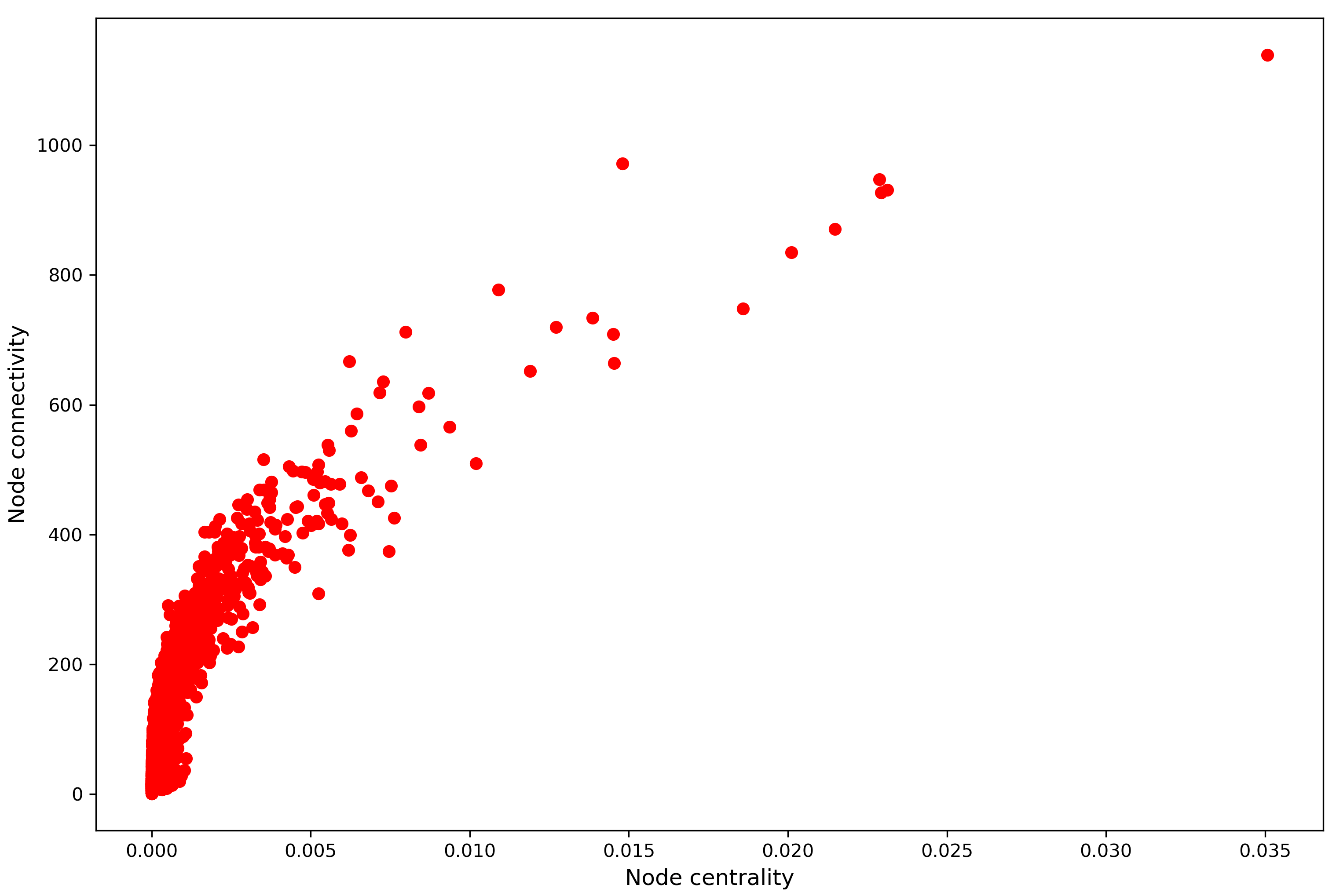
We can also compare the in- and out-degrees of the nodes in this network which would give us information about counties that export to more counties than they import from and vice versa. For example, in the figure below, points below the diagonal line represent counties that import from more places than they export to.

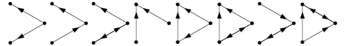
To address the last two prompt questions, we are essentially concerned with network connectness. In directed networks such as this one, we can distinguish between strongly connected and weakly connected notions. A network is weakly connected if there is an undirected path between any pair of nodes (i.e., ignoring edge direction), and strongly connected if there is a directed path between every pair of vertices (i.e., only following edge direction) [3]. The networks below are all weakly but not strongly connected:
NetworkX can help answer these questions for our network, using existent and intuitive functionality. Executing:
nx.is_strongly_connected(G)
nx.is_weakly_connected(G)
will return False for both. This means that using the already established connections and directions, not all nodes can be reached by all other nodes. If we ignore the directions (weak connectedness) this remains the case. This implies that our network is made up of more than one components, i.e., connected subgraphs of our network. For example the undirected graph below has three components:

Strongly connected components in directed graphs also consider the direction of each edge. For example the directed graph below also has three components:
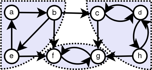
Weakly connected components in directed graphs are identified by ignoring the direction of the edges, so in the above example, the graph has one weakly connected component.
To examine these components for our network we can use nx.strongly_connected_components(G) and nx.weakly_connected_components(G) which would produce lists of all strongly or weakly connected components in the network, respectively, in this case 1156 strongly connected and 111 weakly connected components. In both cases this includes one giant component including most of the network nodes, 1220 in the strongly connected and 2348 in the weakly connected case, and hundreds of small components with fewer than 10 nodes trading between them.

Finally, we can draw these strongly and weakly connected components. In the top row of figure below, I show the largest components identified by each definition and in the bottom row all other components in the network, according to each definition.

References:
[1] Broido, A.D., Clauset, A. Scale-free networks are rare. Nat Commun 10, 1017 (2019). https://doi.org/10.1038/s41467-019-08746-5
[2] http://networksciencebook.com/
[3] Skiena, S. “Strong and Weak Connectivity.” §5.1.2 in Implementing Discrete Mathematics: Combinatorics and Graph Theory with Mathematica. Reading, MA: Addison-Wesley, pp. 172-174, 1990.