MOEAFramework Training Part 2: Optimization of an External Problem

Part 2 of our MOEAFramework Training covers the optimization of the lake problem using your choice of algorithms. The relevant files and folders for this part of the training have been added to the Github repo. These are:

  • lib folder
  • global.properties
  • generate_samples.sh
  • settings.sh
  • run.sh
  • algorithm parameter files

In general, the goal of diagnostics is to conduct the optimization of a test problem (the lake problem in our case) using different evolutionary algorithms and to evaluate the performance of these algorithms.

Steps for Optimization

  • New files and folders:
    1. lib folder: The lib folder contains the Java libraries with source code for the evolutionary algorithms, libraries that may be called from within the algorithms, and a Java version of Borg. Unzip this folder before starting the training.
    2. global.properties: This file is necessary for MOEAFramework to recognize the external problem. Lines 1 and 2 indicate the name of the problem and the class that had been indicated in the lake.java file and the resulting lake.class file.
  • settings.sh: This file defines the relevant parameters for the optimization.
    1. Line 1 contains the names of the algorithms to be tested.
    2. Line 2 indicates the number of samples of the algorithms that the user wants to test. Each algorithm has a set of parameters that characterize it. These parameters can be anything from population size to crossover rate. Each parameter has an acceptable range of values. In a diagnostics study, it is typical to take multiple Latin Hypercube samples within these ranges to obtain different instances of the algorithm to test.
    3. Line 3 indicates the number of seeds (number of replicate trials)
    4. Line 4 indicates the name of the problem (name of the .class file)
    5. Line 9 shows that the relevant Java files are all in the lib folder
    6. Line 45 is where the user states the epsilons for each objective
    7. Line 50 is where the user specifies the number of functional evaluations

Run this script by typing ./settings.sh

  • generate_samples.sh: The next step is to generate NSAMPLES of the MOEAs specified in the settings.sh file. In order to do this, you must provide a text file with the relevant parameter ranges for each algorithm. I have added these parameter files for the 5 MOEAs that I have chosen to use, which represent a wide range of different styles and generations of MOEAs, from the older, but most commonly downloaded algorithm, NSGA-II, to some of the newer reference point and reference vector algorithms, NSGA-III and RVEA. These files contain the names of the parameters and the relevant range of values. It is important to note that these parameter ranges might not always be relevant to every problem. Some parameter values depend on the number of objectives and/or decision variables. General rules and defaults for algorithm and operator parameters can be found here and here.

Run this script by typing ./generate_samples.sh

This script utilizes the SampleGenerator from MOEAFramework to produce a corresponding sample file, with each row corresponding to a different parameterization of that algorithm.

  • run.sh: This bash script is where the meat of the optimization takes place. The script reads in the parameter/sample files and information from the settings.sh file to set up the problem. Then, through a for-loop, the script uses the DetailedEvaluator from MOEAFramework to perform the optimization for all algorithms, seeds, and samples. The arguments for this java command are intuitive- the only unspecified one being the f flag, which states, in this case, that the output be reported every 100 functional evaluations.

Run this script by typing ./run.sh

This script will submit a job for each seed of each algorithm and create a directory called data_raw to store the optimization results. Each job will take up 1 processor. All parameterizations of the algorithm will be running on the same processor. Depending on the complexity of the problem, the number of functional evaluations, and the number of parameterizations, the optimization of the problem could take a very long time. It is important to start off with small trials to understand how a problem scales with increased NFE, parameterizations, and Monte Carlo sampling if that is relevant to your problem. Below is a table outlining some examples of timing trials that one can do to determine problem complexity as well as to determine approximate wall clock time for trials.

No. of Seeds No. of Parameterizations No. of MC Samples NFE Time
1 1 1000 25,000 16 minutes
1 1 5000 25,000 1 hr, 23 minutes
10 1 1000 25,000 1 hr, 24 minutes
1 2 1000 25,000 32 minutes
10 1 10000 25,000 3 hours
1 100 1000 25,000 25 hours
1 2 1000 200,000 4 hours

This finishes up Part 2 of the MOEAFramework training. In Part 3, we will go over how to evaluate the performance of our algorithms by generating metrics.


Credits: All of the bash scripts in the training repo are written by Dave Hadka, the creator of MOEAFramework.

Parasol: an open source, interactive parallel coordinates library for multi-objective decision making

For my entire graduate student career, I’ve gravitated toward parallel coordinates plots… in theory. These plots scale well for high-dimensional, multivariate datasets (Figure 1); and therefore, are ideal for visualizing multi-objective optimization solutions. However, I found it difficult to create parallel coordinates plots with the aesthetics and features I wanted.

basic

Figure 1. An example parallel coordinates plot that visualizes the “cars” dataset. Each polyline represents the attributes of a particular car and similar types of cars have the same color polyline.

I was amazed when I learned about Parcoords–a D3-based parallel coordinates library for creating interactive web visualizations. D3 (data-driven documents) is a popular JavaScript library which offers developers total control over their visualizations. Building upon D3, the Parcoords library is capable of creating beautiful, functional, and shareable parallel coordinates visualizations. Bernardo (@bernardoct), David (@davidfgold), and Jan Kwakkel saw the potential of Parcoords, each developing tools (tool #1 and tool #2) and additional features. Exploring these tools, I liked how they linked parallel coordinates plots with interactive data tables using the SlickGrid library. Being able to inspect individual solutions was so powerful. Plus, the features in Parcoords like interactive brushing, reorderable axes, easy-to-read axes labels, blew my mind. Working with large datasets was suddenly intuitive!

The potential of these visualizations was inspiring, but learning web development (i.e., JavaScript, CSS, and HTML) was daunting. Not only would I have to learn web development, I would need to learn how to use multiple libraries, and figure out how to link plots and tables together to make these types of tools. It just seemed like too much work for this sort of visualization to catch on… and that was the inspiration behind Parasol. Together with my advisor (Joe Kasprzyk, @jrk301) and Josh Jacobson, we built Parasol to streamline the development of linked, web-based parallel coordinates visualizations.

We’ve published a paper describing the Parasol library in Environmental Modelling & Software, so please refer to that paper for an in-depth discussion:

Raseman, William J., Joshuah Jacobson, and Joseph R. Kasprzyk. “Parasol: An Open Source, Interactive Parallel Coordinates Library for Multi-Objective Decision Making.” Environmental Modelling & Software 116 (June 1, 2019): 153–63. https://doi.org/10.1016/j.envsoft.2019.03.005.

In this post, I’ll provide a brief, informal overview of Parasol’s features and some example applications.

Cleaning up the clutter with Parasol

Parallel coordinates can visualize large, high-dimensional datasets, but at times they can become difficult to read when polylines overlap and obscure the underlying data. This issue is known as “overplotting” (see Figure 1 and 2a). That’s why we’ve implemented a suite of “clutter reduction techniques” in Parasol that enables the user to tidy up the data dynamically.

Probably the most powerful clutter reduction technique is brushing (Figure 2b). Using interactive filters, the user can filter out unwanted data and focus on a subset of interest. Users can also alter polyline transparency to reveal density in the data (Figure 2c), assign colors to polylines (Figure 2d), and apply “curve bundling” to group similar data together in space (Figure 2e). These clutter reduction techniques can also be used simultaneously to enhance the overall effect (Figure 2f).

figure-1

Figure 2. Vanilla parallel coordinates plots (a) suffer from “overplotting”, obscuring the underlying data. Interactive filters (b: brushes) and other clutter reduction techniques (c-f) alleviate these issues.

Another cool feature of both Parcoords and Parasol is dynamically reorderable axes (Figure 3). With static plots, the user can only look at pairwise relationships between variables plotted on adjacent axes. With reorderable axes, they are free to explore any pairwise comparison they choose!

reorderable

Figure 3. Users can click and drag axes to interactively reorder them.

API resources

The techniques described above (and many other features) are implemented using Parasol’s application programming interface (API). In the following examples (Figures 4-6), elements of the API are denoted using ps.XXX(). For a complete list of Parasol features, check out the API Reference on the Parasol GitHub repo.

Example applications

The applications (shown in Figures 4-6) demonstrate the library’s ability to create a range of custom visualization tools. To open the applications, click on the URL in the caption below each image and play around with them for yourself. Parallel coordinates plots are meant to be explored!

Example app #1 (Figure 4) illustrates the use of linked parallel coordinates plots. If the user applies a brush on one plot, the changes will be reflected on both linked plots. Furthermore, app developers can embed functionalities of the Parasol API using HTML buttons. For instance, if the user applies multiple brushes to the plots, they can reset all the brushes by clicking on the “Reset Brushes” button which invokes ps.resetSelections(). Other functionalities allow the user to remove the brushed data from a plot [ps.removeData()] or keep only the brushed data [ps.keepData()] and export brushed data [ps.exportData()].

Example app #2 (Figure 5) demonstrates utility of linking data tables to parallel coordinates plots. By hovering a mouse over a data table row, the corresponding polyline will become highlighted. This provides the user with the ability to fine-tune their search and inspect individual data points–a rare feature in parallel coordinates visualizations.

App #2 also demonstrates how k-means clustering [ps.cluster()] can enhance these visualizations by sorting similar data into groups or clusters. In this example, we denote the clusters using color. Using a slider, users can alter the number of clusters (k) in real-time. Using checkboxes, they can customize which variables are included in the clustering calculation.

Example app #3 also incorporates clustering but encodes the clusters using both color and “curve bundling”. With curve bundling, polylines in the same cluster are attracted to one another in the whitespace between the axes. Bundling is controlled by two parameters: 1) curve smoothness and 2) bundling strength. This app allows the user to play around with these parameters using interactive sliders.

Similar to highlighting, Parasol features “marking” to isolate individual data points. Highlighting is temporary, when the user’s mouse leaves the data table, the highlight will disappear. By clicking a checkbox on the data table, the user can “mark” data of interest for later. Although marks are more subtle than highlights, they provide a similar effect.

Lastly, this app demonstrates the weighted sum method [ps.weightedSum()]. Although we don’t generally recommend aggregating objectives in multi-objective optimization literature, there are times when assigning weights to different variables and calculating an aggregate score can be useful. In the above example, the user can input different combinations of weights with text input or using sliders.

We want to hear from you!

For the most up-to-date reference on Parasol, see the GitHub repo, and for additional examples, check out the Parasol webpage. We would love to hear from you, especially if you have suggestions for new features or bugs to report. To do so, post on the issues page for the repo.

If you make a Parasol app and want to share it with the world, post a link in the comments below. It would be great to see what people create!

Parasol tutorials

If you aren’t sure how to start developing Parasol applications, don’t worry. In subsequent posts, I’ll take you step-by-step through how to make some simple apps and give you the tools to move on to more complicated, custom applications.

Those tutorials are currently under development and can be found on the Parasol GitHub wiki.

R-Markdown

What Is R-Markdown? Why We Are Interested in It?

A few years ago, a very dear friend of mine told me about R-Markdown. I was working on a report, and he said that I should try this very cool tool. I did so but not immediately. I started with an “if it ain’t broke, don’t fix it” attitude. However, I quickly realized that R-Markdown really is helpful—well, at least in many situations.

What is R-Markdown? It is a script-based text-development platform for preparing high-quality papers and reports. This strong tool is effective for use on complicated documents that have various types of diagrams and tables. R-Markdown is a distribution of Markdown language for R. More information about Markdown can be found here.
Personally, I’ve found R-Markdown to be a powerful tool for creating tutorial documents that include figures, tables, blocks of code, and more. R-Markdown can also be very helpful for working on papers; you can have everything in the same place. For example, as you will see in this tutorial, you can generate your figures and tables within documents. Because it is script-based, R-Markdown is reproducible; you will always get the same text format and figure quality. Therefore, if you want to have a professional-looking CV or are working on a paper or report, I suggest giving R-Markdown a try. The tool might become your new best friend.

install R Markdown

There are two steps to install R-Markdown:

1- Install R Markdown


# 1- Install R Markdown

install.packages("rmarkdown")
library(rmarkdown)


2- You also need to install “tinytex”. You can use the following command to install and load “tinytex”

tinytex::install_tinytex()
library(tinytex)

Create an R-Markdown Document

To create your first R-Markdown document, start by installing R-Markdown. Then, open the “File” menu, and click on “New File.” From the dropdown menu, select “R-Markdown.” Doing so will open an R-Markdown file in your RStudio. The file comes with very simple and informative instructions.

On a side note, I use RStudio, which is a popular and user-friendly integrated development environment (IDE) for R. You can find more information about it (here).

Publish your document

The final format of your output document can be pdf, html, or word. To select your favorite output and generate your final document, click on “Knit,” which opens a dropdown menu. Select the output format—for example, pdf—and it will generate your document.

Components of an R-Markdown Code

R-Markdown documents usually include meta-data, text, and code chunks. The following sections briefly describe the components, and more information can be found on R-Markdown’s website.

Meta-Data

When generating documents, R-Markdown requires some initial information and instructions. These can include general data about the documents—for example, date, title, output format, and author’s name.

Text

Text parts in R-Markdown follow the tradition of other document-markup languages such as LaTex (see here). However, R-Markdown is easier than LaTex. Basically, authors can use scripts to adjust document formatting. Many details can be listed about R-Markdown’s text-formatting commands, but I am not going to explain them in this short tutorial. These cheat sheets here and here provide enough information to get you started on writing an R-Markdown document. A few examples: #header creates headers, ‘[]()’ creates a hyperlink. You can use $ to insert equations (e.g. $y=ax^{2}+ bx +c$).

Code Chunks

Different types of code chunks can be used in R-Markdown; the types depend on application of the code. You might want to show your code when you develop an instruction. You can also write a code solely for generating a figure, but you may not want to show the code itself. The following is a generated timeline figure of Michael Jackson’s life; you can see the code.

#You need to uncomment ``` lines

#```{r timeline}

# This code chunck generates a timeline of Michael Jackson life.

library(timelineS)
timelineS(mj_life, main = "Life of Michael Jackson",label.cex =   0.7)

#```

Adding Tables

There are different libraries available in R for generating nice-looking tables. Here I use knitr.

#You need to uncomment ``` lines

#```{r table}

library(ggplot2)

library(knitr)
kable(mpg[1:8,])

#```

Adding Figures to Your Document

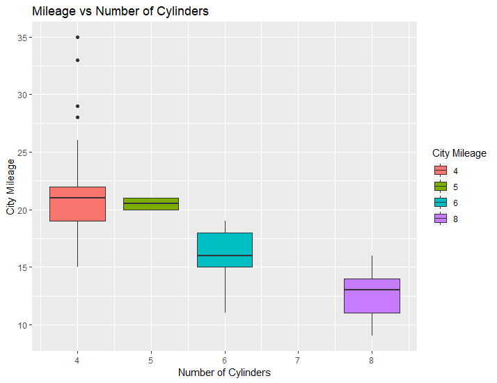
R-Markdown allows you to generate plots in your documents. For example, you can use ggplot, which is a powerful figure-creation library in R, to create and insert a plot into your document. See the following. If you include echo = FALSE to the header of your code chunk, the code would disappear on your final pdf file.

#You need to uncomment ``` lines

#```{r ggplot} 

library(ggplot2)

# MPG dataset is already available in ggplot2, I use it to generate the following figure

ggplot(mpg, aes(x=cyl, y=cty)) + geom_boxplot(aes(fill=factor(cyl))) + 
    labs(title="Mileage vs Number of Cylinders", 
         x="Number of Cylinders",
         y="City Mileage",
         fill="City Mileage")

#```

Radial convergence diagram (aka chord diagram) for sensitivity analysis results and other inter-relationships between data

TLDR; Python script for radial convergence plots that can be found here.

You might have encountered this type of graph before, they’re usually used to present relationships between different entities/parameters/factors and they typically look like this:

From https://datavizcatalogue.com/methods/non_ribbon_chord_diagram.html

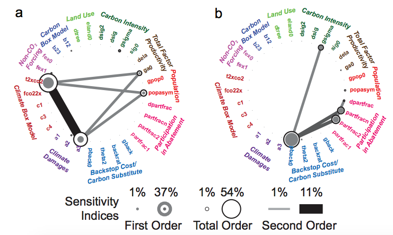
In the context of our work, I have seen them used to present sensitivity analysis results, where we are interested in both the individual significance of a model parameter, but also the extent of its interaction with others. For example, in Butler et al. (2014) they were used to present First, Second, and Total order parameter sensitivities as produced by a Sobol’ Sensitivity Analysis.

From Butler et al. (2014)

I set out to write a Python script to replicate them. Calvin Whealton has written a similar script in R, and the same functionality also exists within Rhodium. I just wanted something with a bit more flexibility, so I wrote this script that produces two types of these graphs, one with straight lines and one with curved (which are prettier IMO). The script takes dictionary items as inputs, either directly from SALib and Rhodium (if you are using it to display Sobol results), or by importing them (to display anything else). You’ll need one package to get this to run: NetworkX. It facilitates the organization of the nodes in a circle and it’s generally a very stable and useful package to have.

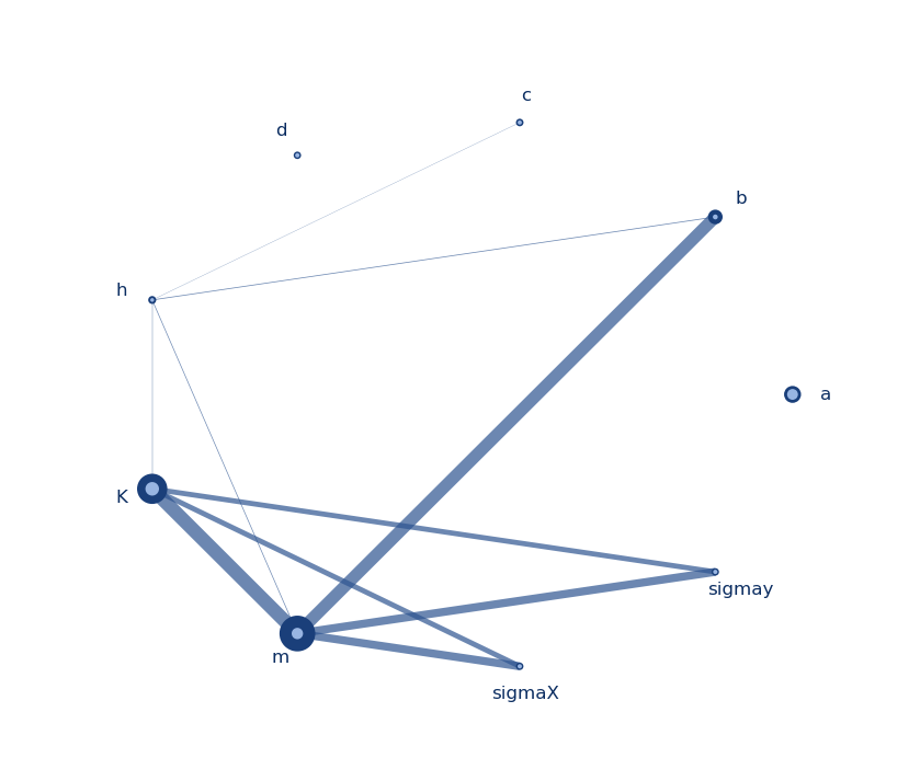
Graph with straight lines
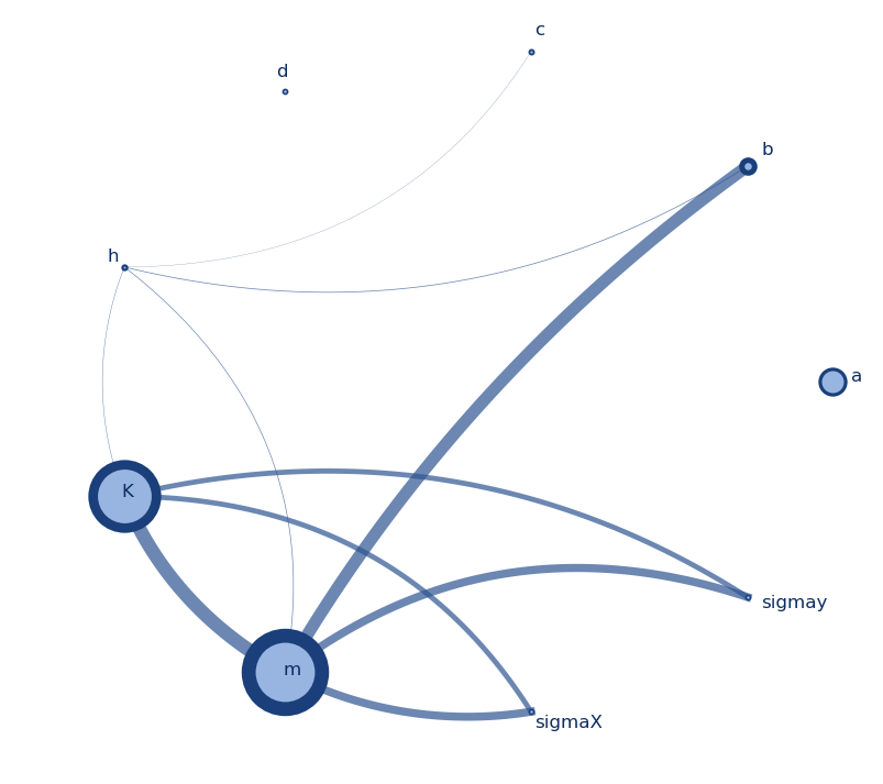
Graph with curved lines

I made these graphs to display results the results of a Sobol analysis I performed on the model parameters of a system I am studying (a, b, c, d, h, K, m, sigmax, and sigmay). The node size indicates the first order index (S1) per parameter, the node border thickness indicates the total order index (ST) per parameter, and the thickness of the line between two nodes indicates the secord order index (S2). The colors, thicknesses, and sizes can be easily changed to fit your needs. The script for these can be found here, and I will briefly discuss what it does below.

After loading the necessary packages (networkx, numpy, itertools, and matplotlib) and data, there is some setting parameters that can be adapted for the figure generation. First, we can define a significance value for the indices (here set to 0.01). To keep all values just set it to 0. Then we have some stylistic variables that basically define the thicknesses and sizes for the lines and nodes. They can be changed to get the look of the graph to your liking.

# Set min index value, for the effects to be considered significant
index_significance_value = 0.01
node_size_min = 15 # Max and min node size
node_size_max = 30
border_size_min = 1 # Max and min node border thickness
border_size_max = 8
edge_width_min = 1 # Max and min edge thickness
edge_width_max = 10
edge_distance_min = 0.1 # Max and min distance of the edge from the center of the circle
edge_distance_max = 0.6 # Only applicable to the curved edges

The rest of the code should just do the work for you. It basically does the following:

  • Define basic variables and functions that help draw circles and curves, get angles and distances between points
  • Set up graph with all parameters as nodes and draw all second order (S2) indices as lines (edges in the network) connecting the nodes. For every S2 index, we need a Source parameter, a Target parameter, and the Weight of the line, given by the S2 index itself. If you’re using this script for other data, different information can fit into the line thickness, or they could all be the same.
  • Draw nodes and lines in a circular shape and adjust node sizes, borders, and line thicknesses to show the relative importance/weight. Also, annotate text labels on each node and adjust their location accordingly. This produces the graph with the straight lines.
  • For the graph with the curved lines, define function that will generate the x and y coordinates for them, and then plot using matplotlib.

I would like to mention this script by Enrico Ubaldi, based on which I developed mine.