Determining the appropriate number of samples for a sensitivity analysis

Sensitivity analysis aims at assessing the relative contributions of the different sources of uncertainty to the variability in the output of a model. There are several mathematical techniques available in the literature, with variance-based approaches being the most popular, and variance-based indices the most widely used, especially “total effects” indices. Literature also provides several estimators/approximators for these indices (reviews can be found here [1]), which typically need N = n × (M + 2) model evaluations (and resulting outputs), where M is the number of uncertain inputs and n is some factor of proportionality that is selected ad hoc, depending on the complexity of the model (e.g. linear or not, monotonic or not, continuous or not). [Note: Literature typically refers to n as the number of samples and to N as the number of model evaluations, and this is how I’ll be using them also.]

The generation of this set of model runs of size N is by far the most computationally demanding step in the calculation of variance-based indices, and a major limitation to their applicability, as it’s typically in the order of magnitude of thousands [2] (n typically >1000). For example, consider a model with 5 uncertain inputs that takes 1 minute to run. To appropriately estimate sensitivity indices for such a model, we would potentially need about N=7000 model evaluations, which would take almost 5 days on a personal computer, excluding the time for the estimator calculation itself (which is typically very short).

The aim is therefore to pick the minimum n needed to ensure our index calculation is reliable. Unfortunately, there is no hard and fast rule on how to do that, but the aim of this post is to illuminate that question a little bit and provide some guidance. I am going off the work presented here [3] and elsewhere, and the aim is to perform the estimation of sensitivity indices repeatedly, using an increasing number of n until the index values converge.

I will be doing this using a fishery model, which is a nonlinear and nonmonotonic model with 9 parameters. Based on previous results suggesting that 3 of these parameters are largely inconsequential to the variability in the output, I’ll be fixing them to their nominal values. I’ll be using SALib to perform the analysis. My full script can be found here, but I’ll only be posting the most important snippets of code in this post.

First, I set up my SALib ‘problem’ and create arrays to store my results:

# Set up dictionary with system parameters
problem = {
  'num_vars': 6,
  'names': ['a', 'b', 'c','h',
            'K','m'],
  'bounds': [[ 0.002, 2],
             [0.005, 1],
             [0.2, 1],
             [0.001, 1],
             [100, 5000],
             [0.1, 1.5]]
}

# Array with n's to use
nsamples = np.arange(50, 4050, 50)

# Arrays to store the index estimates
S1_estimates = np.zeros([problem['num_vars'],len(nsamples)])
ST_estimates = np.zeros([problem['num_vars'],len(nsamples)])

I then loop through all possible n values and perform the sensitivity analysis:

# Loop through all n values, create sample, evaluate model and estimate S1 & ST
for i in range(len(nsamples)):
    print('n= '+ str(nsamples[i]))
    # Generate samples
    sampleset = saltelli.sample(problem, nsamples[i],calc_second_order=False)
    # Run model for all samples
    output = [fish_game(*sampleset[j,:]) for j in range(len(sampleset))]
    # Perform analysis
    results = sobol.analyze(problem, np.asarray(output), calc_second_order=False,print_to_console=False)
    # Store estimates
    ST_estimates[:,i]=results['ST']
    S1_estimates[:,i]=results['S1']

I can then plot the evolution of these estimates as n increases:

Evolution of first order and total order indices with increasing number of samples (n)

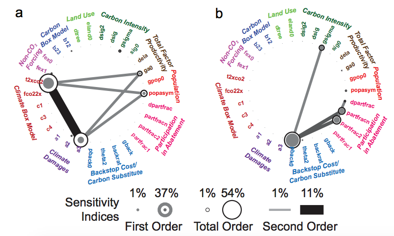
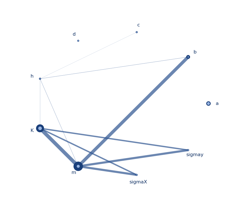
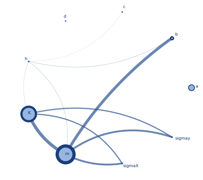
What these figures tell us is that choosing an n below 1000 for this model would potentially misestimate our indices, especially the first order ones (S1). As n increases, we see the estimates becoming less noisy and converging to their values. For more complex models, say, with more interactive effects, the minimum n before convergence could actually be a lot higher. A similar experiment by Nossent et al. [3] found that convergence was reached only after n=12,000.

An observation here is that the values of the total indices (ST) are higher than those of the the first order indices (S1), which makes sense, as ST includes both first order effects (captured by S1) and second order effects (i.e. interactions between the factors). Another observation here is that the parameters with the most significant effects (m and K) converge much faster than parameters with less impact on the output (a and b). This was also observed by Nossent et al. [3].

Finally, sensitivity analysis is often performed for the purposes of factor prioritization, i.e. determining (often rank-ordering) the most important parameters for the purposes of, for example, deciding where to devote most calibration efforts in the model or most further analysis to reduce the uncertainty in a parameter. The figures below show the evolution of that rank-ordering as we increase n.

Evolution of parameter ranking based on first order and total order indices with increasing number of samples (n)

These figures show that with a number of samples that is too small, we could potentially misclassify a factor as important or unimportant when it actually is not.

Now, one might ask: how is this useful? I’m trying to minimize my n, but you’ve just made me run way too many model evaluations, multiple times, just to determine how I could have done it faster? Isn’t that backwards?

Well, yes and no. I’ve devoted this time to run this bigger experiment to get insight on the behavior of my model. I have established confidence in my index values and factor prioritization. Further, I now know that n>1500 would probably be unnecessary for this system and even if the model itself or my parameter ranges change. As long as the parameter interactions, and model complexity remain relatively the same, I can leverage this information to perform future sensitivity analyses, with a known minimum n needed.

References:
[1] A. Saltelli, P. Annoni, I. Azzini, F. Campolongo, M. Ratto, and S. Tarantola, “Variance based sensitivity analysis of model output. Design and estimator for the total sensitivity index,” Computer Physics Communications, vol. 181, no. 2, pp. 259–270, Feb. 2010, doi: 10.1016/j.cpc.2009.09.018.
[2] F. Pianosi and T. Wagener, “A simple and efficient method for global sensitivity analysis based on cumulative distribution functions,” Environmental Modelling & Software, vol. 67, pp. 1–11, May 2015, doi: 10.1016/j.envsoft.2015.01.004.
[3] J. Nossent, P. Elsen, and W. Bauwens, “Sobol’ sensitivity analysis of a complex environmental model,” Environmental Modelling & Software, vol. 26, no. 12, pp. 1515–1525, Dec. 2011, doi: 10.1016/j.envsoft.2011.08.010.

Factor prioritization and factor fixing: how to know what’s important

There have been several blogposts on sensitivity analysis (SA) on this blog, focusing primarily on tools to perform it (e.g., SALib) and visualize outputs. Today I’ll be providing some more information on how to decide which factors are most important in affecting our output and which are largely inconsequential. Picking what is actually important for what we care about is obviously largely subjective and case-dependent, but this post is meant to provide some support to that exercise. I will performing a Global Sensitivity Analysis of a system resulting in a rank-ordering of the most important factors driving variability in the output (i.e., factor prioritization), which can be used to decide which are the least influential factors that can be fixed to simplify the model (i.e., factor fixing) [1].

The scripts I’ll be using can be found here, and I’ll be using a fishery model to demonstrate, as a simplified representation of a socio-ecological system we’re trying to manage. The procedure I’ll be following has been based on the work found in [2-4].

The idea is this:
I generate 1000 samples of uncertain factors that might be driving variability in my outcome (let’s call this Set 1). I apply a certain SA method on the samples and the outcomes and get sensitivity indices for each of my factors, ranking them from most important to least. Where do I draw the line between important and not important?
We can create a Set 2, using only the T most important factors from our Set 1 sample, and fixing all other factors to their default values.
We can also create a Set 3, now fixing the T most important factors to defaults and using the sampled values of all other factors from Set 1.

If we classified our important and unimportant factors correctly, then the correlation coefficient between the model outputs of Set 2 and Set 1 should approximate 1 (since we’re fixing all factors that don’t matter), and the correlation coefficient between outputs from Set 3 and Set 1 should approximate 0 (since the factors we sampled are inconsequential to the output).

Here’s how it’s done using SALib and the Delta Method (in the interest of space I’ll only share the most important snippets of code, you need the full scripts to make it run, which are in this repository) :

First we set up our problem using SALib nomenclature, generate 1000 samples using all factors (which will be our Set 1) and run the model for all 1000 samples. Finally we analyze our output using the Delta method. (This should take a couple minutes to run on your personal computer.)

# Set up dictionary with system parameters
problem = {
  'num_vars': 9,
  'names': ['a', 'b', 'c', 'd','h',
            'K','m','sigmaX','sigmaY'],
  'bounds': [[ 0.002, 2],
             [0.005, 1],
             [0.2, 1],
             [0.05, 0.2],
             [0.001, 1],
             [100, 5000],
             [0.1, 1.5],
             [0.001, 0.01],
             [0.001, 0.01]]
}

defaultvalues = np.array([0.005, 0.5, 0.5, 0.1, 0.1, 2000, 0.7, 0.004, 0.004])

# Generate samples
nsamples = 1000
X_Set1 = latin.sample(problem, nsamples) # This is Set 1

# Run model for all samples
output = [fish_game(*X_Set1[j,:]) for j in range(nsamples)]

# Perform analysis
results = delta.analyze(problem, X_Set1, np.asarray(output), print_to_console=True)

This will produce output like below, telling as the Delta indices of each of the sampled parameters, the confidence internals of those, the First order Sobol indices of the parameters, and their equivalent confidence intervals.

Parameter delta delta_conf S1 S1_conf
a 0.102206 0.021648 0.052453 0.033510
b 0.139056 0.018379 0.065019 0.022922
c 0.090550 0.016505 0.006749 0.007823
d 0.076542 0.005375 0.003923 0.009140
h 0.097057 0.016910 0.021070 0.009275
K 0.267461 0.020434 0.190670 0.057397
m 0.252351 0.040149 0.315562 0.031664
sigmaX 0.076175 0.014001 0.005930 0.005333
sigmaY 0.075390 0.015346 0.004970 0.011557

Without further analysis, one simple way of determining whether a parameter is unimportant is to check whether the confidence interval of its value overlaps 0 (i.e., subtract delta_conf from delta). For our particular results, this doesn’t seem to be the case for any of our delta values, though it does happen for some of the S1 values (c, d, sigmaY). You can refer to this post for discussion on what this might mean.
Looking at the delta values, we can clearly see two factors coming up top (K and m), followed by b, and a closely behind it. The rest of the parameters are reduced in their importance in small decrements after that. So where should we draw the line of importance? Another simple way is to use a threshold (say, 0.1) as a cutoff value [3], but one could argue over including a and not h, given how close their indices are and the wider confidence interval of a (see also the appendix below on this).

But, let’s continue with our analysis. What I am doing below is the following. First, I sort the factors from most to least important based on my results for the delta indices. Then, I create my Sets 2 and 3 on which I’ll be iteratively replacing the values of important factors with either those from Set 1 or with defaults. Finally, I loop through all possible numbers of important factors (1 to 9), generate Sets 2 and 3, calculate outputs for all samples in each, and calculate their correlation with the outputs from Set 1. (This should take 20-30 minutes to run on your personal computer.)

# Sort factors by importance
factors_sorted = np.argsort(results['delta'])[::-1]

# Set up DataFrame of default values to use for experiment
X_defaults = np.tile(defaultvalues,(nsamples, 1))

# Create initial Sets 2 and 3
X_Set2 = np.copy(X_defaults)
X_Set3 = np.copy(X_Set1)

for f in range(1, len(factors_sorted)+1):
    ntopfactors = f
    
    for i in range(ntopfactors): #Loop through all important factors
        X_Set2[:,factors_sorted[i]] = X_Set1[:,factors_sorted[i]] #Fix use samples for important
        X_Set3[:,factors_sorted[i]] = X_defaults[:,factors_sorted[i]] #Fix important to defaults
    
    # Run model for all samples    
    output_Set2 = [fish_game(*X_Set2[j,:]) for j in range(nsamples)]
    output_Set3 = [fish_game(*X_Set3[j,:]) for j in range(nsamples)]
    
    # Calculate coefficients of correlation
    coefficient_S1_S2 = np.corrcoef(output,output_Set2)[0][1]
    coefficient_S1_S3 = np.corrcoef(output,output_Set3)[0][1]

I can also plot the outputs from each iteration, which should look something like this (this is animated to show all figures, in the interest of space):

The figures above tell us the following:
If we choose one important factor (K) and fix all other parameters our outputs don’t really capture the variability of outcomes produced when considering all nine (this is also a case against one-at-a-time type analyses). The coefficient of correlation between Sets 1 and 2 is pretty low (0.44) suggesting we’re still missing important parameters. We’re doing a better job by actually fixing our most important parameter and varying all others (figure on the right, with R=0.763).
Adding the second most important factor (m), shifts things significantly to the right direction, by increasing our coefficient on the right and reducing the one on the left to R=0.203.
There is only a slight improvement with the addition of the third factor (b), but with the inclusion of the fourth (a), our reduced model is already looking very close to the full, with R=0.94. Our counter model excluding these four factors (on the right) also has a very low coefficient of R=0.025.
One could consider this performance sufficient, with the model reduced to four parameters instead of nine. Further adding parameter h and then c would further improve the values to a near perfect match between Set 2 and Set 1, but this is where subjectivity takes over, depending on the cost of adding these variables and how much we care about fidelity in this case.
It is also clear that it is likely safe to fix the last three parameters, as in this case they don’t have any consequential effects on our outcomes.

References:
[1] Saltelli, Andrea, et al.  Global Sensitivity Analysis: The Primer. (2008)
[2] T. H. Andres, “Sampling methods and sensitivity analysis for large parameter sets,” Journal of Statistical Computation and Simulation, vol. 57, no. 1–4, pp. 77–110, Apr. 1997, doi: 10.1080/00949659708811804.
[3] Y. Tang, P. Reed, T. Wagener, and K. van Werkhoven, “Comparing sensitivity analysis methods to advance lumped watershed model identification and evaluation,” Hydrology and Earth System Sciences, vol. 11, no. 2, pp. 793–817, Feb. 2007, doi: https://doi.org/10.5194/hess-11-793-2007.
[4] J. Nossent, P. Elsen, and W. Bauwens, “Sobol’ sensitivity analysis of a complex environmental model,” Environmental Modelling & Software, vol. 26, no. 12, pp. 1515–1525, Dec. 2011, doi: 10.1016/j.envsoft.2011.08.010.


Appendix:
Another way to identify a threshold of importance to classify parameters, is to add a dummy parameter to your model, that does nothing. Reperforming my SA for this same system including the dummy, produces this:

Parameter delta delta_conf S1 S1_conf
a 0.105354 0.019236 0.040665 0.020949
b 0.144955 0.023576 0.050471 0.014810
c 0.075516 0.009578 0.003889 0.006113
d 0.081177 0.011604 0.004186 0.007235
h 0.101583 0.010008 0.032759 0.021343
K 0.261329 0.022876 0.174340 0.038246
m 0.258345 0.024750 0.325690 0.052234
sigmaX 0.071862 0.008620 0.001681 0.006720
sigmaY 0.077337 0.009344 0.003131 0.006918
dummy 0.072546 0.008313 0.004176 0.009567

Even though the dummy does absolutely nothing in our model, it was still given a non-zero delta index by the analysis (0.07). One could use this as the cutoff value of non-importance and choose to fix parameters c, sigmaX, and sigmaY.

Radial convergence diagram (aka chord diagram) for sensitivity analysis results and other inter-relationships between data

TLDR; Python script for radial convergence plots that can be found here.

You might have encountered this type of graph before, they’re usually used to present relationships between different entities/parameters/factors and they typically look like this:

From https://datavizcatalogue.com/methods/non_ribbon_chord_diagram.html

In the context of our work, I have seen them used to present sensitivity analysis results, where we are interested in both the individual significance of a model parameter, but also the extent of its interaction with others. For example, in Butler et al. (2014) they were used to present First, Second, and Total order parameter sensitivities as produced by a Sobol’ Sensitivity Analysis.

From Butler et al. (2014)

I set out to write a Python script to replicate them. Calvin Whealton has written a similar script in R, and the same functionality also exists within Rhodium. I just wanted something with a bit more flexibility, so I wrote this script that produces two types of these graphs, one with straight lines and one with curved (which are prettier IMO). The script takes dictionary items as inputs, either directly from SALib and Rhodium (if you are using it to display Sobol results), or by importing them (to display anything else). You’ll need one package to get this to run: NetworkX. It facilitates the organization of the nodes in a circle and it’s generally a very stable and useful package to have.

Graph with straight lines
Graph with curved lines

I made these graphs to display results the results of a Sobol analysis I performed on the model parameters of a system I am studying (a, b, c, d, h, K, m, sigmax, and sigmay). The node size indicates the first order index (S1) per parameter, the node border thickness indicates the total order index (ST) per parameter, and the thickness of the line between two nodes indicates the secord order index (S2). The colors, thicknesses, and sizes can be easily changed to fit your needs. The script for these can be found here, and I will briefly discuss what it does below.

After loading the necessary packages (networkx, numpy, itertools, and matplotlib) and data, there is some setting parameters that can be adapted for the figure generation. First, we can define a significance value for the indices (here set to 0.01). To keep all values just set it to 0. Then we have some stylistic variables that basically define the thicknesses and sizes for the lines and nodes. They can be changed to get the look of the graph to your liking.

# Set min index value, for the effects to be considered significant
index_significance_value = 0.01
node_size_min = 15 # Max and min node size
node_size_max = 30
border_size_min = 1 # Max and min node border thickness
border_size_max = 8
edge_width_min = 1 # Max and min edge thickness
edge_width_max = 10
edge_distance_min = 0.1 # Max and min distance of the edge from the center of the circle
edge_distance_max = 0.6 # Only applicable to the curved edges

The rest of the code should just do the work for you. It basically does the following:

  • Define basic variables and functions that help draw circles and curves, get angles and distances between points
  • Set up graph with all parameters as nodes and draw all second order (S2) indices as lines (edges in the network) connecting the nodes. For every S2 index, we need a Source parameter, a Target parameter, and the Weight of the line, given by the S2 index itself. If you’re using this script for other data, different information can fit into the line thickness, or they could all be the same.
  • Draw nodes and lines in a circular shape and adjust node sizes, borders, and line thicknesses to show the relative importance/weight. Also, annotate text labels on each node and adjust their location accordingly. This produces the graph with the straight lines.
  • For the graph with the curved lines, define function that will generate the x and y coordinates for them, and then plot using matplotlib.

I would like to mention this script by Enrico Ubaldi, based on which I developed mine.

Magnitude-varying sensitivity analysis and visualization (Part 2)

In my last post, I talked about producing these flow-duration-curve-type figures for an output time-series one might be interested in, and talked about their potential use in an exploratory approach for the purpose of robust decision making. Again, the codes to perform the analysis and visualization are in this Github repository.

experiment_data_range

Fig. 1: Historical data vs. range of experiment outputs

As already discussed, there are multiple benefits for visualizing the output in such manner: we are often concerned with the levels and frequencies of extremes when making decisions about systems (e.g. “how bad is the worst case?”, “how rare is the worst case?”), or we might like to know how often we exceed a certain threshold (e.g. “how many years exceed an annual shortage of 1000 af?“). The various percentiles tell a different part of the story of how a system operates, the 5th percentile tells as that its level is exceeded 95% of the time, the 99th tells as that its level is only reached once in every 100 years in our records. These might seem obvious to the readers of this blog, but often times we perform our analyses for only some of these percentiles, “the worst event”, “the average”, etc., which is certainly very informative, but can potentially miss part of the bigger picture.

In this post I’m going to walk the reader through performing a sensitivity analysis using the output of an experiment using multiple Latin Hypercube Samples. The analysis will be magnitude-varying, i.e., it will be performed at different magnitudes of our output of interest. For this particular example, we aim to see what are the most significant drivers of shortage at the different levels it’s experienced by this user. In other words, if some factors appear to be driving the frequent small shortages experienced, are those factors the same for the rare large shortages?

To perform the sensitivity analysis, I am going to use SALib (featured in this blog multiple times already), to perform a Delta Moment-Independent Analysis [1] (also produces a first order Sobol sensitivity index [2]). You’ll probably need to install SALib if it’s not a package you’ve used already. I’m also going to use statsmodels, to perform a simple linear regression on the outputs and look at their R2 values. But, why, you might ask, perform not one, not two, but three sensitivity analyses for this? There are nuanced, yet potentially important differences between what the three methods capture:

Delta method: Look for parameters most significantly affecting the density function of observed shortages. This method is moment-independent, i.e., it looks at differences in the entire distribution of the output we’re interested in.
First order Sobol (S1): Look for parameters that most significantly affect the variance of observed outputs, including non-linear effects.
R2: Look for parameters best able to describe the variance of observed outputs, limited to linear effects.

Another important thing to note is that using the First order Sobol index, the total variance resulting from the parameters should equal 1. This means that if we sum up the S1’s we get from our analysis, the sum represents the variance described by the first order effects of our parameters, leaving whatever is left to interactions between our variables (that S1 cannot capture). The same holds using R2, as we are repeatedly fitting our parameters and scoring them on how much of the output variance they describe as a sole linear predictor (with no interactions or other relationships).

The following Python script will produce all three as well as confidence intervals for the Delta index and S1. The script essentially loops through all percentiles in the time-series and performs the two analyses for each one. In other words, we’re are looking at how sensitive each magnitude percentile is to each of the sampled parameters.

import numpy as np
import pandas as pd
import statsmodels.api as sm
from SALib.analyze import delta
# Load parameter samples
LHsamples = np.loadtxt('./LHsamples.txt')
params_no = len(LHsamples[0,:])
param_bounds=np.loadtxt('./uncertain_params.txt', usecols=(1,2))
# Parameter names
param_names=['IWRmultiplier','RESloss','TBDmultiplier','M_Imultiplier',
'Shoshone','ENVflows','EVAdelta','XBM_mu0','XBM_sigma0',
'XBM_mu1','XBM_sigma1','XBM_p00','XBM_p11']
# Define problem class
problem = {
'num_vars': params_no,
'names': param_names,
'bounds': param_bounds.tolist()
}
# Percentiles for analysis to loop over
percentiles = np.arange(0,100)
# Function to fit regression with Ordinary Least Squares using statsmodels
def fitOLS(dta, predictors):
# concatenate intercept column of 1s
dta['Intercept'] = np.ones(np.shape(dta)[0])
# get columns of predictors
cols = dta.columns.tolist()[-1:] + predictors
#fit OLS regression
ols = sm.OLS(dta['Shortage'], dta[cols])
result = ols.fit()
return result
# Create empty dataframes to store results
DELTA = pd.DataFrame(np.zeros((params_no, len(percentiles))), columns = percentiles)
DELTA_conf = pd.DataFrame(np.zeros((params_no, len(percentiles))), columns = percentiles)
S1 = pd.DataFrame(np.zeros((params_no, len(percentiles))), columns = percentiles)
S1_conf = pd.DataFrame(np.zeros((params_no, len(percentiles))), columns = percentiles)
R2_scores = pd.DataFrame(np.zeros((params_no, len(percentiles))), columns = percentiles)
DELTA.index=DELTA_conf.index=S1.index=S1_conf.index = R2_scores.index = param_names
# Read in experiment data
expData = np.loadtxt('./experiment_data.txt')
# Identify magnitude at each percentiles
syn_magnitude = np.zeros([len(percentiles),len(LHsamples[:,0])])
for j in range(len(LHsamples[:,0])):
syn_magnitude[:,j]=[np.percentile(expData[:,j], i) for i in percentiles]
# Delta Method analysis
for i in range(len(percentiles)):
if syn_magnitude[i,:].any():
try:
result= delta.analyze(problem, LHsamples, syn_magnitude[i,:], print_to_console=False, num_resamples=2)
DELTA[percentiles[i]]= result['delta']
DELTA_conf[percentiles[i]] = result['delta_conf']
S1[percentiles[i]]=result['S1']
S1_conf[percentiles[i]]=result['S1_conf']
except:
pass
S1.to_csv('./S1_scores.csv')
S1_conf.to_csv('./S1_conf_scores.csv')
DELTA.to_csv('./DELTA_scores.csv')
DELTA_conf.to_csv('./DELTA_conf_scores.csv')
# OLS regression analysis
dta = pd.DataFrame(data = LHsamples, columns=param_names)
# fig = plt.figure()
for i in range(len(percentiles)):
shortage = np.zeros(len(LHsamples[:,0]))
for k in range(len(LHsamples[:,0])):
shortage[k]=syn_magnitude[i,k]
dta['Shortage']=shortage
for m in range(params_no):
predictors = dta.columns.tolist()[m:(m+1)]
result = fitOLS(dta, predictors)
R2_scores.at[param_names[m],percentiles[i]]=result.rsquared
R2_scores.to_csv('./R2_scores.csv')

The script produces the sensitivity analysis indices for each magnitude percentile and stores them as .csv files.

I will now present a way of visualizing these outputs, using the curves from Fig. 1 as context.  The code below reads in the values for each sensitivity index, normalizes them to the range of magnitude at each percentile, and then plots them using matplotlib’s stackplot fuction, which stacks the contribution of each parameter to the sum (in this case the maximum of the resulting range)

I’ll go through what the code does in more detail:

First, we take the range boundaries (globalmax and globalmin) which give us the max and min values for each percentile. We then read in the values for each sensitivity index and normalize them to that range (i.e. globalmaxglobalmin for each percentile). The script also adds two more arrays (rows in the pandas dataframe), one representing interaction and one representing the globalmin, upon which we’re going to stack the rest of the values. [Note: This is a bit of a roundabout way of getting the figures how we like them, but it’s essentially creating a pseudo-stack for the globalmin, that we’re plotting in white.] 

The interaction array is only used when normalizing the S1 and R2 values, where we attribute to it the difference between 1 and the sum of the calculated indices (i.e. we’re attributing the rest to interaction between the parameters). We don’t need to do this for the delta method indices (if you run the code the array remains empty), but the reason I had to put it there was to make it simpler to create labels and a single legend later.

The plotting simply creates three subplots and for each one uses stackplot to plot the normalized values and then the edges in black. It is important to note that the colorblocks in each figure do not represent the volume of shortage attributed to each parameter at each percentile, but rather the contribution of each parameter to the change in the metric, namely, the density distribution (Delta Method), and the variance (S1 and R2). The code for this visualization is provided at the bottom of the post.

experiment_sensitivity_curves.png

Fig. 2: Magnitude sensitivity curves using three sensitivity indeces

The first thing that pops out from this figure is the large blob of peach, which represents the irrigation demand multiplier in our experiment. The user of interest here was an irrigation user, which would suggest that their shortages are primarily driven by increases in their own demands and of other irrigation users. This is important, because irrigation demand is an uncertainty for which we could potentially have direct or indirect control over, e.g. through conservation efforts.

Looking at the other factors, performing the analysis in a magnitude-varying manner, allowed us to explore the vulnerabilities of this metric across its different levels. For example, dark blue and dark green represent the mean flow of dry and wet years, respectively. Across the three figures we can see that the contribution of mean wet-year flow is larger in the low-magnitude percentiles (left hand side) and diminishes as we move towards the larger-magnitude percentiles.

Another thing that I thought was interesting to note was the difference between the S1 and the R2 plots. They are both variance-based metrics, with R2 limited to linear effects in this case. In this particular case, the plots are fairly similar which would suggest that a lot of the parameter effects on the output variance are linear. Larger differences between the two would point to non-linearities between changes in parameter values and the output.

The code to produce Fig. 2:

# Percentiles for analysis to loop over
percentiles = np.arange(0,100)
# Estimate upper and lower bounds
globalmax = [np.percentile(np.max(expData_sort[:,:],1),p) for p in percentiles]
globalmin = [np.percentile(np.min(expData_sort[:,:],1),p) for p in percentiles]
delta_values = pd.read_csv('./DELTA_scores.csv')
delta_values.set_index(list(delta_values)[0],inplace=True)
delta_values = delta_values.clip(lower=0)
bottom_row = pd.DataFrame(data=np.array([np.zeros(100)]), index= ['Interaction'], columns=list(delta_values.columns.values))
top_row = pd.DataFrame(data=np.array([globalmin]), index= ['Min'], columns=list(delta_values.columns.values))
delta_values = pd.concat([top_row,delta_values.loc[:],bottom_row])
for p in range(len(percentiles)):
total = np.sum(delta_values[str(percentiles[p])])-delta_values.at['Min',str(percentiles[p])]
if total!=0:
for param in param_names:
value = (globalmax[p]-globalmin[p])*delta_values.at[param,str(percentiles[p])]/total
delta_values.set_value(param,str(percentiles[p]),value)
delta_values = delta_values.round(decimals = 2)
delta_values_to_plot = delta_values.values.tolist()
S1_values = pd.read_csv('./S1_scores.csv')
S1_values.set_index(list(S1_values)[0],inplace=True)
S1_values = S1_values.clip(lower=0)
bottom_row = pd.DataFrame(data=np.array([np.zeros(100)]), index= ['Interaction'], columns=list(S1_values.columns.values))
top_row = pd.DataFrame(data=np.array([globalmin]), index= ['Min'], columns=list(S1_values.columns.values))
S1_values = pd.concat([top_row,S1_values.loc[:],bottom_row])
for p in range(len(percentiles)):
total = np.sum(S1_values[str(percentiles[p])])-S1_values.at['Min',str(percentiles[p])]
if total!=0:
diff = 1-total
S1_values.set_value('Interaction',str(percentiles[p]),diff)
for param in param_names+['Interaction']:
value = (globalmax[p]-globalmin[p])*S1_values.at[param,str(percentiles[p])]
S1_values.set_value(param,str(percentiles[p]),value)
S1_values = S1_values.round(decimals = 2)
S1_values_to_plot = S1_values.values.tolist()
R2_values = pd.read_csv('./R2_scores.csv')
R2_values.set_index(list(R2_values)[0],inplace=True)
R2_values = R2_values.clip(lower=0)
bottom_row = pd.DataFrame(data=np.array([np.zeros(100)]), index= ['Interaction'], columns=list(R2_values.columns.values))
top_row = pd.DataFrame(data=np.array([globalmin]), index= ['Min'], columns=list(R2_values.columns.values))
R2_values = pd.concat([top_row,R2_values.loc[:],bottom_row])
for p in range(len(percentiles)):
total = np.sum(R2_values[str(percentiles[p])])-R2_values.at['Min',str(percentiles[p])]
if total!=0:
diff = 1-total
R2_values.set_value('Interaction',str(percentiles[p]),diff)
for param in param_names+['Interaction']:
value = (globalmax[p]-globalmin[p])*R2_values.at[param,str(percentiles[p])]
R2_values.set_value(param,str(percentiles[p]),value)
R2_values = R2_values.round(decimals = 2)
R2_values_to_plot = R2_values.values.tolist()
color_list = ["white", "#F18670", "#E24D3F", "#CF233E", "#681E33", "#676572", "#F3BE22", "#59DEBA", "#14015C", "#DAF8A3", "#0B7A0A", "#F8FFA2", "#578DC0", "#4E4AD8", "#F77632"]
fig, (ax1, ax2, ax3) = plt.subplots(1,3, figsize=(14.5,8))
ax1.stackplot(percentiles, delta_values_to_plot, colors = color_list, labels=parameter_names_long)
l1 = ax1.plot(percentiles, globalmax, color='black', linewidth=2)
l2 = ax1.plot(percentiles, globalmin, color='black', linewidth=2)
ax1.set_title("Delta index")
ax1.set_xlim(0,100)
ax2.stackplot(np.arange(0,100), S1_values_to_plot, colors = color_list, labels=parameter_names_long)
ax2.plot(percentiles, globalmax, color='black', linewidth=2)
ax2.plot(percentiles, globalmin, color='black', linewidth=2)
ax2.set_title("S1")
ax2.set_xlim(0,100)
ax3.stackplot(np.arange(0,100), R2_values_to_plot, colors = color_list, labels=parameter_names_long)
ax3.plot(percentiles, globalmax, color='black', linewidth=2)
ax3.plot(percentiles, globalmin, color='black', linewidth=2)
ax3.set_title("R^2")
ax3.set_xlim(0,100)
handles, labels = ax3.get_legend_handles_labels()
ax1.set_ylabel('Annual shortage (af)', fontsize=12)
ax2.set_xlabel('Shortage magnitude percentile', fontsize=12)
ax1.legend((l1), ('Global ensemble',), fontsize=10, loc='upper left')
fig.legend(handles[1:], labels[1:], fontsize=10, loc='lower center',ncol = 5)
plt.subplots_adjust(bottom=0.2)
fig.savefig('./experiment_sensitivity_curves.png')

References:

[1]: Borgonovo, E. “A New Uncertainty Importance Measure.” Reliability Engineering & System Safety 92, no. 6 (June 1, 2007): 771–84. https://doi.org/10.1016/j.ress.2006.04.015.

[2]: Sobol, I. M. (2001). “Global sensitivity indices for nonlinear mathematical models and their Monte Carlo estimates.” Mathematics and Computers in Simulation, 55(1-3):271-280, doi:10.1016/S0378-4754(00)00270-6.

Open exploration with the Exploratory Modelling Workbench

In this blog, I will continue to showcase the functionality of the exploratory modelling workbench. In the previous blog, I have given a general introduction to the workbench, and showed how the Direct Policy Search example that comes with Rhodium can be adapted for use with the workbench. In this blog post, I will showcase how the workbench can be used for open exploration.

first a short background

In exploratory modeling, we are interested in understanding how regions in the uncertainty space and/or the decision space map to the whole outcome space, or partitions thereof. There are two general approaches for investigating this mapping. The first one is through systematic sampling of the uncertainty or decision space. This is sometimes also known as open exploration. The second one is to search through the space in a directed manner using some type of optimization approach. This is sometimes also known as directed search.

The workbench support both open exploration and directed search. Both can be applied to investigate the mapping of the uncertainty space and/or the decision space to the outcome space. In most applications, search is used for finding promising mappings from the decision space to the outcome space, while exploration is used to stress test these mappings under a whole range of possible resolutions to the various uncertainties. This need not be the case however. Optimization can be used to discover the worst possible scenario, while sampling can be used to get insight into the sensitivity of outcomes to the various decision levers.

open exploration

To showcase the open exploration functionality, let’s start with a basic example using the DPS lake problem also used in the previous blog post. We are going to simultaneously sample over uncertainties and decision levers. We are going to generate 1000 scenarios and 5 policies, and see how they jointly affect the outcomes. A scenario is understood as a point in the uncertainty space, while a policy is a point in the decision space. The combination of a scenario and a policy is called experiment. The uncertainty space is spanned by uncertainties, while the decision space is spanned by levers. Both uncertainties and levers are instances of RealParameter (a continuous range), IntegerParameter (a range of integers), or CategoricalParameter (an unorder set of things). By default, the workbench will use Latin Hypercube sampling for generating both the scenarios and the policies. Each policy will be always evaluated over all scenarios (i.e. a full factorial over scenarios and policies).

from ema_workbench import (RealParameter, ScalarOutcome, Constant,
                           ReplicatorModel)
model = ReplicatorModel('lakeproblem', function=lake_model)
model.replications = 150

#specify uncertainties
model.uncertainties = [RealParameter('b', 0.1, 0.45),
                       RealParameter('q', 2.0, 4.5),
                       RealParameter('mean', 0.01, 0.05),
                       RealParameter('stdev', 0.001, 0.005),
                       RealParameter('delta', 0.93, 0.99)]

# set levers
model.levers = [RealParameter("c1", -2, 2),
                RealParameter("c2", -2, 2),
                RealParameter("r1", 0, 2),
                RealParameter("r2", 0, 2),
                RealParameter("w1", 0, 1)]

def process_p(values):
    values = np.asarray(values)
    values = np.mean(values, axis=0)
    return np.max(values)

#specify outcomes
model.outcomes = [ScalarOutcome('max_P', kind=ScalarOutcome.MINIMIZE,
                                function=process_p),
                  ScalarOutcome('utility', kind=ScalarOutcome.MAXIMIZE,
                                function=np.mean),
                  ScalarOutcome('inertia', kind=ScalarOutcome.MINIMIZE,
                                function=np.mean),
                  ScalarOutcome('reliability', kind=ScalarOutcome.MAXIMIZE,
                                function=np.mean)]

# override some of the defaults of the model
model.constants = [Constant('alpha', 0.41),
                   Constant('steps', 100)]

Next, we can perform experiments with this model.

from ema_workbench import (MultiprocessingEvaluator, ema_logging,
                           perform_experiments)
ema_logging.log_to_stderr(ema_logging.INFO)

with MultiprocessingEvaluator(model) as evaluator:
    results = evaluator.perform_experiments(scenarios=1000, policies=5)

Visual analysis

Having generated these results, the next step is to analyze them and see what we can learn from the results. The workbench comes with a variety of techniques for this analysis. A simple first step is to make a few quick visualizations of the results. The workbench has convenience functions for this, but it also possible to create your own visualizations using the scientific Python stack.

from ema_workbench.analysis import pairs_plotting
fig, axes = pairs_plotting.pairs_scatter(results, group_by='policy',
                                         legend=False)
plt.show()

output_6_0

Writing your own visualizations requires a more in-depth understanding of how the results from the workbench are structured. perform_experiments returns a tuple. The first item is a numpy structured array where each row is a single experiment. The second item contains the outcomes, structured in a dict with the name of the outcome as key and a numpy array as value. Experiments and outcomes are aligned based on index.

import seaborn as sns

experiments, outcomes = results

df = pd.DataFrame.from_dict(outcomes)
df = df.assign(policy=experiments['policy'])

# rename the policies using numbers
df['policy'] = df['policy'].map({p:i for i, p in
                                enumerate(set(experiments['policy']))})

# use seaborn to plot the dataframe
grid = sns.pairplot(df, hue='policy', vars=outcomes.keys())
ax = plt.gca()
plt.show()

output_8_0

Often, it is convenient to separate the process of performing the experiments from the analysis. To make this possible, the workbench offers convenience functions for storing results to disc and loading them from disc. The workbench will store the results in a tarbal with .csv files and separate metadata files. This is a convenient format that has proven sufficient over the years.

from ema_workbench import save_results

save_results(results, '1000 scenarios 5 policies.tar.gz')

from ema_workbench import load_results

results = load_results('1000 scenarios 5 policies.tar.gz')

advanced analysis

In addition to visual analysis, the workbench comes with a variety of techniques to perform a more in-depth analysis of the results. In addition, other analyses can simply be performed by utilizing the scientific python stack. The workbench comes with

  • Scenario Discovery, a model driven approach to scenario development.
  • Dimensional stacking, a quick visual approach drawing on feature scoring to enable scenario discovery. This approach has received limited attention in the literature (Suzuki et al., 2015). The implementation in the workbench replaces the rule mining approach with a feature scoring approach.
  • Feature Scoring, a poor man’s alternative to global sensitivity analysis
  • Regional sensitivity analysis

Scenario Discovery

A detailed discussion on scenario discovery can be found in an earlier blogpost. For completeness, I provide a code snippet here. Compared to the previous blog post, there is one small change. The library mpld3 is currently not being maintained and broken on Python 3.5 and higher. To still utilize the interactive exploration of the trade offs within the notebook, use the interactive back-end as shown below.

from ema_workbench.analysis import prim

experiments, outcomes = results

x = experiments
y = outcomes['max_P'] <0.8

prim_alg = prim.Prim(x, y, threshold=0.8)
box1 = prim_alg.find_box()

%matplotlib notebook

box1.show_tradeoff()
plt.show()

tradeoff

%matplotlib inline
# we go back to default not interactive

box1.inspect(43)
box1.inspect(43, style='graph')
plt.show()

output_13_1

dimensional stacking

Dimensional stacking was suggested as a more visual approach to scenario discovery. It involves two steps: identifying the most important uncertainties that affect system behavior, and creating a pivot table using the most influential uncertainties. Creating the pivot table involves binning the uncertainties. More details can be found in Suzuki et al. (2015) or by looking through the code in the workbench. Compared to the original paper, I use feature scoring for determining the most influential uncertainties. The code is set up in a modular way so other approaches to global sensitivity analysis can easily be used as well if so desired.

from ema_workbench.analysis import dimensional_stacking

x = experiments
y = outcomes['max_P'] <0.8

dimensional_stacking.create_pivot_plot(x,y, 2, nbins=3)
plt.show()

output_15_1

We can see from this visual that if B is low, while Q is high, we have a high concentration of cases where pollution stays below 0.8. The mean and delta have some limited additional influence. By playing around with an alternative number of bins, or different number of layers, patterns can be coarsened or refined.

regional sensitivity analysis

A third approach for supporting scenario discovery is to perform a regional sensitivity analysis. The workbench implements a visual approach based on plotting the empirical CDF given a classification vector. Please look at section 3.4 in Pianosi et al (2016) for more details.

from ema_workbench.analysis import regional_sa
from numpy.lib import recfunctions as rf

x = rf.drop_fields(experiments, 'model', asrecarray=True)
y = outcomes['max_P'] < 0.8

regional_sa.plot_cdfs(x,y)
plt.show()

output_17_0

feature scoring

Feature scoring is a family of techniques often used in machine learning to identify the most relevant features to include in a model. This is similar to one of the use cases for global sensitivity analysis, namely factor prioritisation. In some of the work ongoing in Delft, we are comparing feature scoring with Sobol and Morris and the results are quite positive. The main advantage of feature scoring techniques is that they impose virtually no constraints on the experimental design, while they can handle real valued, integer valued, and categorical valued parameters. The workbench supports multiple techniques, the most useful of which generally is extra trees (Geurts et al. 2006).

For this example, we run feature scoring for each outcome of interest. We can also run it for a specific outcome if desired. Similarly, we can choose if we want to run in regression mode or classification mode. The later is applicable if the outcome is a categorical variable and the results should be interpreted similar to regional sensitivity analysis results. For more details, see the documentation.

from ema_workbench.analysis import feature_scoring

x = experiments
y = outcomes

fs = feature_scoring.get_feature_scores_all(x, y)
sns.heatmap(fs, cmap='viridis', annot=True)
plt.show()

output_19_0

From the results, we see that max_P is primarily influenced by b, while utility is driven by delta, for inertia and reliability the situation is a little bit less clear cut.

linear regression

In addition to the prepackaged analyses that come with the workbench, it is also easy to rig up something quickly using the ever expanding scientific Python stack. Below is a quick example of performing a basic regression analysis on the results.

experiments, outcomes = results

for key, value in outcomes.items():
    params = model.uncertainties #+ model.levers[:]

    fig, axes = plt.subplots(ncols=len(params), sharey=True)

    y = value

    for i, param in enumerate(params):
        ax = axes[i]
        ax.set_xlabel(param.name)

        pearson = sp.stats.pearsonr(experiments[param.name], y)

        ax.annotate("r: {:6.3f}".format(pearson[0]), xy=(0.15, 0.85),
                    xycoords='axes fraction',fontsize=13)

        x = experiments[param.name]
        sns.regplot(x, y, ax=ax, ci=None, color='k',
        scatter_kws={'alpha':0.2, 's':8, 'color':'gray'})

        ax.set_xlim(param.lower_bound, param.upper_bound)

    axes[0].set_ylabel(key)

plt.show()

output_22_0

More advanced sampling techniques

The workbench can also be used for more advanced sampling techniques. To achieve this, it relies on SALib. On the workbench side, the only change is to specify the sampler we want to use. Next, we can use SALib directly to perform the analysis. To help with this, the workbench provides a convenience function for generating the problem dict which SALib provides. The example below focusses on performing SOBOL on the uncertainties, but we could do the exact same thing with the levers instead. The only changes required would be to set lever_sampling instead of uncertainty_sampling, and get the SALib problem dict based on the levers.

from SALib.analyze import sobol
from ema_workbench.em_framework.salib_samplers import get_SALib_problem

with MultiprocessingEvaluator(model) as evaluator:
    sa_results = evaluator.perform_experiments(scenarios=1000,
                                               uncertainty_sampling='sobol')

experiments, outcomes = sa_results
problem = get_SALib_problem(model.uncertainties)

Si = sobol.analyze(problem, outcomes['max_P'],
                   calc_second_order=True, print_to_console=False)

Si_filter = {k:Si[k] for k in ['ST','ST_conf','S1','S1_conf']}
Si_df = pd.DataFrame(Si_filter, index=problem['names'])

Python’s template class

Many analyses require the same model to be run many times, but with different inputs.  For instance a Sobol sensitivity analysis requires thousands (or millions) of model runs corresponding to some strategic sampling of the factor space.  Depending on how complicated your model is, facilitating hundreds or thousands of runs may or may not be straightforward.  Some models require a unique configuration file, so performing a Sobol analysis is not as simple as changing a vector of numbers passed to an executable.

A very simple solution suggested by Jon Herman in an earlier post is to use Python string templates.  It is such a handy tool, I thought it deserved its own post.  We’ll use Python’s string module’s Template class.  The Template class has two methods: substitute and safe_substitute.  The difference between substitute and safe_substitute is that substitute will throw an exception if there is some problem filling the template, where as safe_substitute will not.  These two methods work essentially as standard $-based substitutions in Python, but rather than altering a single string, we can alter an entire document, and can then save it with a unique name.

Let’s consider a simple example first where we modify a single string:

from string import Template
s = Template('$who is from $where')

d = {}
d['who'] = 'Bill'
d['where'] = 'Boston'

p = s.substitute(d)

Which returns the string Bill is from Boston…lucky Bill.  Now we can get a bit fancier with lists of people and places:

from string import Template
s = Template('$who is from $where')

people = ['Bill','Jim','Jack']
places = ['Boston','London','LA']

p = {}
cnt = int(0)
for person in people:
 for place in places:
  d = {}
  d['who'] = person
  d['where'] = place
  p[cnt] = s.substitute(d)
  cnt = cnt+1

Which returns a p as a dictionary of every combination of people and places:

Bill is from Boston
Bill is from London
Bill is from LA
Jim is from Boston
Jim is from London
Jim is from LA
Jack is from Boston
Jack is from London
Jack is from LA

Of course this is a silly example, but this sort of exercise proved really useful for some recent factorial experiments where we wanted to test a model performance for every combination of input factors (specified by filename strings).

Getting a bit more complex, let’s consider a long configuration file needed to run your model.  For example GCAM, an integrated assessment model I’ve previously discussed, uses a configuration xml file that’s about 100 lines long. We’ll consider a pared down version:

<?xml version="1.0" encoding="UTF-8"?>
<Configuration>
   <Files>
      <Value name="xmlInputFileName">../input/gcam-data-system/xml/modeltime-xml/modeltime.xml</Value>
      <Value name="BatchFileName">batch_ag.xml</Value>
      <Value name="policy-target-file">../input/policy/forcing_target_4p5.xml</Value>
      <Value name="xmldb-location">../output/database_basexdb</Value>
   </Files>
   <ScenarioComponents>
      <Value name = "climate">../input/climate/magicc.xml</Value>
   </ScenarioComponents>
</Configuration>

Now, suppose we want to vary the cost of solar power inside the model over a number of levels, and we want each model run to print to a unique output directory.  Our first step is to make a template xml file with a $-place holder where we want to vary the configuration file:

<?xml version="1.0" encoding="UTF-8"?>
<Configuration>
   <Files>
      <Value name="xmlInputFileName">../input/gcam-data-system/xml/modeltime-xml/modeltime.xml</Value>
      <Value name="BatchFileName">batch_ag.xml</Value>
      <Value name="policy-target-file">../input/policy/forcing_target_4p5.xml</Value>
      <Value name="xmldb-location">../output/database_basexdb_$RN&</Value>
   </Files>
   <ScenarioComponents>
      <Value name = "climate">../input/climate/magicc.xml</Value>
      <!-- SOLAR -->
      $SOLAR
   </ScenarioComponents>
</Configuration>

We can utilize the template xml file using Python’s template class as follows:

with open(template_name,'r') as T:
 template = Template(T.read())
SOLAR_1 = ['<Value name="solar">../input/gcam-data-system/xml/energy-xml/solar_low.xml</Value>']
SOLAR_2 = ['']
SOLAR_3 = ['<Value name="solar">../input/gcam-data-system/xml/energy-xml/solar_adv.xml</Value>']
SOLAR = [SOLAR_1,SOLAR_2,SOLAR_3]
for i in range(3):
   d = {}
   d['SOLAR']=SOLAR[i]
   d['RN']=str(i)
   S1 = template.safe_substitute(d)
   with open('./configuration_' + str(i) + '.xml','w') as f1:
   f1.write(S1)

Here we are looping over experimental particles, defined by a unique setting of the solar power level in our experimental design.  For each particle a GCAM, the solar level and run number are substituted in (see S1), and S1 is written to a unique XML file.  If we open configuration_0.xml we get see that the substitution has worked!

<?xml version="1.0" encoding="UTF-8">
<Configuration>
   <Files>
      <Value name="xmlInputFileName">../input/gcam-data-system/xml/modeltime-xml/modeltime.xml</Value>
      <Value name="BatchFileName">batch_ag.xml</Value>
      <Value name="policy-target-file">../input/policy/forcing_target_4p5.xml</Value>
      <Value name="xmldb-location">../output/database_basexdb_0</Value>
   </Files>
   <ScenarioComponents>
      <Value name = "climate">../input/climate/magicc.xml</Value>
<!-- SOLAR -->
<Value name="solar">../input/gcam-data-system/xml/energy-xml/solar_low.xml</Value>
</ScenarioComponents>
</Configuration>

Of course this is a very simple example, but it has proven incredibly useful in our ongoing work.

That’s all for now!

SALib v0.7.1: Group Sampling & Nonuniform Distributions

This post discusses the changes to the Python library SALib in version 0.7.1, with some examples of how to use the new capabilities. The two major additions in this version were: group sampling for Sobol’ sensitivity analysis and specifying nonuniform distributions for variables.

Sobol’ Indices Group Sampling

Previous versions of SALib allowed one to calculate the first-order, total-order, and second-order indices for individual input parameters. These same indices can be defined for groups of input parameters (see Saltelli (2002) for more discussion). The main change is adding an item called ‘groups’  to the problem dictionary, which specifies the group of each parameter. Here is some example code. Notice in the ‘groups’  entry in the problem definition.


from SALib.sample import saltelli
from SALib.analyze import sobol
from SALib.util import read_param_file
import numpy as np

# example function
def sampleModel(x):
    y = x[:,0]**1.5 + x[:,1] + 2*x[:,2] + x[:,3] + np.exp(0.3*x[:,4]) + x[:,5] \
         + 2*x[:,1]*x[:,4] + (x[:,0]*x[:,5])**2
    return y

# problem definition
prob_gps_code = {
'num_vars':6,
'names': ['P1','P2','P3','P4','P5','P6'],
'bounds':[[0.0, 1.0], [2.0, 3.0], [0.5, 1.0], [0.0, 5.0], [-0.5, 0.5], [0.0, 1.0]],
'groups':['group1','group2','group1','group1','group2','group3']
}
# generating parameter values
param_vals_gps_code = saltelli.sample(prob_gps_code, 10000,calc_second_order=True)

# calculating model output values
Y_gps_code = sampleModel(param_vals_gps_code)

# completing Sobol' sensitivity analysis
Si_gps_code = sobol.analyze(prob_gps_code,Y_gps_code,calc_second_order=True,print_to_console=True)

The output from this code is given below. In this case the first-order indices (S1’s) are the index that is closed for the group. The S1 for group1 ( P1, P3, and P4) would be equivalent to summing:  S1 for P1, P3, and P4; S2 for (P1 & P3), (P1 & P4), and (P3 & P4); and S3 for (P1 & P3 & P4). All of the equations used in calculating the sensitivity indices are the same, but now they are for groups of variables.

Group S1 S1_conf ST ST_conf
group1 0.471121 0.081845 0.472901 0.011769
group2 0.498600 0.078950 0.497005 0.013081
group3 0.030502 0.019188 0.031736 0.001041

Group_1 Group_2 S2 S2_conf
group1 group2 0.000618 0.159951
group1 group3 0.002170 0.161403
group2 group3 -0.003324 0.155224

Note: You can also use the read_param_file() function to define the problem. For the above example the problem file would look like:

P1,0.0,1.0,group1
P2,2.0,3.0,group2
P3,0.5,1.0,group1
P4,0.0,5.0,group1
P5,-.5,.5,group2
P6,0.0,1.0,group3

Nonuniform Distributions

Often the variables in a sensitivity analysis are assumed to be distributed uniformly over some interval. In the updated version of the SALib it is possible to specify whether the each input parameter is triangular, normal, lognormal, or uniform. Each of these distributions interprets the ‘bounds’ in the problem dictionary separately, as listed below.

  • Triangular, “triang” (assumed lower bound of 0)
    • first “bound” is width of distribution (scale, must be greater than 0)
    • second “bound” is location of peak as a fraction of the scale (must be on [0,1])
  • Normal, “norm”
    • first “bound” is the mean (location)
    • second “bound” is the standard deviation (scale, must be greater than 0)
  • Lognormal, “lognorm” (natural logarithms, assumed lower bound of 0)
    • first “bound” is the ln-space mean
    • second “bound” is the ln-space standard deviation (must be greater than 0)
  • Uniform, “unif”
    • first “bound” is the lower bound
    • second “bound” is the upper bound (must be greater than lower bound)

Triangular and lognormal distributions with a non-zero lower bound can be obtained by adding the lower bound to the generated parameters before sending the input data to be evaluated by the model.

Building on the same example as above, the problem dictionary and related analysis would be completed as follows.

# problem definition
prob_dists_code = {
'num_vars':6,
'names': ['P1','P2','P3','P4','P5','P6'],
'bounds':[[0.0,1.0], [1.0, 0.75], [0.0, 0.2], [0.0, 0.2], [-1.0,1.0], [1.0, 0.25]],
'dists':['unif','triang','norm','lognorm','unif','triang']
}

# generating parameter values
param_vals_dists_code = saltelli.sample(prob_dists_code, 10000,calc_second_order=True)

# calculating model output
Y_dists_code = sampleModel(param_vals_dists_code)

# complete Sobol' sensitivity analysis
Si_dists_code = sobol.analyze(prob_dists_code,Y_dists_code,calc_second_order=True,print_to_console=True)&lt;/pre&gt;

The output from this analysis is given below, which is consistent with the format in previous versions of SALib.

Parameter S1 S1_conf ST ST_conf
P1 0.106313 0.030983 0.110114 0.003531
P2 0.037785 0.027335 0.085197 0.003743
P3 0.128797 0.029834 0.128702 0.003905
P4 0.034284 0.016997 0.034193 0.001141
P5 0.579715 0.071509 0.627896 0.017935
P6 0.062791 0.021743 0.065357 0.002221
Parameter_1 Parameter_2 S2 S2_conf
P1 P2 0.001783 0.060174
P1 P3 0.001892 0.060389
P1 P4 0.001753 0.060155
P1 P5 0.001740 0.062130
P1 P6 0.004774 0.060436
P2 P3 -0.003539 0.051611
P2 P4 -0.003500 0.051186
P2 P5 0.044591 0.054837
P2 P6 -0.003585 0.051388
P3 P4 -0.000562 0.058972
P3 P5 -0.000533 0.059584
P3 P6 -0.000480 0.059923
P4 P5 -0.000364 0.034382
P4 P6 -0.000191 0.034301
P5 P6 -0.001293 0.137576

Note 1: You can also use the read_param_file() function to define the problem. The one catch is when you want to use nonuniform distributions without grouping the variables. In this case the fourth column in the input file (column for ‘groups’) must be the parameter name repeated from the first column. For the above example the problem file would look like:

P1,0.0,1.0,P1,unif
P2,1.0,.75,P2,triang
P3,0.0,.2,P3,norm
P4,0.0,.2,P4,lognorm
P5,-1.0,1.0,P5,unif
P6,1.0,.25,P6,triang

Note 2: If you are uncertain that the distribution transformation yielded the desired results, especially since the ‘bounds’ are interpreted differently by each distribution, you can check by plotting histograms of the data. The histograms of the data used in the example are shown below. (The data was actually saved to a .txt file for reference and then imported to R to plot these histograms, but matplotlib has a function histogram().)

allHist

References

Saltelli, Andrea (2002). Making best use of model evaluations to compute sensitivity indices. Computer Physics Communications 145(2):280-297. doi:10.1016/S0010-4655(02)00280-1

Extensions of SALib for more complex sensitivity analyses

Over the past few weeks, I’ve had some helpful discussions with users of SALib that I thought would be worth sharing. These questions mostly deal with using the existing library in clever ways for more complicated modeling scenarios, but there is some extra information about library updates at the end.

1. How to sample parameters in log space

All three methods in the library (Sobol, Morris, and extended FAST) currently assume an independent uniform sampling of the parameters to be analyzed. (This is described in the documentation). However, lots of models have parameters that should be sampled in log space. This is especially true of environmental parameters, like hydraulic conductivity for groundwater models. In this case, uniform sampling over several orders of magnitude will introduce bias away from the smaller values.

One approach is instead to uniformly sample the exponent of the parameter. For example, if your parameter value ranges from [0.001, 1000], sample from [-3, 3]. Then transform the value back into real space after you read it into your model (and of course, before you do any calculations!) This way you can still use uniform sampling while ensuring fair representation in your parameter space.

2. How to sample discrete scenarios

In some sensitivity analysis applications, the uncertain factor you’re sampling isn’t a single value, but an entire scenario! This could be, for example, a realization of future streamflow or climate conditions—we would like to compare the sensitivity of some model output to streamflow and climate scenarios, without reducing the latter to a single value.

This can be done in SALib as follows. Say that you have an ensemble of 1,000 possible streamflow scenarios. Sample a uniform parameter on the range [0, 999]. Then, in your model, round it down to the nearest integer, and use it as an array index to access a particular scenario. This is the approach used in the “General Probabilistic Framework” described by Baroni and Tarantola (2014). Discretizing the input factor should not affect the Sobol and FAST methods. It will affect the Morris method, which uses the differences between input factors to determine elementary effects, so use with caution.

This approach was recently used by Matt Perry to analyze the impact of climate change scenarios on forest growth.

3. Dealing with model-specific configuration files

In Matt’s blog post (linked above), he mentioned an important issue: the space-separated columns of parameter samples generated by SALib may not be directly compatible with model input files. Many models, particularly those written in compiled languages, will have external configuration files (plaintext/XML/etc.) to specify their parameters. Currently SALib doesn’t have a solution for this—you’ll have to roll your own script to convert the parameter samples to the format of your model’s configuration file. (Update 11/16/14: here is an example of using Python to replace template variables with parameter samples from SALib).

One idea for how to do this in the future would be to have the user specify a “template file”, which is a configuration file where the parameter values are replaced with tags (for example, “{my_parameter}”. The location of this file could be specified as a command line parameter. Then, while generating parameter samples, SALib could make a copy of the template for each model run, overwriting the tags with parameter values along the way. The downside of this approach is that you would have thousands of input files instead of one. I’m going to hold off on this for now, but feel free to submit a pull request.

4. Confidence intervals for Morris and FAST

Previously, only the Sobol method printed confidence intervals for the sensitivity indices. These are generated by bootstrapping with subsets of the sample matrix. I updated the Morris method with a similar technique, where confidence intervals are bootstrapped by sampling subsets of the distribution of elementary effects.

For FAST (and extended FAST), there does not appear to be a clear way to get confidence intervals by bootstrapping. The original extended FAST paper by Saltelli et al. displayed confidence intervals on sensitivity indices, but these were developed by replicating the experiment, adding a random phase shift to generate alternate sequences of points as given in Section 2.2 of the linked paper. I added this random phase shift to SALib such that a different random seed will produce a different sampling sequence for FAST (previously this was not the case).

However, my attempts to bootstrap the FAST results were unsuccessful. The sequence of model outputs are FFT‘d to develop the sensitivity indices, which means that they cannot be sub-sampled or taken out of order. So for now, FAST does not provide confidence intervals. You can generate your own confidence intervals by replicating the full sensitivity analysis with different random seeds. This is usually very difficult for environmental models, given the computational expense, but not for test functions.

Thanks for reading. Email me at jdh366-at-cornell-dot-edu if you have any questions, or want to share a successful (or unsuccessful) application of SALib!

Method of Morris (Elementary Effects) using SALib

This post was updated on January 16, 2015 to correct a few errors and update the SALib module structure, and again in 2017.

The Sensitivity Analysis Library (SALib) is an open-source Python library for common sensitivity analysis routines, including the Sobol, Morris, and FAST methods. In 2017 it was published in the Journal of Open Source Software:

Herman, J. and Usher, W. (2017) SALib: An open-source Python library for sensitivity analysis. Journal of Open Source Software, 2(9).

This post describes how to use the command-line interface of the library to run the Method of Morris (also known as the Elementary Effects Method). The Github page gives an example of the Python interface. The default use case for SALib is to perform decoupled sensitivity analysis, i.e. the sampling and analysis steps are performed separately, and the model evaluations that occur in between are left to the user.

Step 0: Get the library

The easiest approach is to pip install SALib, which will pull the latest version from the Python package index. Or, you can download at the above link as a zip/tar file and run python setup.py install. If you’re interested in contributing, you can clone the git repository:

git clone https://github.com/SALib/SALib .

Step 1: Choose sampling bounds for your parameters

Create a simple text file with the form [parameter] [lower bound] [upper bound]. For example, such a file for the “Sobol G” test function might look like this:

x1 0.0 1.0
x2 0.0 1.0
x3 0.0 1.0
x4 0.0 1.0
x5 0.0 1.0
x6 0.0 1.0
x7 0.0 1.0
x8 0.0 1.0

The bounds are used to sample parameter values. The variable names will only appear in the printed output, and they will not affect the method itself. Let’s call this file params.txt.

Step 2: Generate parameter sets

Put your params.txt file in the same directory as the SALib folder. Move to this directory and type the following command:

python -m SALib.sample.morris -n 1000 -p params.txt -o my_samples_file.txt

The -n flag specifies the number of trajectories to generate. The -p flag specifies the parameter bounds file that you created in the first step. Finally, the -o flag tells the program where to output the matrix of parameter samples. A total of N(p+1) samples will be generated; in this case, N = 1000 and p = 8, leading to a total of 9000 model evaluations.

The sampling command also has two options that aren’t required, --num-levels and --grid-jump. By default, these are set to 4 and 2, respectively.

Step 3: Run the parameter sets through your model

The parameter sets are now saved in my_samples_file.txt. Run these parameter sets through your model, and save the output(s) to a text file. The output file should contain one row of output values for each model run. This process is performed outside of SALib, so the details will be language-specific. Be careful to read in your parameter sets in the same order they were sampled.

Step 4: Calculate Morris Indices

You now have the output values for all of your model runs saved to a file. For the sake of example, let’s call that file SGOutput.txt (the output from the Sobol G function). We need to send this information back to SALib to compute the sensitivity indices, using following command:

python -m SALib.analyze.morris -p params.txt -X my_samples_file.txt -Y SGOutput.txt -c 0

The options here are: the parameter file (-p), the file containing calculated outputs (-Y), and the column of the objective values file to read (-c). The columns are assumed to be zero-indexed; if you have calculated multiple objective values, you would continue on to -m 1, etc., repeating the same command as above. By default, this will print sensitivity indices to the command line. You may want to print them to a file using the “>” operator.

Step 5: Interpret your results

Say that you saved the indices from the above command into the file morrisIndices.txt. If you open this file in a text editor, it will look something like this:

Parameter Mu Sigma Mu_Star
x1 0.040674 2.573977 2.077549
x2 -0.113902 1.514879 1.109394
x3 -0.025667 0.620538 0.454424
x4 -0.001532 0.324167 0.229770
x5 -0.001736 0.032333 0.023077
x6 -0.000858 0.032265 0.022693
x7 -0.000976 0.032779 0.022949
x8 -0.000224 0.034278 0.024575

The parameter names will match the ones you specified in params.txt. The mean and variance of each parameter’s elementary effects are given by mu and sigma, respectively. Mu_star is the mean of the absolute values of the elementary effects, following Campolongo et al. (2007). This Mu_star value is the best approximation of “total” sensitivity provided by the Morris method. Note that these indices do not have a direct interpretation as an “attribution of variance”, like we saw in the example results from the Sobol method. Instead, they should be used to understand the ranking of the most sensitive parameters, and to provide an approximate quantification of sensitivity.

For a full description of available methods and options, please consult the readme in the Github repository or on the SALib website. Github users can also post issues or submit pull requests. Thanks for reading!

Running Sobol Sensitivity Analysis using SALib

This post was updated on August 11, 2014 to update the SALib module structure, and again in 2017.

The Sensitivity Analysis Library (SALib) is an open-source Python library for common sensitivity analysis routines, including the Sobol, Morris, and FAST methods. In 2017 it was published in the Journal of Open Source Software:

Herman, J. and Usher, W. (2017) SALib: An open-source Python library for sensitivity analysis. Journal of Open Source Software, 2(9).

This post describes how to use the command-line interface of the library. (The Github page gives an example of the Python interface).

Step 0: Get the library

The easiest way to install is pip install SALib, which will pull the latest version from the Python package index. Or, you can download at the above link and run python setup.py install. If you’re interested in contributing, you can clone the git repository:

git clone https://github.com/SALib/SALib .

Step 1: Choose sampling bounds for your parameters

First, you will need to create a simple text file with the form [parameter] [lower bound] [upper bound]. For example, such a file for the Hymod model might look like this:

Cmax 0.0 1000.0
B 0.0 3.0
Alpha 0.0 1.0
Kq 0.15 1.0
Ks 0.0 0.15

The bounds are used to sample parameter values. The names of the parameters themselves are only used to print the final sensitivity indices, so you can name them whatever you want. Let’s call this file params.txt.

Step 2: Generate parameter sets using the Sobol Sequence

Put your params.txt file in the same directory as the SALib folder. Move to this directory and type the following command:

python -m SALib.sample.saltelli -n 1000 -p params.txt -o my_samples_file.txt

The -n flag specifies the number of initial samples to generate from the pseudo-random Sobol sequence. The -p flag specifies the parameter bounds file that you created in the first step.

In this example, 1000 parameter sets are generated from the Sobol sequence. After that, the Saltelli method of cross-sampling is applied (for more information, see: Saltelli 2008, “Global Sensitivity Analysis: The Primer“). The cross-sampling scheme creates a total of 2N(p+1) total parameter sets to be run in your model; for the Hymod example, we would have 1000*(5+1) = 6000 total model runs. The parameter samples will be printed to the file specified with the -o flag, which in this case is called my_samples_file.txt.

Note that the Sobol method can be computationally intensive depending on the model being analyzed. Even for a simple model like Hymod, from personal experience I would recommend a sample size of at least N = 10,000 (which translates to 60,000 model runs). More complex models will be slower to run and will also require more samples to calculate accurate estimates of Sobol indices. Once you complete this process, pay attention to the confidence bounds on your sensitivity indices to see whether you need to run more samples.

Step 3: Run the parameter sets through your model

The parameter sets are now saved in my_samples_file.txt. Run these parameter sets through your model, and save the output(s) to a text file. The output file should contain one row of output values for each model run. This process is performed outside of SALib, so the details will be language-specific. Be careful to read in your parameter sets in the same order they were sampled.

Step 4: Calculate Sobol Indices

You now have the output values for all of your model runs saved to a file. For the sake of example, let’s call that file objectiveValues.txt. We need to send this information back to SALib to compute the sensitivity indices, using following command:

python -m SALib.analyze.sobol -p params.txt -Y objectiveValues.txt -c 0

The options here are: the parameter file (-p), the file containing calculated outputs (-Y), and the column of the objective values file to read (-c). The columns are assumed to be zero-indexed; if you have calculated multiple objective values, you would continue on to -m 1, etc., repeating the same command as above. By default, this will print sensitivity indices to the command line. You may want to print them to a file using the “>” operator.

Step 5: Interpret your results

Say that you saved the indices from the above command into the file sobolIndices.txt. If you open this file in a text editor, it will look something like this:

Parameter First_Order First_Order_Conf Total_Order Total_Order_Conf
x1 0.696371 0.183873 0.704233 0.211868
x2 0.232399 0.119619 0.264305 0.129080
x3 -0.021573 0.048209 0.027243 0.066093
...(etc.)

Parameter_1 Parameter_2 Second_Order Second_Order_Conf
x1 x2 -0.142104 0.307560
x1 x3 -0.009698 0.271062
x1 x4 -0.049298 0.283457
...(etc.)

The parameter names will match the ones you specified in params.txt (Here they don’t, but this is just an example). The first order, total order, and second order sensitivities are specified as indicated, along with their respective confidence intervals. Most of the indices are omitted here for the sake of brevity. Typically we use the total order indices to get a broad picture of model behavior, since they estimate all of the interactions between parameters. If the confidence intervals of your dominant indices are larger than roughly 10% of the value itself, you may want to consider increasing your sample size as computation permits. For total-order indices to be important, they will usually need to be above 0.05 at the very least (the most dominant parameters will have values upward of 0.8).

For a full description of available methods and options, please consult the readme and examples in the Github repository or on the SALib website. Github users can also post issues or submit pull requests. Thanks for reading!