

This post will describe how to create parallel axis plots using the web based tool available at http://reed.cee.cornell.edu/parallel-axis/, as well as using the open source and widely used software GNUPlot 5.0.
Parallel axis plot is a simple and intuitive way of visualizing high dimensional data (4 or more dimensions). It allows for easy pairwise dimension correlation assessment, easy identification of properties of each individual points and, if it is the case, easy visualization of what an ideal or best solution would be.
There are several software able to generate parallel plots based on a dataset, with the most famous and widely used being Matlab. However, Matlab is expensive, which makes it not viable for a researcher or business user who does not have interest in its other features. This argument motivated the choices of tools for this post. Before starting to describe the usage of the tools, below is a comparison between their features for you to choose which one best fit your needs:
| Feature | Web Cornell | GNUPlot |
|---|---|---|
| Interactive | Yes | No |
| Exports figures | No | Yes |
| GUI instead of scripting | Yes | No |
| Color schemes | Limited | Infinite |
| Adjustable font/axis | No | Yes |
Bottom line, the Web Cornell tool is more appropriate for actual data analysis and decision making but, if creating a figure for a report, GNUPlot would probably be more appropriate.
Web Cornell Tool
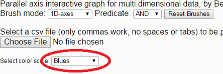
The first step when using the Web Cornell Tool is to choose the desired color scheme for the plot. Several options are available in the drop down menu, as in the figure below:
After the color scheme is selected, the user should load the data file by clicking on the “Choose File” button, as in the figure below. The data file MUST be in comma separated values (csv) with linux line breaks.

If the “Blues” color scheme was selected, the plot should appear automatically and look similar to the figure below:

One interesting feature of the Web Cornell Tool is that of highlighting in the plot a particular solution shown in the table. This allows the user to see how a data point with a particular ID compares to the other data points. For this, the user just needs to place the cursor over the line corresponding to he solution to be highlighted, as in the figure below:

Another interesting feature of this tool is the brushing feature. In order to display only the data points with inertia between 0.84 and 0.93, just click on the Inertia axis and drag a box that covers the desired range. The plot should now look like this:

Multiple axes can be brushed, looking like this:

Brushes can be removed by either pressing the “Reset Brushes” button or by right clicking on a brushed axis.
The brushing showed so far is of the type AND, which means that only points with values within the ranges defined for both brushed axes will be displayed. If the option OR is selected in the Predicate drop-down is selected, points with values within the ranges of any at least one of the brushed axes will be displayed. The outcome should look like this:

The brushing mode can also be changed. The option used to create the previous plots is the 1D-axes mode. Try playing with the 2D-strums option by selecting it and clicking between axes for a different way of brushing your data.
Gnuplot
Gnuplot is an open source standalone ploting tool that can be used to create several types of plots, including parallel axis plots (v 5.0 and above). The source code and binaries can be download here. You should then click on the folder of version 5.0.0 or later.
Installing on Windows
If using windows, you should download the file gp500-winxx-mingw.zip, where xx is the number of bits of your processor (32 or 64). If unsure, download the 64 bits version, since most computers nowadays are 64 bits. In order to open gnuplot, unzip the file, go to the folder where it was unzipped, and open the file gnuplot/bin/wgnuplot.exe. If this does not work, try downloading the 32 bit version.
Installing on Linux
If using linux, download the source code, as opposed to an executable, and compile it. Even though Gnuplot is present in the repositories of all major linux distributions, it is still in version 4.6 to this date, which cannot create parallel plots. In order to compile the source code, download file gnuplot-5.0.0.tar.gz, unzip it in a folder hat is convenient for you, open a terminal pointing to that folder, and then type:
$ ./configure
$ sudo make
$ sudo make install
After the installation, open a terminal and type “gnuplot” in order to start it.
Setting up gnuplot and a blank script
The first step is to acknowledge that Gnuplot has no official GUI. Given that the GUIs available online are not comprehensive and do not support parallel axes plots, the only alternative is to learn a bit of scripting. The good thing is that its sintax is fairly simple and intuitive (or as intuitive as scripting can be).
Now that Gnuplot is up and running, it is time to create a parallel plot. Although one can always open Gnuplot and type commands in its terminal, it is often better to create a script and load it with gnuplot. To do this, create an empty text file named “example.txt” (the extension does not matter, as long as you create a text file) in the folder of your choice and then point gnuplot this folder with the command “cd “. Now, copy your data file to the same folder where the script is located and type the following command on the gnuplot terminal:
l 'example.txt'
Creating a script
If you did everything right, nothing should happen, since the file has no commands. This is the only thing that will be typed directly on the Gnuplot terminal. Everything from now on are commands that will be typed in your “example.txt” file.
In order to create a plot based on your data file, you will have to set the data separator of your file on Gnuplot. If your file is a csv (comma separated file), you should type the following command on you script file:
set datafile separator ','
If your datafile uses a different separator, just replace “,” by your separator. Now, if your file has, say, 7 columns but you want to plot columns 1, 2, 3, and 4 only, add the following command to your script.
plot 'myfile.csv' using 1:2:3:4 with parallel
Now, you just have to run the script again using “l ‘example.txt'” and voilà! Your first parallel plot with Gnuplot should have appeared on your screen with its purple lines that do not look all that great, but convey the information. It should look like the figure below:

This is probably not the prettiest parallel plot you have seen so far, but we can work on embellishing it now.
One common way of making a parallel axes plot easier to understand is by assigning a color gradient for the line colors based on a certain data column. In order to do this, we need to tell gnuplot which column to use as the basis for the column gradient, say column 1, as well as to make the line color variable. The plot command will then look like this:
plot 'myfile.csv' using 1:2:3:4:1 with parallel linecolor variable
Notice that now that we have the option lc variable, the last column in the list of columns will indicate to gnuplot which column to use, which is why now we have five numbers as opposed to four, as before. The plot should look like this now:

This simple script plots a very basic parallel axis plot to Gnuplot’s visualization terminal. In order plot your data to a figure file, like svg or png, as well as to eliminate the borders, name the axis, set up the tics, and fix other details, add the following to our script:
reset
# sets the terminal to be used and output file. In this case, I used svg.
set terminal svg size 800,480
set output 'parallel.svg'
# Sets the color palette to be used for the lines' gradint color.
set palette defined (1 "#fee6ce", 2 "#fdae6b", 3 "#e6550d")
# Tells Gnuplot this is a csv file, as opposed to tsv
set datafile separator ','
# Removes the legend, tics on the sides, and graph border.
unset key
unset colorbox
unset ytics
unset border
# Sets the axes titles ( )
set xtics ("Phosphorus" 1,"Benefit" 2,"Inertia" 3,"Reliability" 4) nomirror
# Turn on tics for all axis and set their ranges twice.
set paxis 1 tics
set paxis 2 tics
set paxis 3 tics
set paxis 4 tics
# Creates the plot. Let's break this down:
# plot 'myfile.csv' - Plot file named "myfile.csv"
#    accorting to the parameters in the rest of the line.
# u 1:2:3:4:2 - 1:2:3:4 are the columns in the csv file that you
#    want to be plotted. The last :2 means that the color gradient is
#    to be based of column 2. If this was 1:2:3:4:1, column 1 would be
#    the basis for the color gradient.
# w parallel - Means that this is a parallel plot with axes defined as
#    with the u flag.
# lc palette - Tells Gnuplot to use the palette defined with set palette
#    for the color gradient.
# lw 2 - Defines the line weight as 2. Having it as 3 would give you a
#    thicker line.
plot 'myfile.csv' u 1:2:3:4:2 w parallel lc palette lw 2
The output should be a svg file that looks like the picture below:

From there you can add the fresh and beautiful parallel axes plot figure to your work!

