Dynamic Emulation in Water Resources Applications

The purpose of this blog post is to introduce dynamic emulation in the context of applications to hydrology. Hydrologic modelling involves implementing mathematical equations to represent physical processes such as precipitation, runoff, and evapotranspiration and to characterize energy and water flux within the hydrologic system (Abbott et al., 1986). Users of a model might be interested in using it to approach a variety of problems related to, for instance, modeling the rainfall-runoff process in a river basin. The user might try to validate the model, perform sensitivity or uncertainty analysis, determine optimal planning and management of the basin, or test how hydrology of the basin is affected by different climate scenarios. Each of these problems requires a numerically intensive Monte Carlo style approach for which a physical model is not conducive. A solution to this problem is to create an emulator for the physical model. An emulator is a computationally efficient model whose response characteristics mimic those of a complex model as closely as possible. This model can then replace the more complicated model in computationally intensive exercises (Tych & Young, 2012).

There are many different approaches to creating an emulator; one particularly unified approach is Dynamic Emulation Modelling (DEMo) (Castelletti et al., 2012). DEMo seeks to accomplish three goals when creating an emulator:

  1. The emulator is less computationally intensive than the physical model.
  2. The emulator’s input-output behavior approximates as well as possible the behavior of the physical model.
  3. The emulator is credible to users.

DEMo has five main steps:

    1. Design of Computer Experiments: Determine a set of input data to build the emulator off of that will cover the range of responses of the physical model
    2. Variable Aggregation: Reduce dimensionality of the input data
    3. Variable Selection: Select components of the reduced inputs that are most relevant to explaining the output data
    4. Structure Identification and Parameter Estimation: In the case of a rainfall runoff model, choose a set of appropriate black box models that can capture the complex, non-linear process and fit the parameters of these models accordingly.
    5. Evaluation and Physical Interpretation: Evaluate the model on a validation set and determine how well the model’s behavior and structure can be explained or attributed to physical processes.

The next section outlines two data-driven style models that can be used for hydrologic emulation.

Artificial Neural Networks (ANNs)

Rainfall-runoff modelling is one of the most complex and non-linear hydrologic phenomena to comprehend and model. This is due to tremendous spatial and temporal variability in watershed characteristics. Because ANNs can mimic high-dimensional non-linear systems, they are a popular choice for rainfall-runoff modeling (Maier at al., 2010). Depending on the time step of interest as well as the complexity of the hydrology of the basin, a simple feedforward network may be sufficient for accurate predictions. However, the model may benefit from having the ability to incorporate memory that might be inherent in the physical processes that dictate the rainfall-runoff relationship. Unlike feedforward networks, recurrent neural networks are designed to understand temporal dynamics by processing inputs in sequential order (Rumelhart et al., 1986) and by storing information obtained from previous outputs. However, RNNs have trouble learning long-term dependencies greater than 10 time steps (Bengio, 1994). The current state of the art is Long Short-Term Memory (LSTM) models. These RNN style networks contain a cell state that has the ability of learn long-term dependencies as well as gates to regulate the flow of information in and out the cell, as shown in Figure 1.

lstm

Figure 1: Long Short-Term Memory Module Architecture1

LSTMs are most commonly used in speech and writing recognition but have just begun to be implemented in hydrology applications with success especially in modelling rainfall-runoff in snow-influenced catchments. Kratzert et al., 2018, show that the LSTM is able to outperform the Sacramento Soil Moisture Accounting Model (SAC-SMA) coupled with a Snow-17 routine to compute runoff in 241 catchments.

Support Vector Regression (SVR)

Support vector machines are commonly used for classification but have been successfully implemented for working with continuous values prediction in a regression setting. Support vector regression relies on finding a function within a user specified level of precision, ε, from the true value of every data point, shown in Figure 2.

lstm.png

Figure 2: Support Vector Regression Model2

It is possible that this function may not exist, and so slack variables, ξ , are introduced which allow errors up to ξ to still exist. Errors that lie within the epsilon bounds are treated as  0, while points that lie outside of the bounds will have a loss equal to the distance between the point and the ε bound. Training an SVR model requires solving the following optimization problem:

lstm

Where w is the learned weight vector and xand yare training points. C is a penalty parameter imposed on observations that lie outside the epsilon margin and also serves as a method for regularization. In the case that linear regression is not sufficient for the problem, the inner products in the dual form of the problem above can be substituted with a kernel function that maps x to a higher dimensional space, This allows for estimation of non-linear functions. Work by Granata et al., 2016 compares an SVR approach with EPA’s Storm Water Management Model (SWMM) and finds comparable results in terms of RMSE and R2 value.

References

Abbott, M.b., et al. “An Introduction to the European Hydrological System — Systeme Hydrologique Europeen, ‘SHE’, 1: History and Philosophy of a Physically-Based, Distributed Modelling System.” Journal of Hydrology, vol. 87, no. 1-2, 1986, pp. 45–59., doi:10.1016/0022-1694(86)90114-9.

Bengio, Y., et al. “Learning Long-Term Dependencies with Gradient Descent Is Difficult.” IEEE Transactions on Neural Networks, vol. 5, no. 2, 1994, pp. 157–166., doi:10.1109/72.279181.

Castelletti, A., et al. “A General Framework for Dynamic Emulation Modelling in Environmental Problems.” Environmental Modelling & Software, vol. 34, 2012, pp. 5–18., doi:10.1016/j.envsoft.2012.01.002.

Castelletti, A., et al. “A General Framework for Dynamic Emulation Modelling in Environmental Problems.” Environmental Modelling & Software, vol. 34, 2012, pp. 5–18., doi:10.1016/j.envsoft.2012.01.002.

Granata, Francesco, et al. “Support Vector Regression for Rainfall-Runoff Modeling in Urban Drainage: A Comparison with the EPA’s Storm Water Management Model.” Water, vol. 8, no. 3, 2016, p. 69., doi:10.3390/w8030069.

Kratzert, Frederik, et al. “Rainfall–Runoff Modelling Using Long Short-Term Memory (LSTM) Networks.” Hydrology and Earth System Sciences, vol. 22, no. 11, 2018, pp. 6005–6022., doi:10.5194/hess-22-6005-2018.

Maier, Holger R., et al. “Methods Used for the Development of Neural Networks for the Prediction of Water Resource Variables in River Systems: Current Status and Future Directions.” Environmental Modelling & Software, vol. 25, no. 8, 2010, pp. 891–909., doi:10.1016/j.envsoft.2010.02.003.

Rumelhart, David E., et al. “Learning Representations by Back-Propagating Errors.” Nature, vol. 323, no. 6088, 1986, pp. 533–536., doi:10.1038/323533a0.

Tych, W., and P.c. Young. “A Matlab Software Framework for Dynamic Model Emulation.” Environmental Modelling & Software, vol. 34, 2012, pp. 19–29., doi:10.1016/j.envsoft.2011.08.008.

Figures:

(1) https://colah.github.io/posts/2015-08-Understanding-LSTMs/

(2) Kleynhans, Tania, et al. “Predicting Top-of-Atmosphere Thermal Radiance Using MERRA-2 Atmospheric Data with Deep Learning.” Remote Sensing, vol. 9, no. 11, 2017, p. 1133., doi:10.3390/rs9111133.


MORDM using Rhodium – the lake problem workflow

Rhodium is a Python library for Many-Objective Robust Decision Making (MORDM), part of Project Platypus. Multiple past posts have addressed the use of Rhodium on various applications. This post mirrors this older post by Julie which demonstrated the MORDM functionality of Rhodium using a different model; I’ll be doing the same using the lake problem, a case study we often use for training purposes. In this post I will use Rhodium to replicate the analysis in the paper and discuss the importance of the various steps in the workflow, why they are performed and what they mean for MORDM. As this post will be quite long, I will be emphasizing discussion of results and significance and will be using previously written code found in the Rhodium repository (slightly adapted) and in Julie’s lake problem repository. In general, this post will not be re-inventing the wheel in terms of scripts, but will be an overview of why. For a more detailed description of the model, the reader is directed to the paper linked, Dave’s recent post, and the accompanying Powerpoint presentation for this training.

Problem Formulation

The system presents a hypothetical town that seeks to balance economic benefits resulting in phosphorus (P) emissions with the ecological benefits of a healthy lake. The lake naturally receives inflows of phosphorus from the surrounding area and recycles phosphorus in its system. The concentration of P in the lake at every timestep is described by the following equation:

X_{t+1} = X_{t}+a_t+Y_t+\frac{X_t^q}{1+X^q_t}-bX_t

Where a represents the anthropogenic phosphorus inputs from the town, Y ~ LN(mu, sigma) are natural P inputs to the lake, q is a parameter controlling the recycling rate of P from sediment, b is a parameter controlling the rate at which P is removed from the system and t is the time index in years. Looking at the intersections of the temporal fluxes of P, one can see there are three equilibria for this system, two of which are stable and attractive, and one unstable, a tipping point in this system.

Figure by Julie Quinn

Why this matters:
We’re trying to decide on values of a_t 
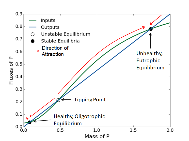
that maximize our economic benefits, but also increase P in the lake. If we increase P too much, and we cross a tipping point of no return. Even though this is vital to the design of the best possible management policy, this value of P is hard to know exactly because:
It depends on stochastic Y_t
The rate of inputs is non-linear
The system parameters determining this point might be (deeply) uncertain

The management of this hypothetical system is concerned in four objectives:

  • Maximize Expected Economic Benefits
  • Minimize Maximum P Concentration
  • Maximize Inertia (Measure of Stability)
  • Maximize Reliability (Fraction of Years Below Threshold)

To search for and identify solution, we will be using two strategies:

Open loop control (Intertemporal):

Each candidate solution is a set of T decision variables a_t , representing the anthropogenic discharges at each timestep t\in(0, 1, \dots, T-1). This strategy necessitates 100 decision variables.

Closed loop control (DPS):

Each candidate solution is a control rule mapping the current P concentration, X_t, to a decision a_t. This strategy necessitates 6 decision variables.

Please refer to the paper for details on the formulations of the objectives and strategies.

Problem Formulation in Rhodium

In general, to set up any Rhodium model, you’d need to follow this template:

The scripts for the two formulations can be found here and here. In general, Rhodium is written in a declarative manner so after you define what everything is (model, parameter, lever, etc.), you only need to describe the operation to be performed (e.g., “optimize”), without needing to specify all the details of how that should be done.

Why this matters:
This library is set up in a way that allows rapid and intuitive application of the MORDM framework. This is especially beneficial in situations were alternative problem formulations are tested (as is the case here with the two search strategies).

Exploring alternatives using J3

To explore the two sets of candidate strategies using the tools provided by Rhodium, we need to merge them into a single dataset. We can do so by adding a key to each solution identified by each strategy:

for i in range(len(output)):
    output[i]['strategy']=1
    dps_output[i]['strategy']=0

merged = DataSet(output+dps_output)

We can visualize the two sets using J3 (see my past post on it here):

from j3 import J3
J3(merged.as_dataframe(list(model.responses.keys())+['strategy']))

Why this matters:
The DPS strategy was able to identify more non-dominated solutions than the intertemporal strategy. Many of the DPS solutions outperform intertemporal solutions in every objective. This is important because we’re trying to identify the best possible management policies for this system and had we only used the Intertemporal strategy we could potentially miss multiple viable solutions that are better.

Policy diagnostics

Now we have a set of candidate management policies, we should like to see what makes their performance different and how they affect the system when applied. Using J3, I can interactively explore the sets using the visualizations provided as well as the tables reporting on the performance of each solution. In the example figure below, I am highlighting the DPS solution with the highest reliability performance.

Using the script found here, I can draw two DPS policies, the one producing the highest reliability and the one resulting in the highest profits. What I am trying to do here is investigate more closely how the two policies prescribe action on the system and how they result in the performance that they do.

Both solutions map low P concentrations, X_t , to higher P releases, a_t , and prescribe decreased releases as the concentration increases. The most reliable policy is more conservative, starting to decrease its emissions earlier. Both policies start increasing discharges beyond some lake P concentration, with the benefits-maximizing solution doing so at lower values. This appears to be as the levels approach the tipping point, beyond which it is best to further maximize economic benefits.

Why this matters:
Understanding how the candidate policies act on a system to achieve their performance gives us further insight on how the system behaves and reacts to our actions. The candidate policies are also not aware of where the critical P threshold is, but appear to “discover” it and when crossed, they prescribe increased emissions to maximize profits.

Robustness analysis and scenario discovery

Finally, we’d like to investigate how the candidate solutions perform under uncertainty. To do so using Rhodium, we need to define which parameters are exogenous uncertainties, including their distributions and ranges, sample them and re-evaluate either specific solutions or all of them in these sampled worlds. The script is simple and intuitive:

model.uncertainties = [UniformUncertainty("b", 0.1, 0.45),
                       UniformUncertainty("q", 2.0, 4.5),
                       UniformUncertainty("mean", 0.01, 0.05),
                       UniformUncertainty("stdev", 0.001, 0.005),
                       UniformUncertainty("delta", 0.93, 0.99)]
SOWs = sample_lhs(model, 1000)
policy = output.find_max("reliability")
scenario_discovery = evaluate(model, update(SOWs, policy))

To perform scenario discovery, Rhodium supports Prim and Cart. We first need to classify the output into “success” and “failure”:

classification = scenario_discovery.apply("'Reliable' if reliability >= 0.95 and utility >=0.2 else 'Unreliable'")

p = Prim(scenario_discovery, classification, include=model.uncertainties.keys(), coi="Reliable")
box = p.find_box()
fig = box.show_tradeoff()

c = Cart(scenario_discovery, classification, include=model.uncertainties.keys(), min_samples_leaf=50)
c.show_tree()

Why this matters:
Scenario discovery allows us to discover regions in the parametric space that cause our policies to fail. In this particular case, it appears that there is a non linear combination of b and q values that lead to failure in meeting the criterion. Both parameters shift the input and output fluxes of P, shifting the tipping point to lower levels.

ggplot (Part 1)

In this blog post, I am going to introduce a powerful plotting package in R. The plotting package is called ggplo2. This library allows us to quickly create different plots (scatter plots, boxplots, histograms, density plots, time series plots: you name it!) while also customizing them to produce elegant graphics beyond regular line or bar charts. First, we need to download the library and then activate it:

install.packages("ggplot2")
library(ggplot2)

I am going to outline how to build two different types of map: (1) calendar heat map and (2) alluvial map. The first is used to present the variations of a variable or an activity over a long period of time through color coding so that we can easily recognize the trend, the seasonality, or any patterns or anomalies. The alluvial map provides better visualization for categorical and multidimensional data. They show the changes in magnitude of some variables at different situations that can be any discrete indexes. To create this type of map, we also need the “ggalluvial” library that has to be called with ggplot2.

The general code structure for plotting calendar heat map is the following:

ggplot ( dataframe , aes ( x , y , fill )) + geom_tile ( ) + facet_grid ( )

With “aes,” which stands for aesthetics, we describe how variables in the data frame are mapped to visual properties, so we specify the x- and y-axes. We use the fill in aesthetic to specify the fill color for different variables.

“Geom” specifies the geometric objects that define the graph type—which can be point, line, etc.—and show the value we assigned in “aes(fill)”. The “geom_tile” tiles plane with rectangles uses the center of the tile and its size. A rectangle can be divided into smaller rectangles or squares.

The “facet” command creates a trellis graph or panel by specifying two variables or one on top of “aes.”

We can show the daily, weekly, or monthly values in the calendar heat map. As an example of calendar heat map, I am using weather data for the Yakima River Basin in central Washington State; these data were originally downloaded from Northwest Knowledge Network. The data set includes three downscaled global climate models (GCMs) from 2019 to 2061 with the resolution of 1/24th degree; the data is also aggregated for the basin and monthly time step. You can download data here. Now, let’s read the data.

gcm1 <- read.csv("(your directory)/CanESM2_rcp85.csv")
gcm2 <- read.csv("(your directory)/inmcm4_rcp85.csv")
gcm3 <- read.csv("(your directory)/GFDL-ESM2G_rcp85.csv")

By running header(gcm1) or colnames(gcm1), you can see different columns in each data set, including “Year”; “Month”; name of the “GCM”; and weather variables including tasmin, tasmax, pr, PotEvap corresponded to minimum and maximum temperature, precipitation, and potential evapotranspiration. The goal is to visualize the difference between these realizations of monthly precipitation for 21 future years from 2020 to 2040. To lay out panels in a faced_grid, I want to show years and months. In each month, I am going to show precipitation values for each GCM.

gcms<- rbind(gcm1,gcm2,gcm3)  # Join three data frames into one

# Add a new column to the data frame and call it “Month_name”; then, fill it with the name of the months for each row
tst<- c("Jan","Feb","Mar","Apr","May","Jun","Jul","Aug","Sep","Oct",
"Nov","Dec")  
gcms$Month_name <- tst[gcms$Month]  
gcms$nmonth<- as.factor(1)  # add a new column to a data frame and fill it with value of 1, as a factor
gcm_2040<- subset(gcms, gcms$Year<2041) # select just the years before 2041
prec_fut<- ggplot(gcm_2040, aes(x=gcm_2040$gcm,nmonth,fill = pr)) +
  geom_tile()+
  facet_grid(Year~Month_name) +
  theme(strip.text.x = element_text(colour = "black",size =9 ,margin=margin(0.2,0,0.2,0,"cm")),
        strip.text.y = element_text(colour = "black",size = 9,angle =360),
        strip.background = element_rect(colour="black", size=1, linetype="solid"),
        axis.text.x=element_text(size=9,angle = 90),
        axis.text.y=element_blank(),
        axis.ticks.y=element_blank(),
        panel.background = element_rect(fill = "white"))+
scale_fill_gradient(low="green",high="red",limits=c(0,230),breaks=c(0,25,50,75,100,125,150,175,200,230),labels=c(0,25,50,75,100,125,150,175,200,230)) +
  labs(x="",
       y="",
       title = "Time-Series Calendar Heatmap",
       subtitle="Projected Monthly Precipitation-Yakima Rive Basin",
       fill="Precipitation (mm)") 
ggsave("(your directory)/name.png", prec_fut)

With theme(), you can modify the non-data parts of your plot. For example, “strip.text.x and .y” and “strip.background“ adjust facet labels of each panel along horizontal and vertical directions and background format.

The “axis.text” and “axis.ticks” commands adjust the tick labels and marks along axes, and by using element_blank(), you can remove specific labels. With “panel.background,” the underlying background of the plot can be customized.

With argument “limits” in “scale_fill_gradient,” you can extend the color bar to the minimum and maximum values you need. In our example, these limits are obtained by the following commands.

max(gcm_2040$pr) 
min(gcm_2040$pr)

With the labs() command, you can change axis labels, plot, and legend titles. Finally, ggsave() is used to save a plot; the scale, size, and resolution of the saved plot can also be specified. Ggsave() supports various formats including “eps,” “ps,” “tex” (pictex), “pdf,” “jpeg,” “tiff,” “png,” “bmp,” “svg,” and “wmf” (Windows only).

What can we learn from this graph? Well, we can see the interannual variability of precipitation based on three GCMs and how monthly precipitation varies in different GCMs. Compared to precipitation values for wet months, when variations are generally higher, precipitation values for dry months are more consistent among GCMs.

Now, let’s create an alluvial diagram. For that, we need to prepare the essential components. The data should be categorical, and for each row, there should be a frequency for a category that we are interested in presenting. In this example, I am going to show simulated (by a crop model) winter wheat yield changes in dryland low rainfall zone of the Pacific Northwest during the future period (2055–2085) compared to the historical period (1980–2010). The low zone in this region includes 1,384 grid cells with the dimension of 4 by 4 km. Different GCMs projected different weather scenarios, which we showed in the calendar heat map plot. As you can imagine, if you force your crop model with different GCMs, you will get different projections for the crop yield. The example data set can be read in R by the following:

L_zones<- read.csv("(your directory)/yield_gcms.csv",head=T)

This data set includes a few columns: “fre_yield,” “GCM,” “Zone,” “RCP,” and “Ratio.”

For each row, there is a GCM name that corresponds to RCP and Zone. Then, there is a Ratio column, which shows the category of the yield ratio. These yield ratio categories correspond to the average winter wheat yield during the future period, divided by average yield during the historical period. For each of the categories under the Ratio column, the number of grid cells was counted and is reported under the “fre_ yield” column. For example, Row 2 (L_zones[2,]) shows that 976 grid cells out of 1,384 cells in a low-rainfall zone are projected to have yield ratio between 1.2 and 1.5 during 2055–2085 compared to 1980–2010, under CanESM2 and RCP 4.5 future weather scenarios.

Ggplot and ggalluvial provide an easy way to illustrate this type of data set. At each category on the x-axis, we can have multiple groups, and they are called “strata.” Alluvial diagrams have horizontal splines that span across the categories at the x-axis, and they are called “alluvia.” A fixed value is assigned to an alluvium at each category at the x-axis that can be represented by a fill color.

install.packages("ggalluvial")
library(ggalluvial)

yield_ratio<- ggplot(data = L_zones, aes(axis=GCM, axis2=RCP, y = fre_yield)) + 
 # We can add more (axis4, …) to have more groups in the x-axis
  scale_x_discrete(limits = c("GCM","RCP"), expand = c(.1, .1)) +
  geom_alluvium(aes(fill = Ratio)) +
  geom_stratum(width = 1/12, fill = "lightgrey", color = "black") + 
  geom_label(stat = "stratum", label.strata = TRUE) +
  scale_fill_brewer(type = "qual", palette = "Set1")+
  labs(x="",
       y="Number of Grid cells in the Zone",
       title = "Average Change in Winter Wheat Yield During 2055-2085 Compared to 1980-2010",
       subtitle="Low Rainfall Zone in Pacific Northwest")
ggsave("(your directory)/Future_WW_Yield.jpeg",yield_ratio, width=10, height=10)

Y in the aes() controls the heights of the alluvia and is aggregated across equivalent observations.

“Scale_x_discrete” allows you to place labels between discrete position scales. You can use “limit” to define values of the scale and also their order, and “expand” adds some space around each value of the scale.

“Geom_alluvium” receives the x and y from the data set from ggplot and plots the flows between categories.

“Geom_stratum” plots the rectangles for the categories, and we can adjust their appearance.

 Labels can be assigned to strata by adding “stat = stratum” and “label.strata = TRUE” to the geom_label. Then, the unique values within each stratum are shown on the map.

“Scale_fill_brewer” is useful for displaying discrete values on a map. The type can be seq (sequential), div (diverging), or qual (qualitative). The “palette” can be a string of the named palette or a number, which will index into the list of palettes of appropriate type.

Now, we can easily see in this graph that the three GCMs used in the crop model produced different results. The changes in winter wheat yield during the future period compared to the historical period are not predicted with the same magnitude based on different future weather scenarios, and these differences are more profound under RCP 8.5 compared to RCP 4.5.