
This blog post focuses on Self-Organizing Maps (SOMs) or Kohonen maps, first created by Teuvo Kohonen in the 1980s, and most recently introduced in Dave Gold’s latest blog post. SOMs are a type of artificial neural network (ANN) that are trained using unsupervised learning to produce a two-dimensional pattern representation of higher-dimensional datasets. SOMs are therefore a good algorithm for dimension reduction, and inputs that are closer in their higher-dimensional input vectors are also mapped closely together in the resulting 2D representation [1].

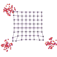
SOMs can be very effective for clustering/classifying outputs and are advantageous because they “self-organize” to identify clusters. The SOM map is first initialized with a user-defined 2D grid of neurons instead of containing layers like traditional ANNs. The weight vector that characterizes the neurons can be randomly initialized with value or more favorably, by sampling across the eigenvectors of the two largest PCs of the input dataset. The training process that SOMs use to build maps is called “competitive learning”, which is also fundamentally different from backpropagation used for ANNs. During competitive learning, an input training point is fed into the algorithm. Its Euclidean distance from each of the neurons is calculated, and the closest neuron is termed the best matching unit, or BMU. The weight of the neuron and surrounding neurons is adjusted to be closer to the related input vector, using an update formula. This process is repeated for every input in the training data and for a large number of iterations until patterns and clusters begin to emerge [3]. The animation on the right illustrates competitive learning. Note how the locations of neurons are adjusted as training points get assigned to their respective BMUs and how whole grid shifts in response to the new samples.
At a high level, this is how SOMs are trained. Next, we will go through a clustering example using the kohonen package offered in R.
Test Case: Maryland Trout
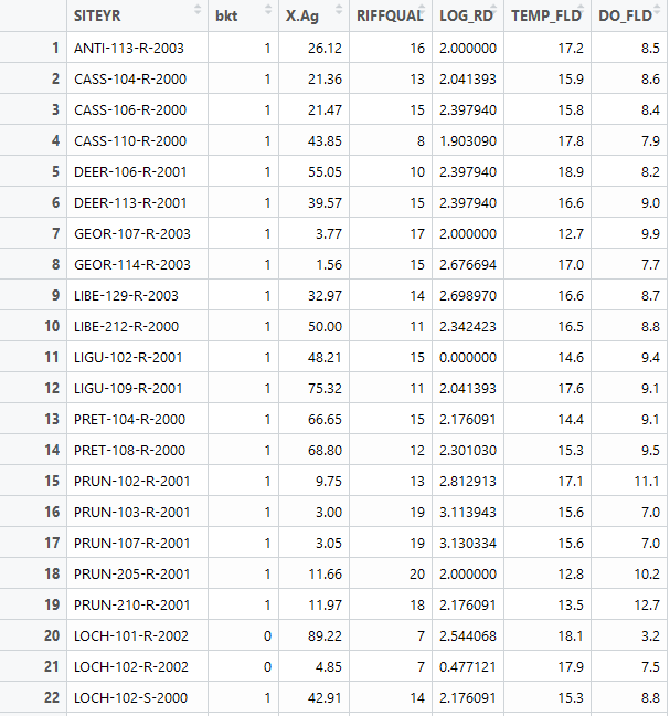
For this text case, we will be using a presence/absence dataset of Maryland trout. Each data point is characterized by a feature vector that includes information on agricultural land cover, logarithmic distance to the nearest road, riffle quality, dissolved oxygen, and spring water temperature. The label associated with each point is a 0 or 1, denoting if trout was observed or not. We will train a SOM to cluster the feature vector and then investigate the characteristics of the resulting clusters. Below is a snippet of our dataset. We use columns 3-7 as our feature vector while column 2 denotes our label. SOMs can also be used for classification, which is not discussed in this blog post. Therefore, you can train the SOM only on a subset of the dataset and used the trained SOM to predict the clusters that the testing points will be assigned to.
First we must scale our data in order to make sure that variables in our feature vector that may have different magnitudes are treated equally by the algorithm. Then we define the SOM grid. The choice of the number of neurons generally follows the rule: 5*sqrt(# of datapoints). In our case, we have 84 datapoints, so technically a grid that is smaller than 7×7 will work well. I decide to use 5×5, which will be explained in the next paragraph. I also specify that I want the grid to be in a hexagonal shape. Finally, we train our model by feeding in our input data, the user-defined grid, and specifying an iteration rate of 1000. This means that the input data will be presented 1000 times to the algorithm.
require(kohonen)
data=read.csv("Maryland.Trout.csv")
#Create the training dataset
data_train <-data[, c(3:7)]
# Change the data frame with training data to a matrix
# Also center and scale all variables to give them equal importance during
# the SOM training process.
data_train_matrix <- as.matrix(scale(data_train))
# Create the SOM Grid
som_grid <- somgrid(xdim = 5, ydim=5, topo="hexagonal")
# Finally, train the SOM
som_model <- som(data_train_matrix,
                 grid=som_grid, rlen = 1000,
                 keep.data = TRUE )
Once the SOM is trained, there are a variety of figures that can be easily created. We can plot the training progress and observe how the distance to the BMU decreases as a function of iteration and starts to level off as we reach many iterations. This is ideal behavior because it means that the training points are associating closely with their BMU.
plot(som_model, type="changes")

We can also plot a heat map of the node counts, which shows how many of each of the training inputs are associated with each node. Any node that is grey means that no training points were assigned to that BMU. This may indicate that the map is too big, so you can go back and adjust the grid size adjust accordingly until the grey points are no longer existent. For this dataset, this was around 5×5. Furthermore, we want the number of points associated with each node to be as uniform as possible.
plot(som_model, type="count", main="Node Counts")

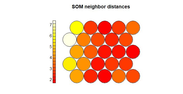
Next we can view the neighbor distances for each neuron, which is also called the U-matrix. Small distances indicate similarity between neighboring nodes.
plot(som_model, type="dist.neighbours", main = "SOM neighbor distances")
We can also view the weight vector of the nodes, which are termed codes. The fan in each node indicates the variables of prominence that are linking the datapoints assigned to the neuron. In our dataset, you can see that in the upper left corner of the map, the algorithm is assigning datapoints to these neurons because of the similarity among the agricultural area and water temperature variables in the feature vector. In the lower right corner, these datapoints are linked primarily due to similarities in riffle quality, and dissolved oxygen. This type of map is useful to understand by what features the points are actually starting to cluster.
plot(som_model, type="codes")

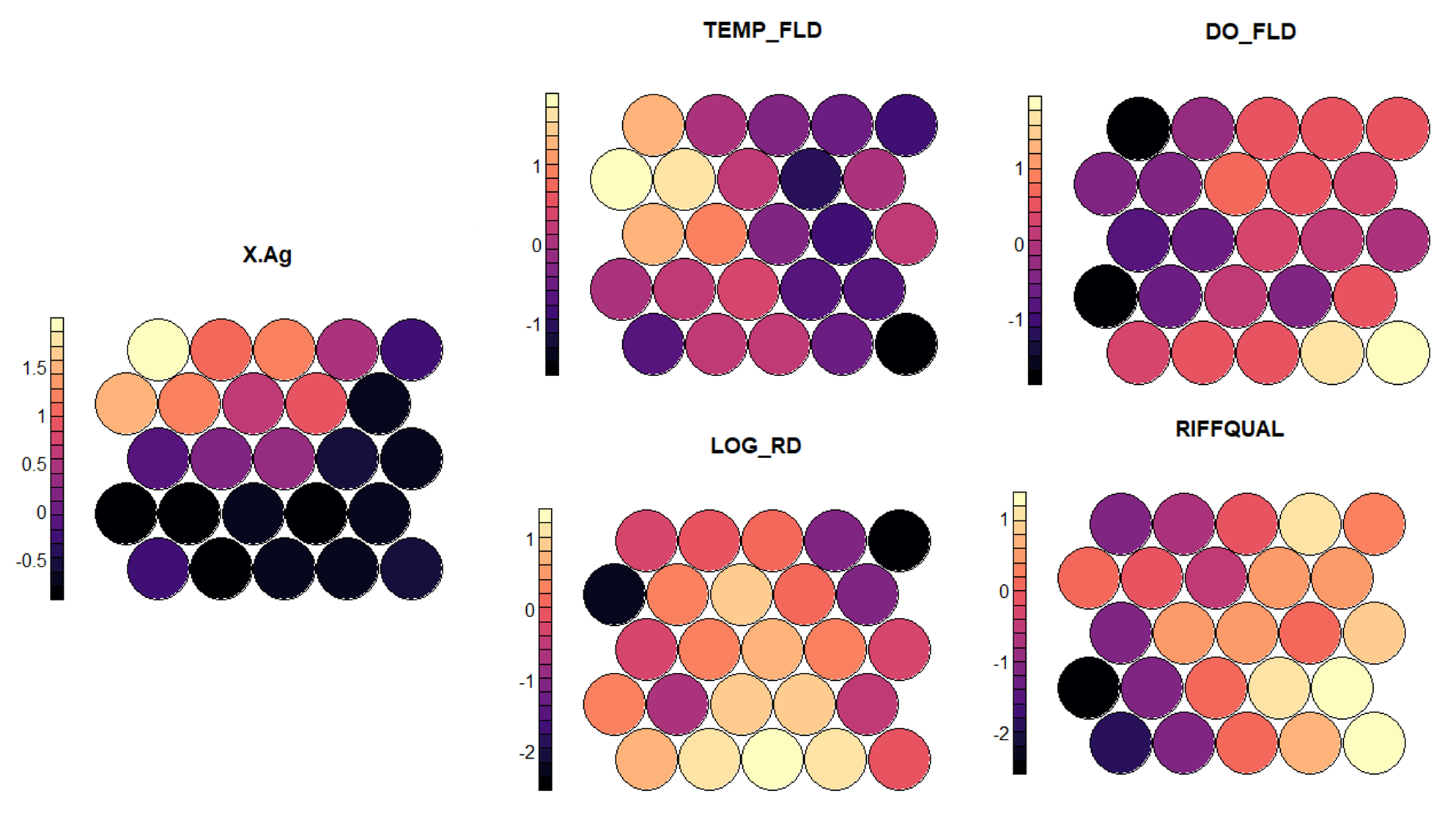
In my opinion, one of the most useful standard figures that the kohonen library creates are heatmaps that show the gradient of input values across the nodes. A heatmap can be created for each feature and when placed side by side, they can help demonstrate correlation between inputs. We can clearly see that areas characterized by low agricultural land tend to have a better riffle quality, lower water temperature, and a higher dissolved oxygen. While these patterns are expected and have a strong physical explanation, these maps can also help to discover other unexpected patterns. Note that the values on the side bar are normalized and can be transformed back to the original scale.
#Plot heatmaps for each feature
plot(som_model, type = "property", property = getCodes(som_model)[,1], main=colnames(getCodes(som_model))[1],palette.name=magma)
plot(som_model, type = "property", property = getCodes(som_model)[,2], main=colnames(getCodes(som_model))[2],palette.name=magma)
plot(som_model, type = "property", property = getCodes(som_model)[,3], main=colnames(getCodes(som_model))[3],palette.name=magma)
plot(som_model, type = "property", property = getCodes(som_model)[,4], main=colnames(getCodes(som_model))[4],palette.name=magma)
plot(som_model, type = "property", property = getCodes(som_model)[,5], main=colnames(getCodes(som_model))[5],palette.name=magma)
#Unscale the variables- do this for each input column in data_train
var_unscaled <- aggregate(as.numeric(data_train[,1]), by=list(som_model$unit.classif), FUN=mean, simplify=TRUE)[,2]
plot(som_model, type = "property", property=var_unscaled, main=colnames(getCodes(som_model))[1], palette.name=magma)
Finally we can cluster our neuron codes weight vectors) to add some boundaries to our map. Typically what is done is to use k-means clustering to determine an appropriate number of clusters that, in this case, minimize the within-cluster sum of squares (WCSS). We can then plot the results and look for an elbow in the scree plot.
#k-means clustering code from [4]
mydata = som_model$codes[[1]]
wss = (nrow(mydata)-1)*sum(apply(mydata,2,var))
for (i in 2:15) {
wss[i] = sum(kmeans(mydata, centers=i)$withinss)
}
par(mar=c(5.1,4.1,4.1,2.1))
plot(1:15, wss, type="b", xlab="Number of Clusters",
ylab="Within groups sum of squares", main="Within cluster sum of squares (WCSS)") #Define a palette and cluster with the number of clusters determined using k-means

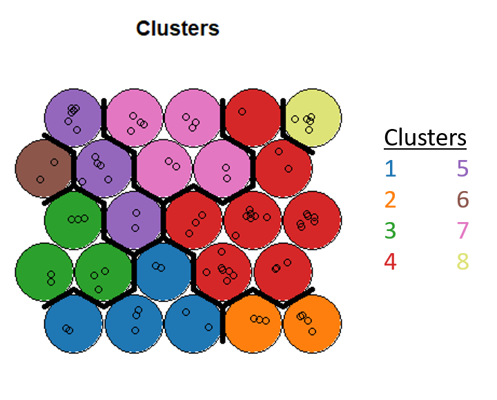
The elbow isn’t so clear in this dataset, but I go with 8 clusters and then use hierarchical clustering to assign each neuron to a cluster. Finally, we can obtain the cluster that each point is assigned to and insert that back as a column in our dataset.
#Final clustering code from [4]
#Define a palette and cluster with the number of clusters determined using k-means
pretty_palette <- c("#1f77b4", '#ff7f0e', '#2ca02c', '#d62728', '#9467bd', '#8c564b', '#e377c2')
som_cluster <- cutree(hclust(dist(som_model$codes[[1]])), 8)
# plot these results:
plot(som_model, type="mapping", bgcol = pretty_palette[som_cluster], main = "Clusters")
add.cluster.boundaries(som_model, som_cluster)

# get vector with cluster value for each original data sample
cluster_assignment <- som_cluster[som_model$unit.classif]
# for each of analysis, add the assignment as a column in the original data:
data$cluster <- cluster_assignment
Post-Processing
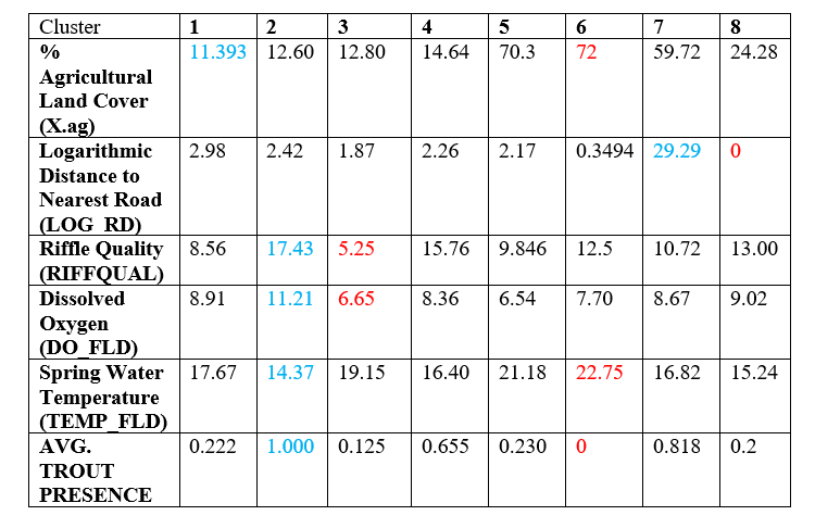
We’re now interested in understanding which of our points actually clustered together, so we generate summary statistics for each cluster. The points highlighted in blue represent the best values for the feature while the points in red represent the worst. Note that the clusters with a large amount of trout presence on average are characterized by best values of features that are favorable for aquatic life, while the clusters that exhibit a lower presence of trout do not have good values for these features. You can also see that clusters with similar characteristics are side by side on the clustering map.
Overall, I found the kohonen library to be a really useful tool to start to internalize how SOMs work and to fairly quickly be able to do a nice analysis on both the features and the resulting clusters. I would highly recommend this package as a starting point. There are packages in Python such as SimpSom and minisom that have snappier graphics and will be a good next step to explore.
References
[1]https://towardsdatascience.com/self-organizing-maps-ff5853a118d4
[2] By Chompinha – Own work, CC BY-SA 4.0, https://commons.wikimedia.org/w/index.php?curid=77822988
[3]http://fourier.eng.hmc.edu/e161/lectures/som/node2.html
[4] Much direction for structuring this tutorial comes from https://www.shanelynn.ie/self-organising-maps-for-customer-segmentation-using-r/

Pingback: Visualizing High Dimensional Data Using the T-SNE Method – Water Programming: A Collaborative Research Blog
Incredible post! Clear and quite illustrative. One simple question, though: what are “PCs” as mentioned in “[…],by sampling across the eigenvectors of the two largest PCs of the input dataset.”
Hi Hugo, thanks for the question! PCs here refers to principal components. There are a couple different ways to initialize the weights of the SOM neurons. You can initialize them with random values, but this is not considered the best practice. The first two PC eigenvectors of your input data are a good approximation of the organizational structure of the data and therefore, it can greatly speed up SOM training (less learning required) by initializing your weights with these values instead of random values. You can read more about this practice here: http://www.cis.hut.fi/projects/somtoolbox/theory/somalgorithm.shtml. Thanks for reading!
Hello, Rohini. Thanks for providing this extra info and for the link. =)
Also, a second question: is that dataset publicly available? Thank you.
The dataset is unfortunately not publicly available (it’s from a class), but I received your email address from WordPress when you posted your first question, so I can email it along to you privately.
Hello, can you explain how you do the post processing with what code?
Hi John, the code above does not do the post-processing, but once each data point is assigned to a cluster, you can go ahead and calculate the mean value of each feature in the cluster based on the points that fall in the cluster. These are the values in the table that I’m displaying.