
Understanding the geometry of a many-objective Pareto front can be challenging due to the high dimensionality of many-objective problems. Often, we use tools such as parallel coordinate plots, glyph plots and pairwise scatter plot matrices to identify trade-offs and select candidate alternatives. While these tools are useful to decision making, they don’t always capture patterns or geometric properties that may be embedded withing many-objective Pareto fronts.
Mathematical tools for visualizing high dimensional data on lower dimensional manifolds have existed for decades, and in recent years they have been applied in many-objective contexts (Filipac and Tusar, 2018). In this post I’ll overview four common methods for representing Pareto fronts on lower dimensional manifolds and demonstrate them on two many-objective test problems: the four objective DTLZ 2 and four objective DTLZ 7 (Deb et al., 2005).
Parallel coordinate plots of the two test problems can be found in Figure 1. DTLZ 2 has a continuous Pareto front, while DTLZ 7 has a highly disconnected Pareto front. Both Pareto fronts visualized here are the analytical true Pareto fronts from the MOEAFramework.
I’ve added the code to produce the plots in this post to my repository on many-objective visualization, which can be found here.

1. Multidimensional Scaling
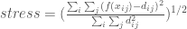
Multidimensional Scaling (MDS) refers to a family of techniques that seek low dimensional representations of high dimensional spaces by preserving pairwise distances between points (Kruskal, 1978). Classic MDS attempts to preserve the euclidean distance between each pair of points by minimizing a stress function defined as:
Where:


To perform MDS on the test problem Pareto Fronts, I used the Manifold tool from the Yellowbrick package, a machine learning visualization module associated with sklearn. MDS representations of four objective DTLZ 2 and DTLZ 7 and shown in Figure 2. For the highly disconnected DTLZ 7 problem, MDS clearly distinguishes the 8 clusters within the Pareto Front.

2. IsoMaps
IsoMaps are an extension of MDS that first clusters points using K-nearest neighbors, then maps the points to a lower dimensional space by minimizing the geodesic distances between clusters. To create IsoMap visualizations for the test problems, I again utilized the Yellowbrick manifold function. IsoMap projections for four objective DTLZ 2 and DTLZ 7 are shown in Figure 3. Like MDS, IsoMapping is able to clearly demonstrate the disconnected nature of the DTLZ 7 Pareto front. I should mention that I had to use 30 neighbors to achieve this, which is much higher than the 8-12 neighbors recommended as an unofficial rule of thumb. This could be a result of the highly disconnected nature of DTLZ 7, which may cause problems for IsoMap.

3. Sammon Mapping
Like MDS and IsoMapping, Sammon Mapping (Sammon, 1969) seeks to find a lower dimensional representation that preserves the the distances between each point in the Pareto front from the high dimensional space. Sammon Mapping uses a modified version of stress known as “Sammon Stress”, defined as:

Where:


The key difference between Sammon Stress and the classic MDS stress is that Sammon Stress is normalized by the distance in the high dimensional space rather than the low dimensional representation. This function is usually minimized by gradient descent.
I coded the Sammon maps for the two test problems using an open source implementation from tompollard on Github. Like the other two methods, Sammon mapping highlights the disconnected nature of DTLZ 7 while showing a relatively continuous representation of DTLZ 2 that suggests its spherical shape.

4. Self Organizing Maps
Self Organizing Maps (SOM; Kohonen, 1982) use an artificial neural network to create a discrete, low dimensional representation of a high dimensional space. SOMs are a form of unsupervised machine learning that are used in both classification and dimensional reduction applications.
To map the high dimensional data, SOMs start with a uniformly spaced grid of neurons, then implement a competitive learning algorithm to associate each neuron with a set of Pareto front solutions. This video has the best explanation I’ve seen on how SOMs work (thanks to Rohini for sharing it with me). I also found this Gif from Wikicommons to be helpful in understanding SOMs.
Pareto front visualizations using SOMs plot the the original uniform grid of neurons on an x-y plane, and the distance between neurons of the final map as the color. Grid points with dark shading (long distance between final neurons) indicate boundaries between clusters in the high dimensional space. SOMs for the four objective DTLZ 2 and DTLZ 7 problems are shown in Figure 5. The disconnected clusters in DTLZ 7 are clearly apparent while no real structure is shown for DTLZ 2.

Concluding thoughts
To be perfectly honest, I don’t think that any of the methods described in this post are particularly useful for understanding many-objective optimization results if used on their own. However, they may be a useful complement when exploring solution sets and finding patterns that may not be apparent when visualizing the full dimensional space. Additionally, they are all fairly straight forward to code and can easily be included in an exploratory analysis.
References
Deb, K., Thiele, L., Laumanns, M., & Zitzler, E. (2005). Scalable test problems for evolutionary multiobjective optimization. In Evolutionary multiobjective optimization (pp. 105-145). Springer, London.
Filipič, B., & Tušar, T. (2018, July). A taxonomy of methods for visualizing pareto front approximations. In Proceedings of the Genetic and Evolutionary Computation Conference (pp. 649-656).
Kohonen, T. (1982). Self-organized formation of topologically correct feature maps. Biological cybernetics, 43(1), 59-69.
Kruskal, J. B. (1978). Multidimensional scaling (No. 11). Sage.
Sammon, J. W. (1969). A nonlinear mapping for data structure analysis. IEEE Transactions on computers, 100(5), 401-409.

Hey Dave This is cool! What are the axes in these figures, though? Does plotting the data in the first two PCs often achieve the same benefits?
Hey Julie! Good questions. The axes of MDS, IsoMaps and Sammon mapping are the values of the two dimensions of the respective manifolds. The values don’t have much meaning, and most of the readings I found don’t label the axes. I don’t like this practice and should have mentioned it in the main post. The lack of interpretation of the manifolds are one of the core limitations for each of these methods.
Regarding PCs, non-kernalized PCA has a linearity assumption about the relationships between features, while the methods here do not. Technically, kernalized PCA can be thought of as a form of MDS (see this paper: https://papers.nips.cc/paper/1873-on-a-connection-between-kernel-pca-and-metric-multidimensional-scaling.pdf). I thought about including PCA in this post but left it out for the sake of brevity.
Ok, I guess I’m just confused on what the dimensions even are. Is it like PCA where the transformed space has just as many dimensions, but the information is predominantly in the first, then the second, etc.? And you’re just plotting the first two of the dimensions? Or are you collapsing n dimensions into 2? I also don’t get how you do these transformations. So for MDS, for example, are you trying to find d_ij that minimize the stress? It seems weird to optimize the distance between two points, so I assume there is instead some function that transforms f(x_ij) into d_ij and you’re optimizing parameters of that function, like you optimize the weights of a linear combination of x_ij in PCA. Is that true? If so, what is the transformation being used?
Pingback: Deeper Dive into Self-Organizing Maps (SOMs) – Water Programming: A Collaborative Research Blog
Pingback: Deeper Dive into Self-Organizing Maps (SOMs) – Hydrogen Water
Sorry, I just read Rohini’s blog post and she answers most of these questions. I don’t know that I followed everything, so I’ll probably ask you guys more questions whenever we have in-person conferences again ;).
Keep the questions coming! With regard to the MDS transformation question, both raw distances and transformations can be used. MDS is really a family of methods rather than a single technique, and different types of transformations have distinct names (metric MDS, classic MDS, non-metric MDS). Here’s a nice slide deck that I found from a stats class at Pitt that covers this in much more detail than I could fit in a blog post: https://www.stat.pitt.edu/sungkyu/course/2221Fall13/lec8_mds_combined.pdf
Thanks Dave!
Pingback: Visualizing High Dimensional Data Using the T-SNE Method – Water Programming: A Collaborative Research Blog
Pingback: Visualizing High Dimensional Data Using the T-SNE Method – Hydrogen Water